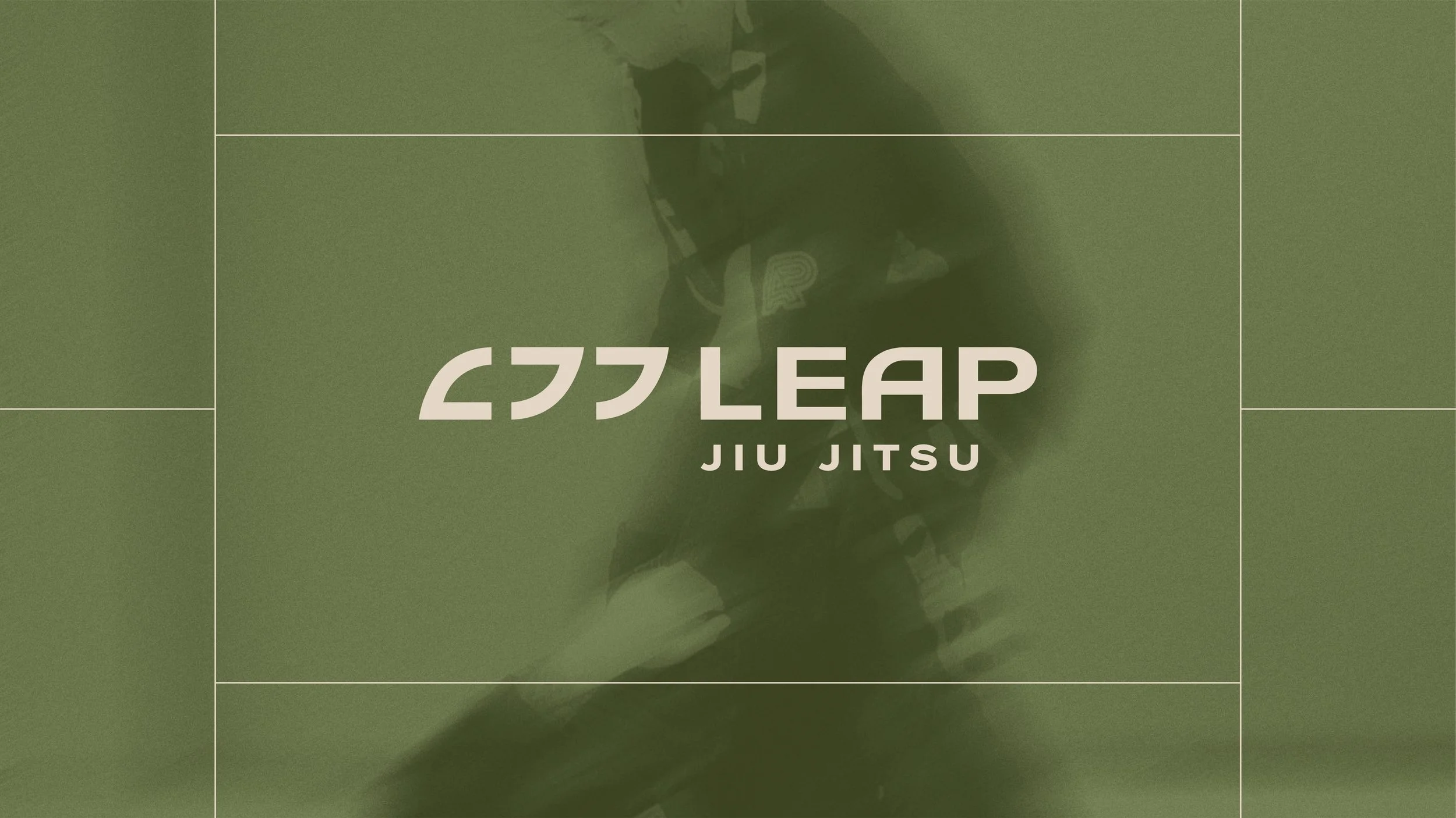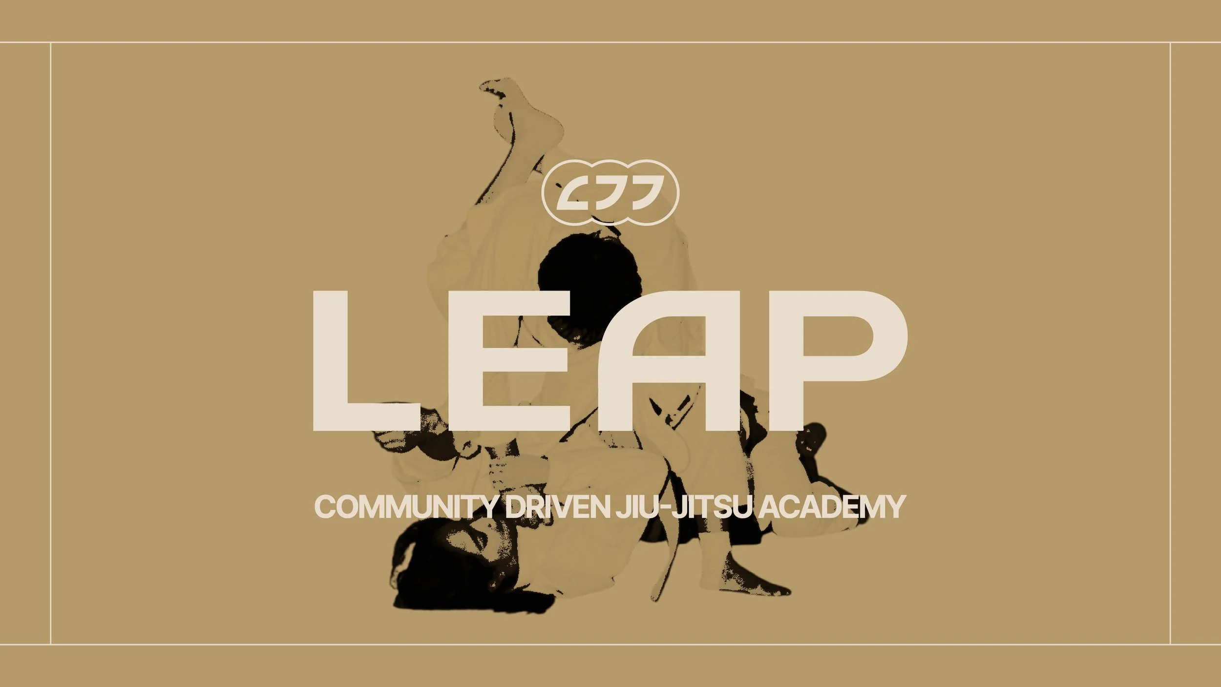
Take The Leap
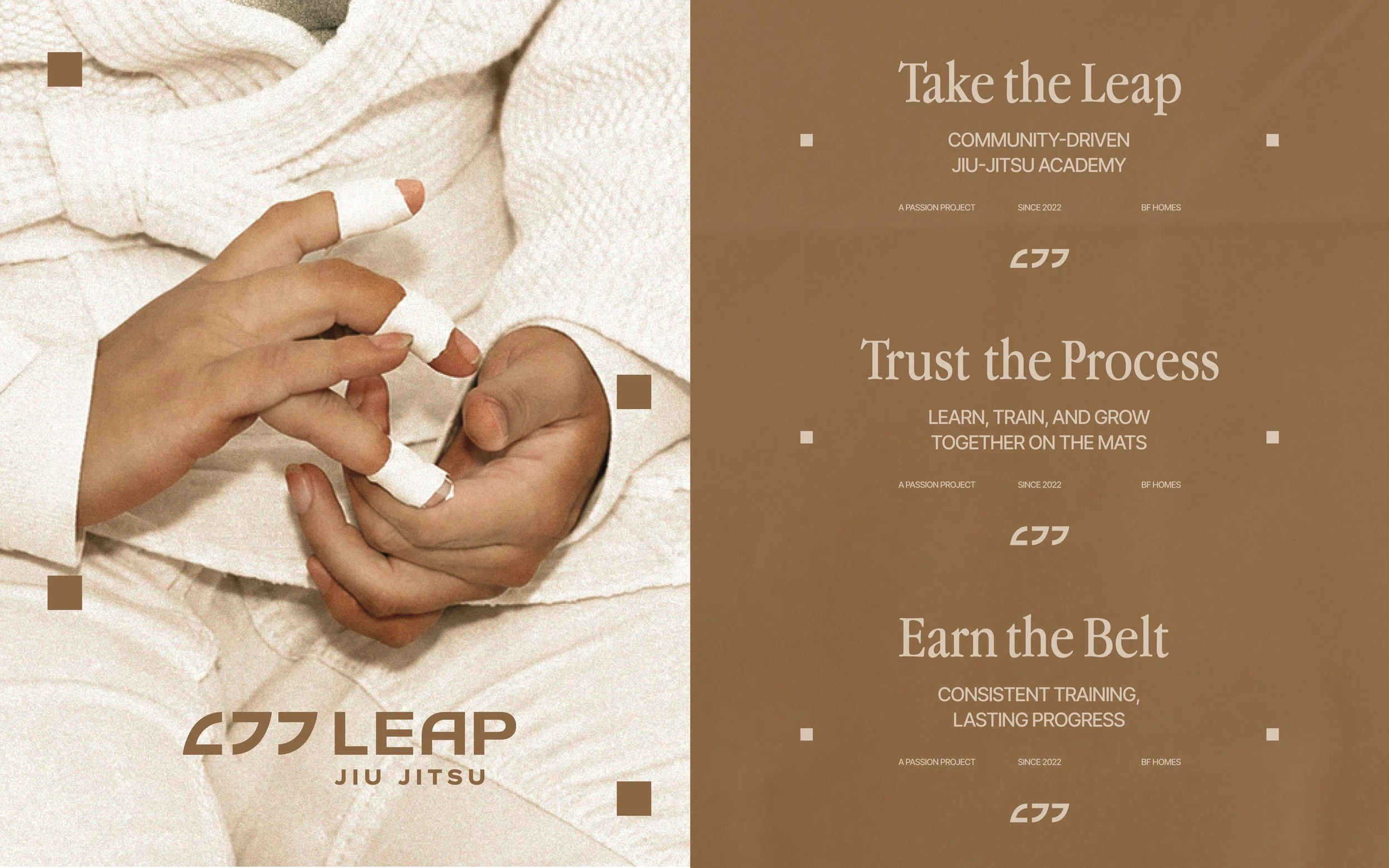
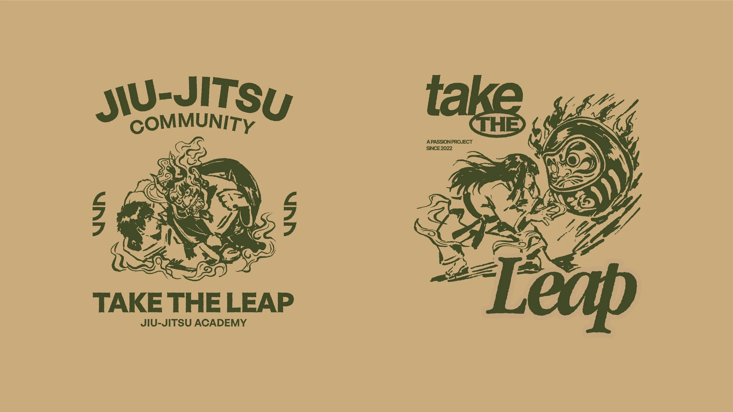
While combat sports are often associated with masculinity and aggression, we explored a more calm, grounded, and gender-neutral expression for the branding of Leap Jiu Jitsu.
What we worked on:
Brand Refresh
Visual Identity
Art Direction
The Challenge:
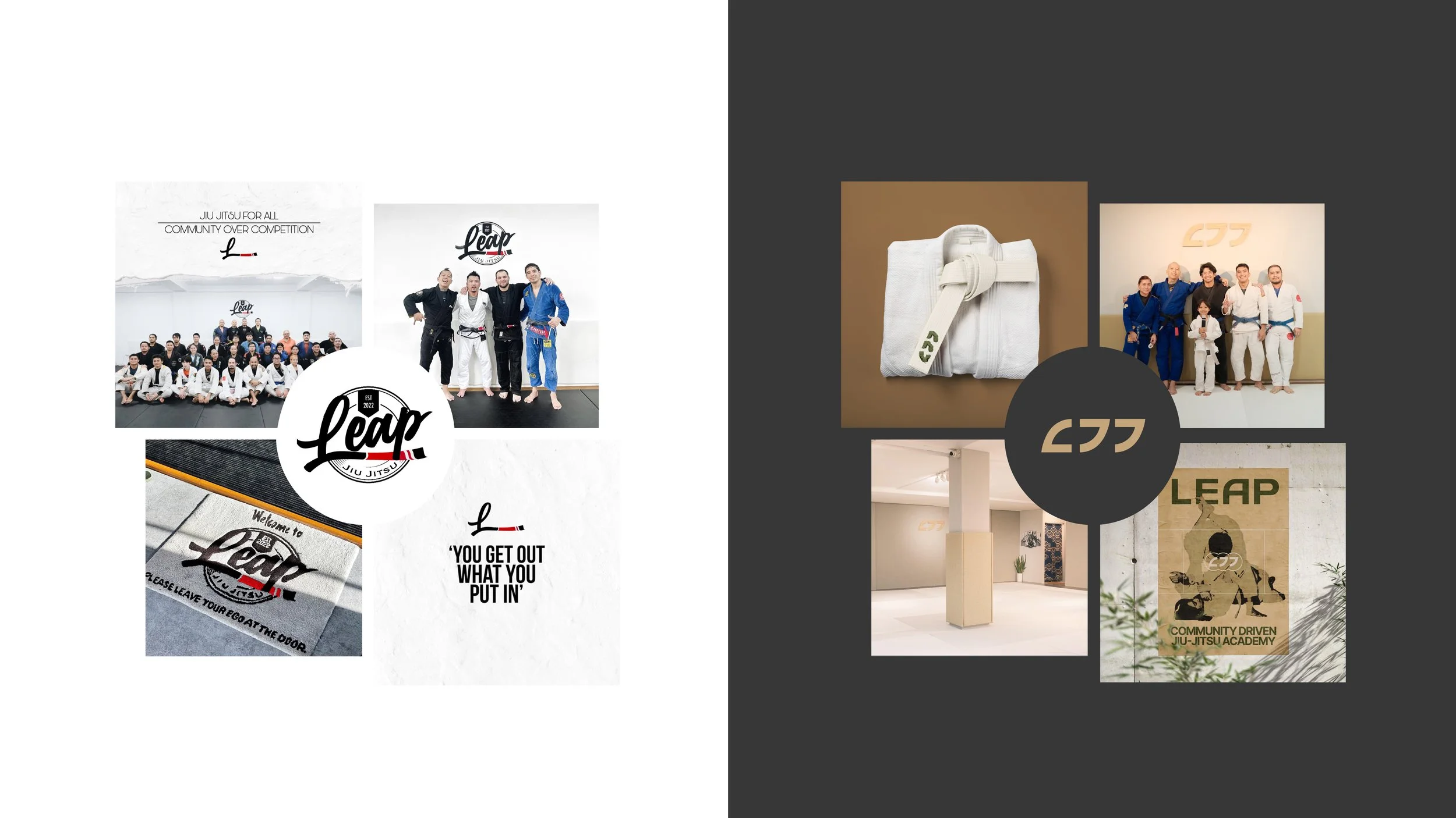
Leap’s original identity leaned into the familiar visual language of combat sports—bold typography, literal and predictable graphics, and an overall masculine feel. For the rebrand, we saw an opportunity to move toward something more unconventional and create an identity that felt more calm, grounded, and gender-neutral; still capturing the discipline and energy of Jiu Jitsu.
Our Solution:
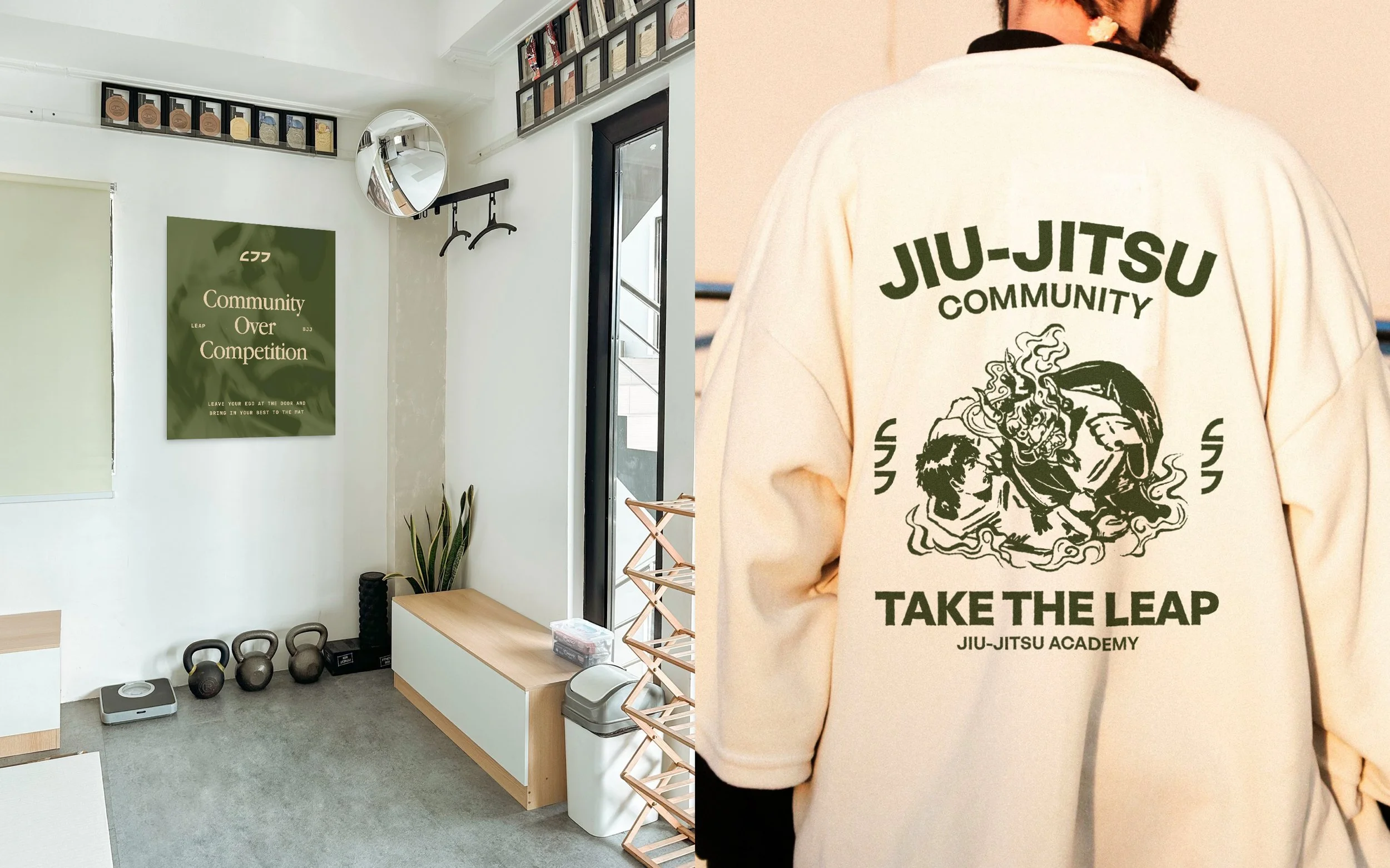
We reframed Leap around the idea of continuous progression, expressing Jiu Jitsu as an ongoing journey rather than simply a combat sport. This led to a more refined and understated visual language, combining Japanese-inspired references, movement, and repetition, creating a brand that feels contemporary, approachable, and built around growth.
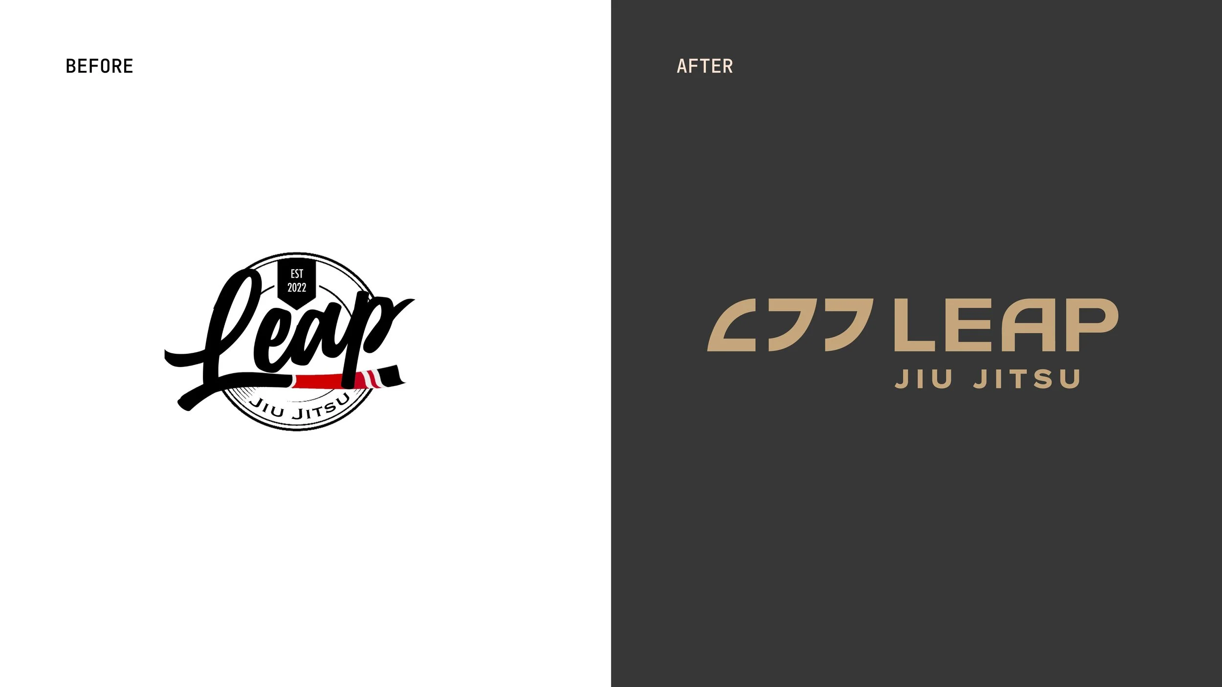
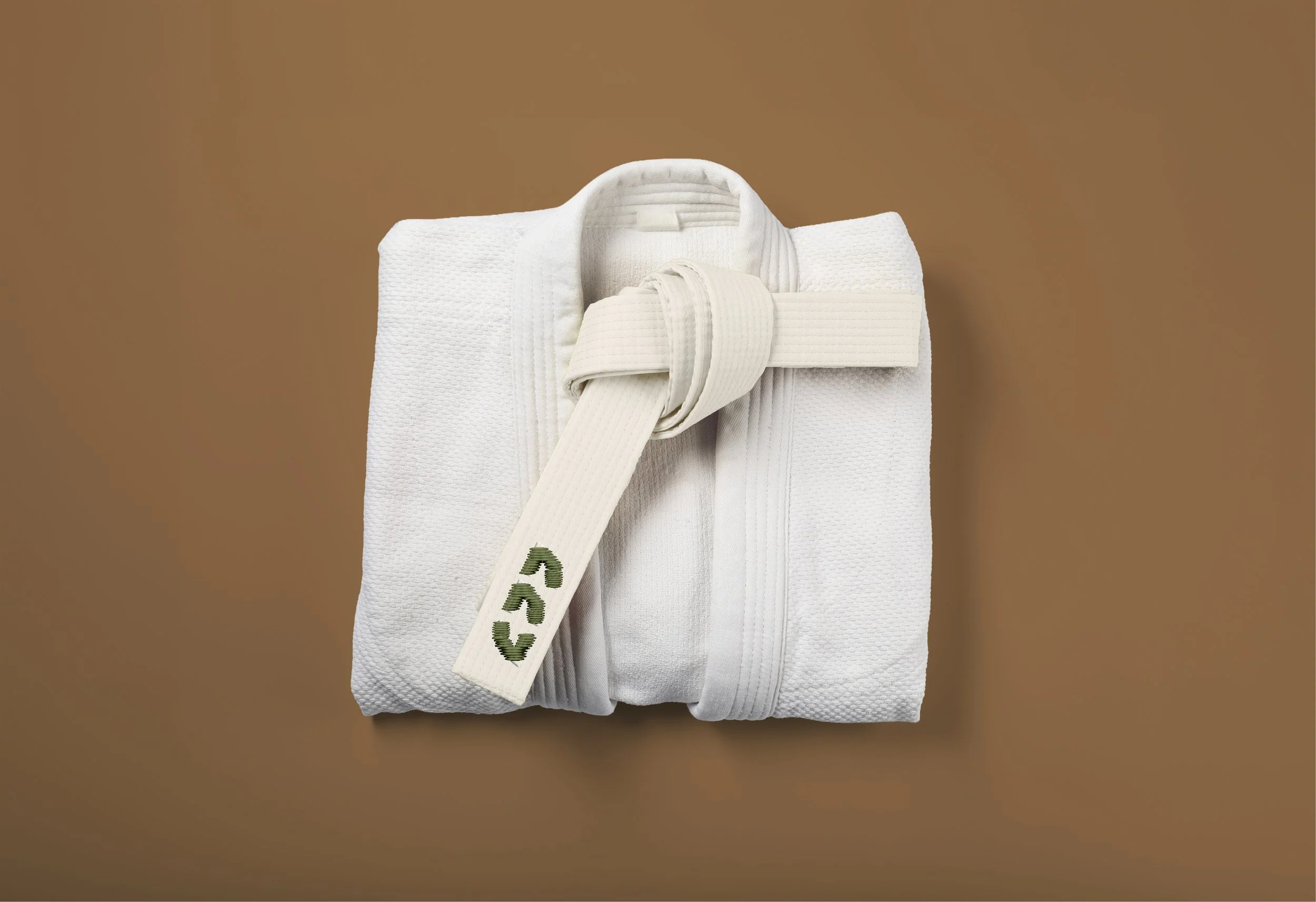
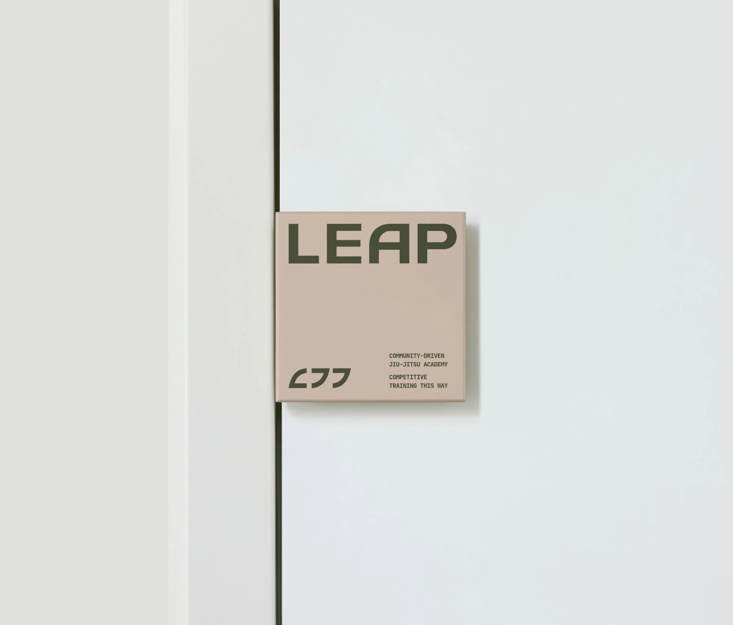

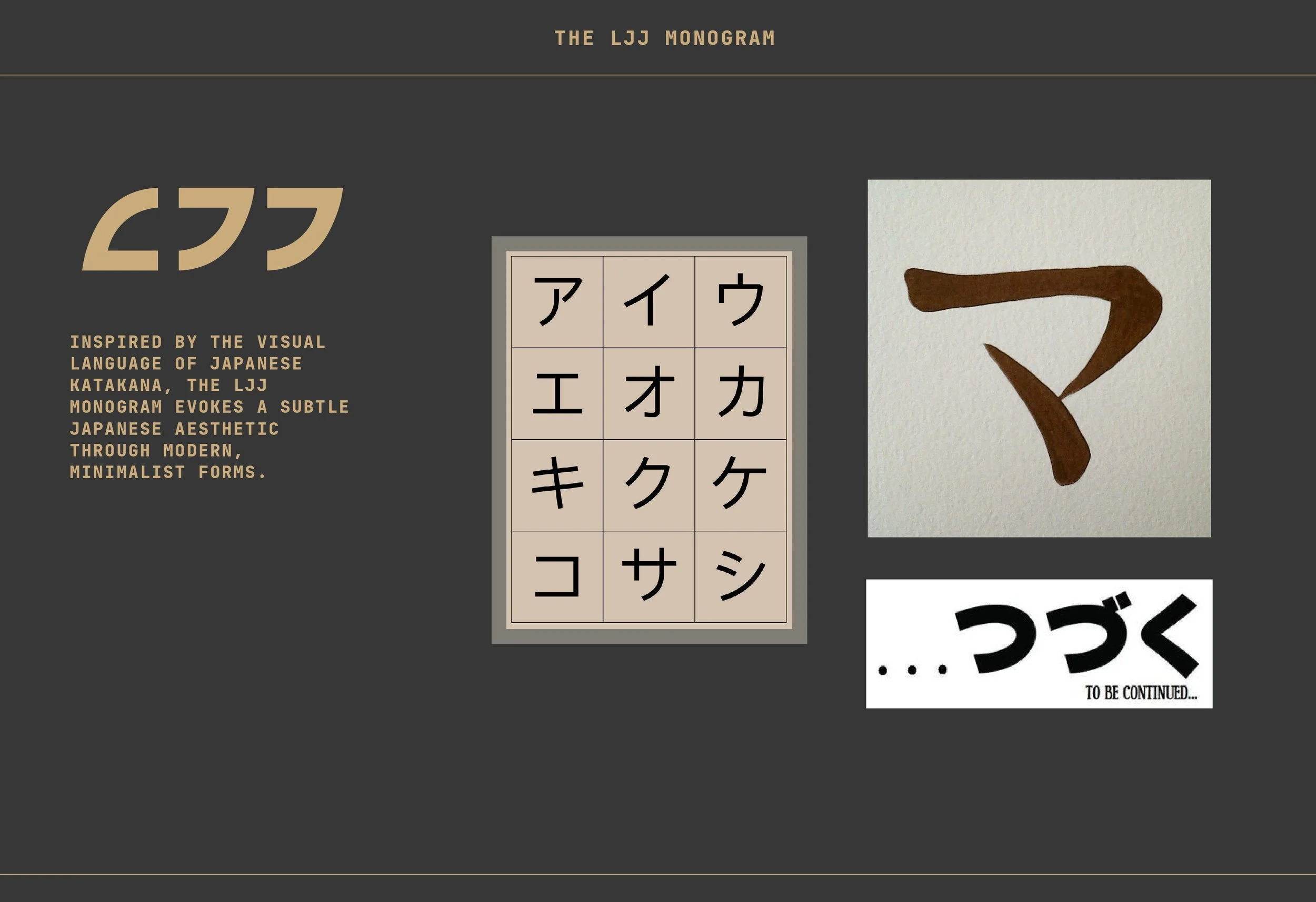
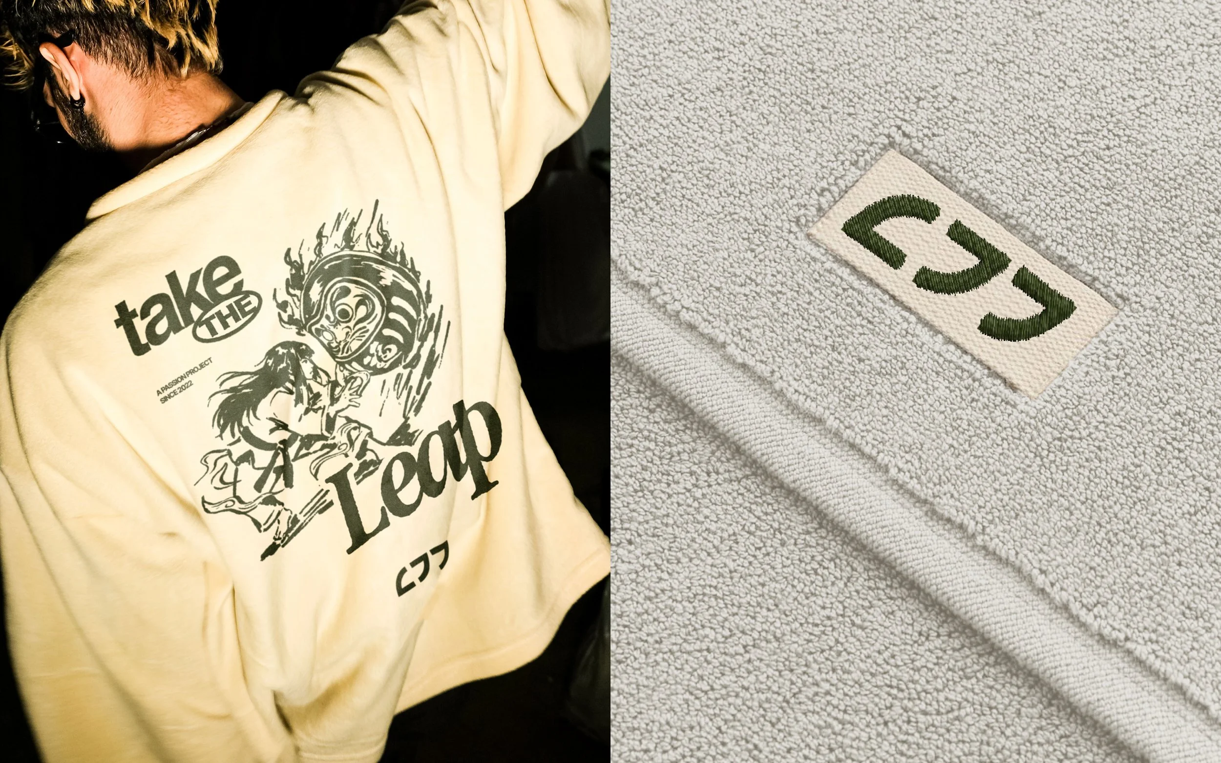
The logo draws from the geometric forms of Japanese Katakana, reinterpreted into a simple and distinctive mark.
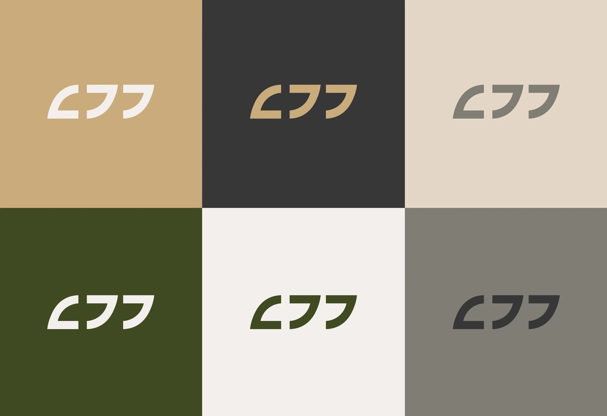
The logo takes inspiration from the end cards of Japanese anime, often marked by the word “tsuzuku,” meaning “to continue.” It embodies the idea of continuation and progression, reflecting Jiu Jitsu as an ongoing journey where there is always something new to learn, build upon, and explore.
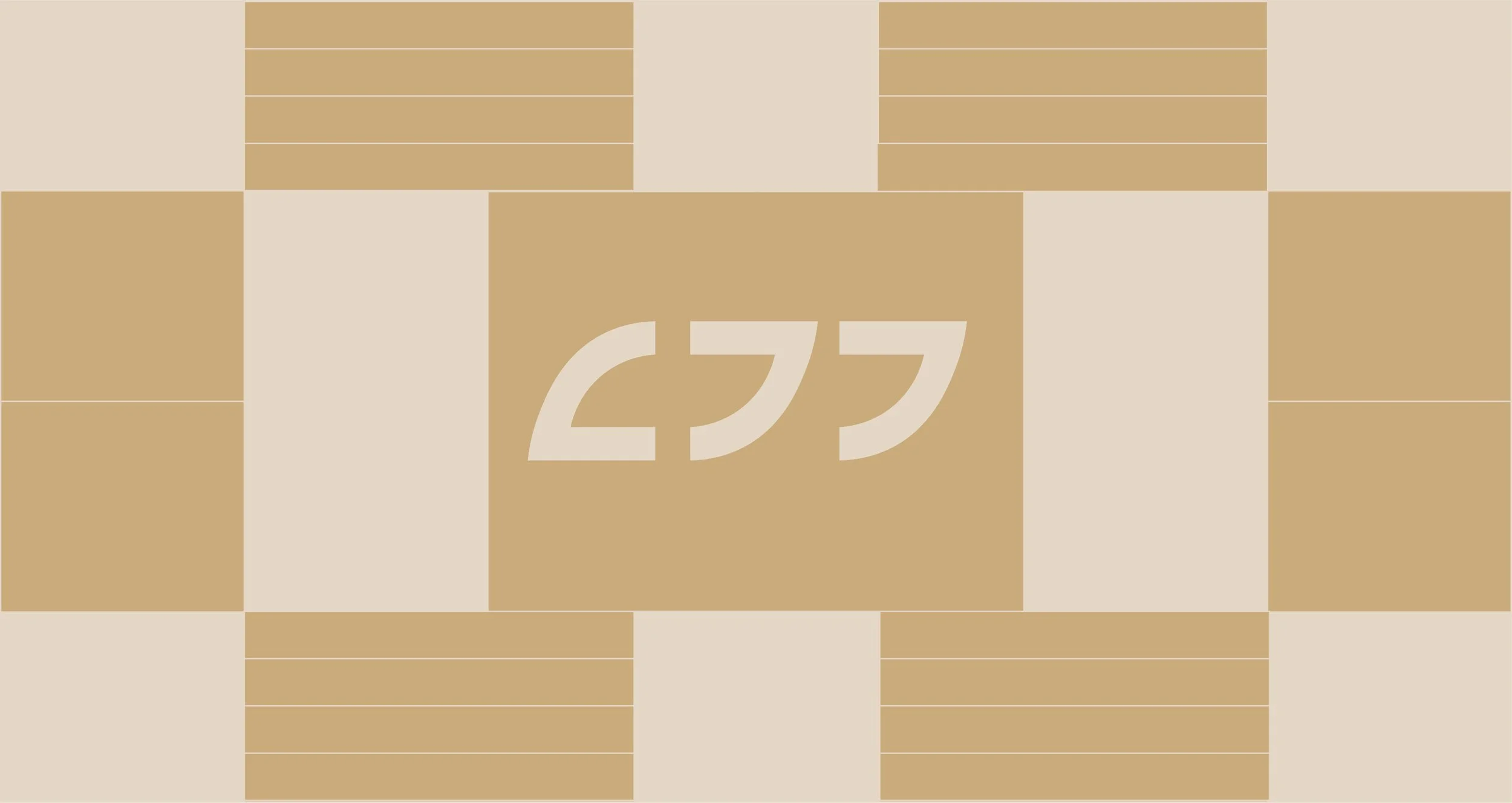
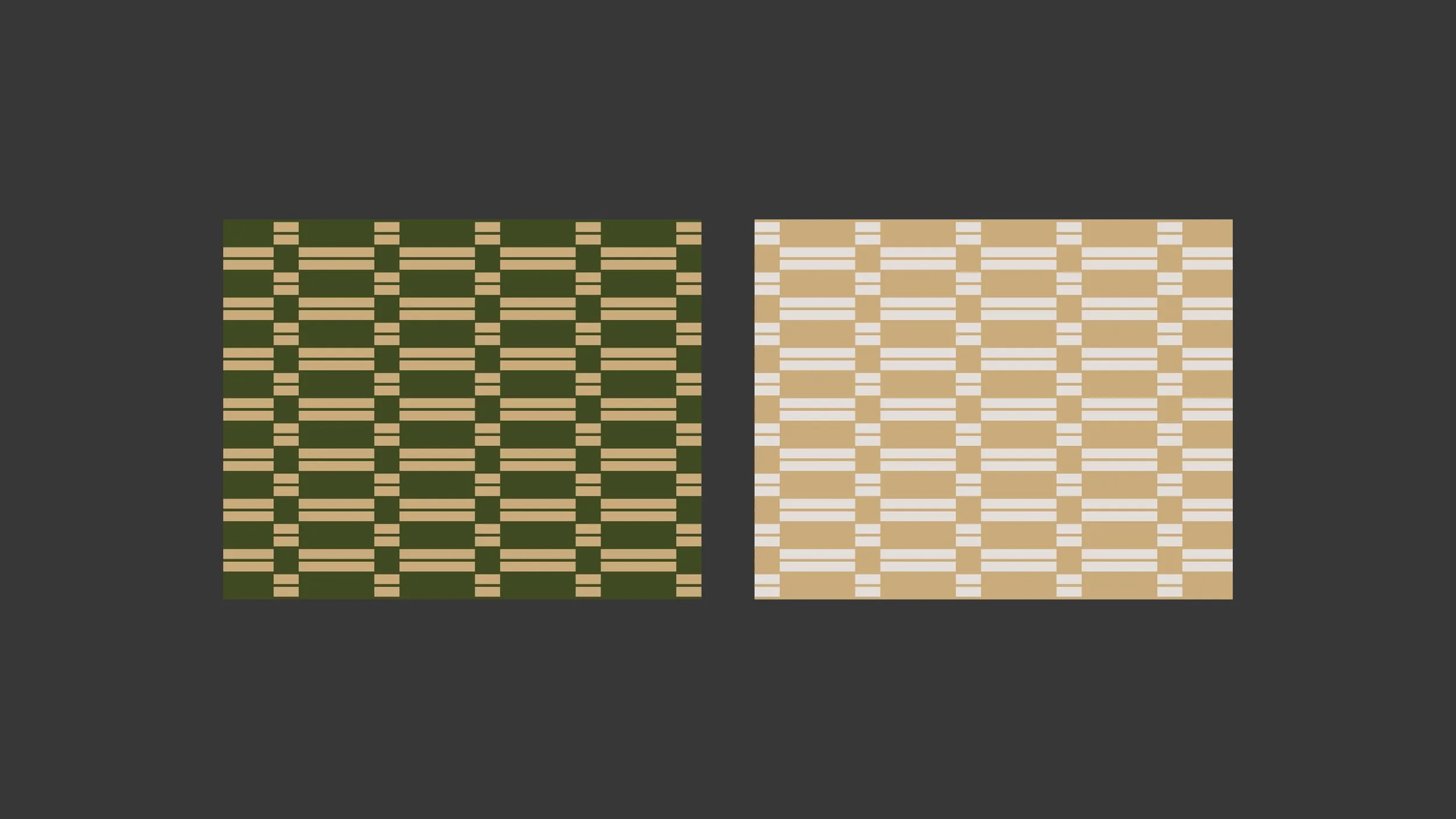
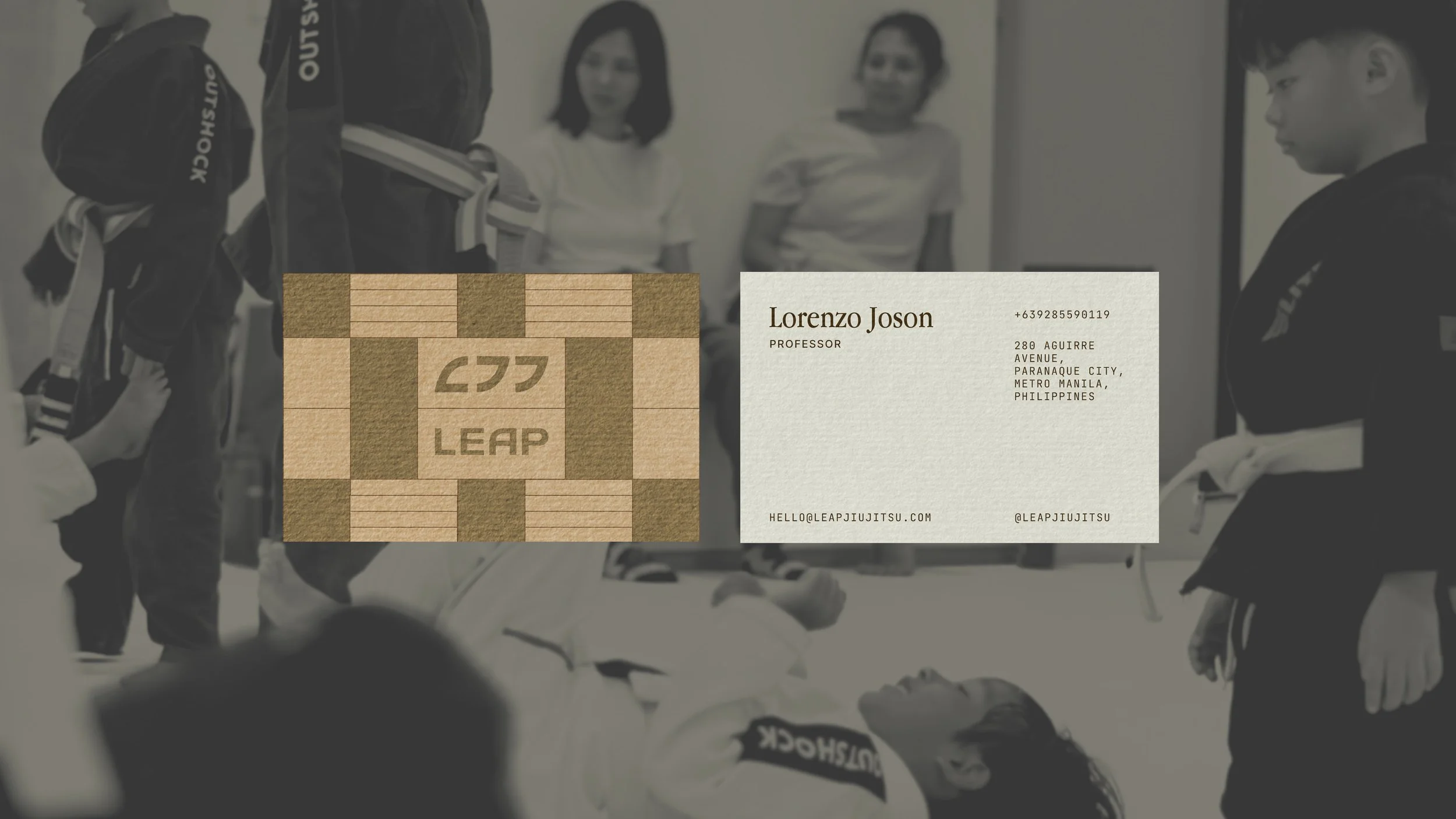
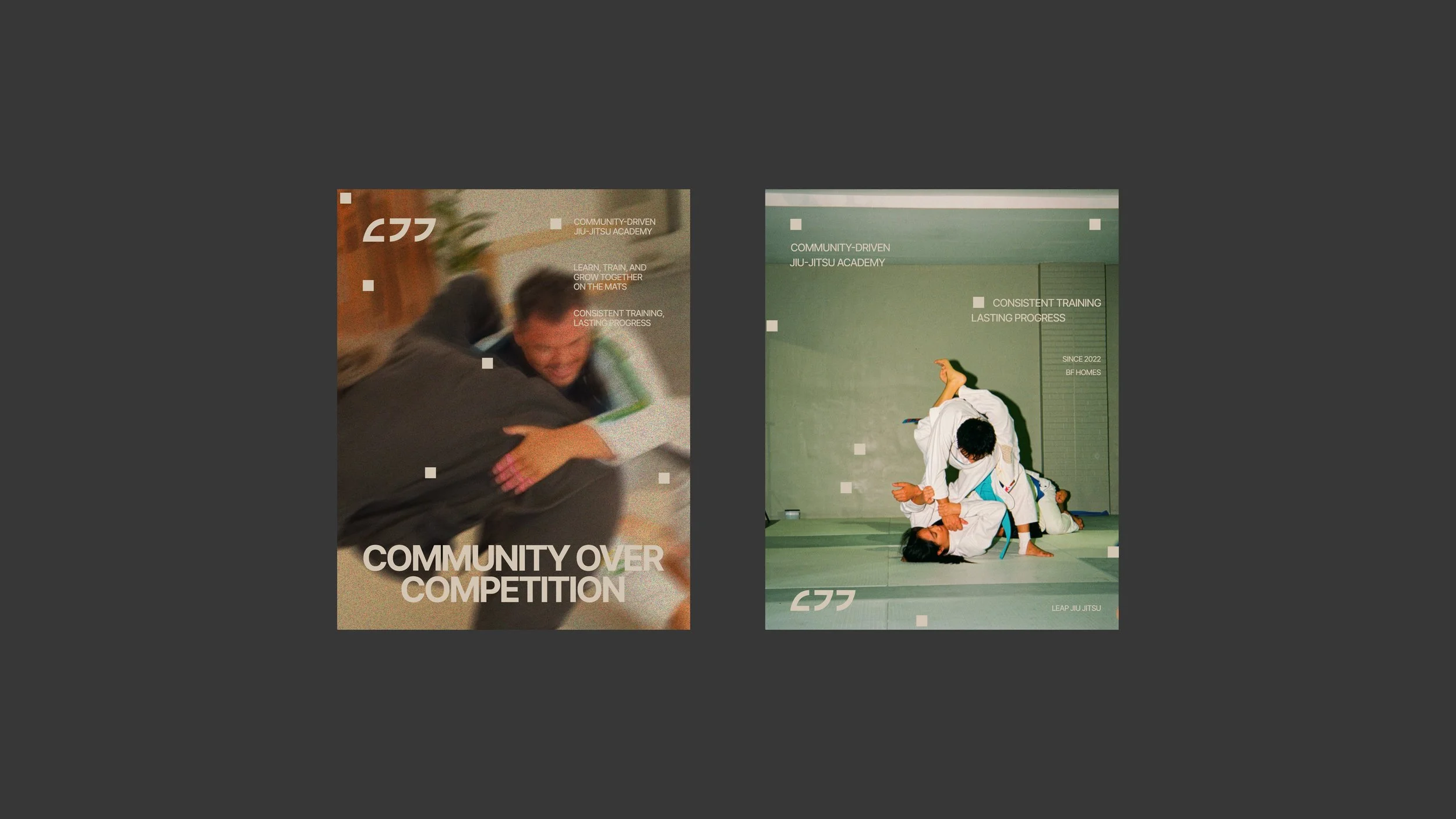
We incorporated patterns inspired from tatami mats, symbolizing the modular nature of Jiu Jitsu where techniques can be combined and adapted in countless ways.


The Result:
The rebrand transforms Leap from a conventional combat-sports identity into a more refined, inclusive, and lifestyle-oriented Jiu Jitsu brand. It feels calm without losing energy, and distinctive without relying on typical and literal visuals traditionally associated with the sport.