Good Coffee in Plain Sight.
After nearly a decade of supplying beans to some of the country’s most beloved cafés, Plain Sight was ready to reinvent itself—not just as a coffee brand, but as a lifestyle brand. Their mission: break down the exclusivity of specialty coffee and make great coffee culture more fun, open, and approachable.
What we worked on:
Brand Identity
Packaging
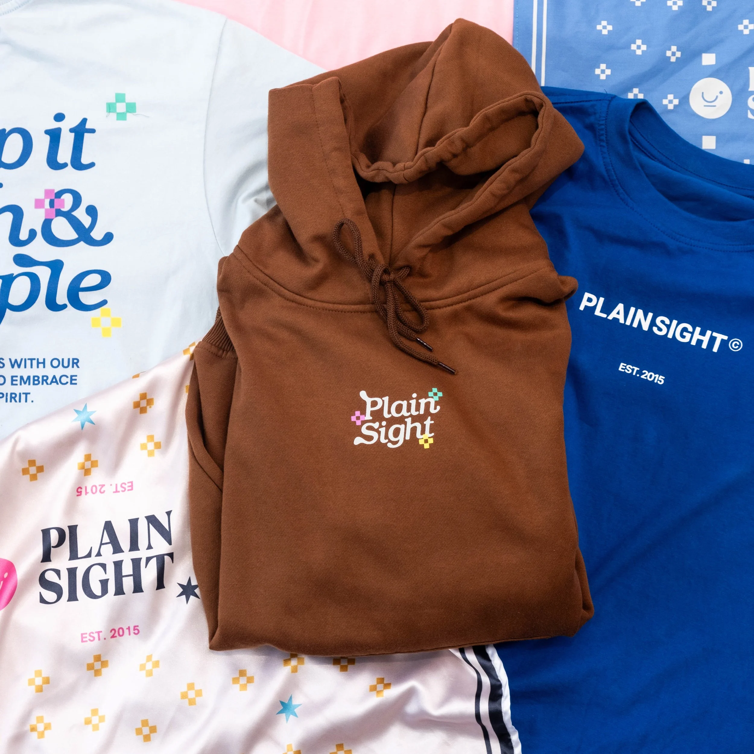
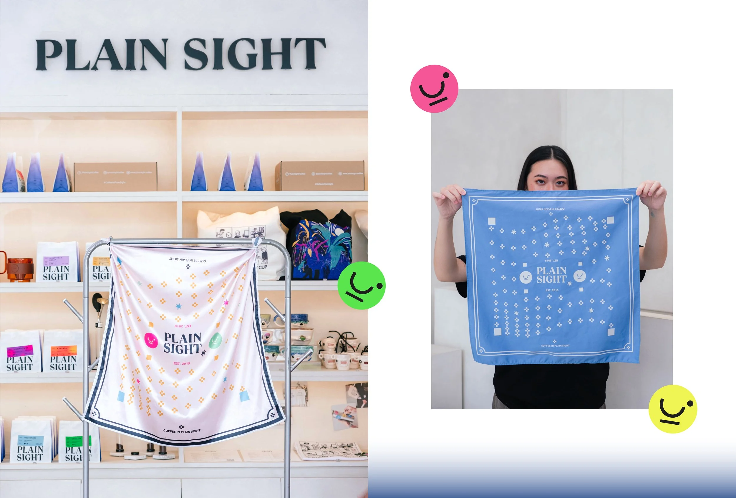
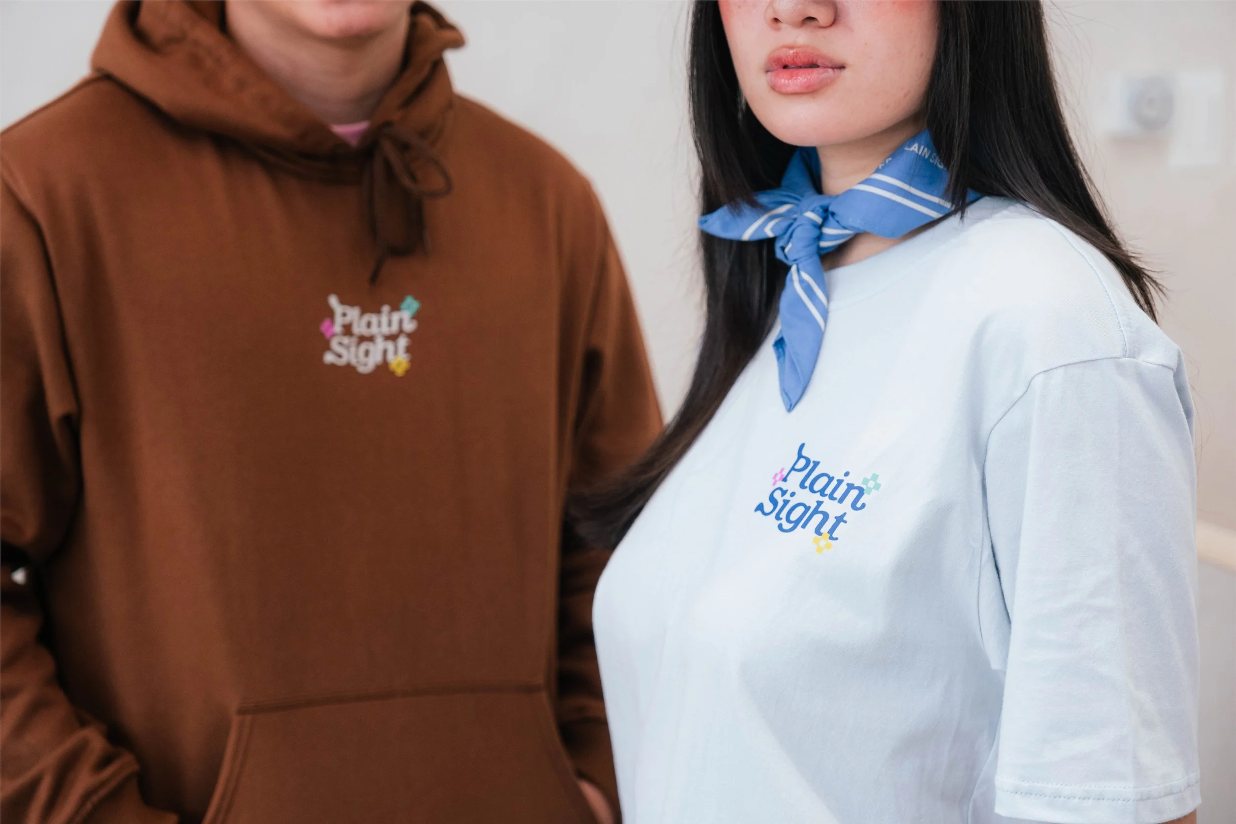
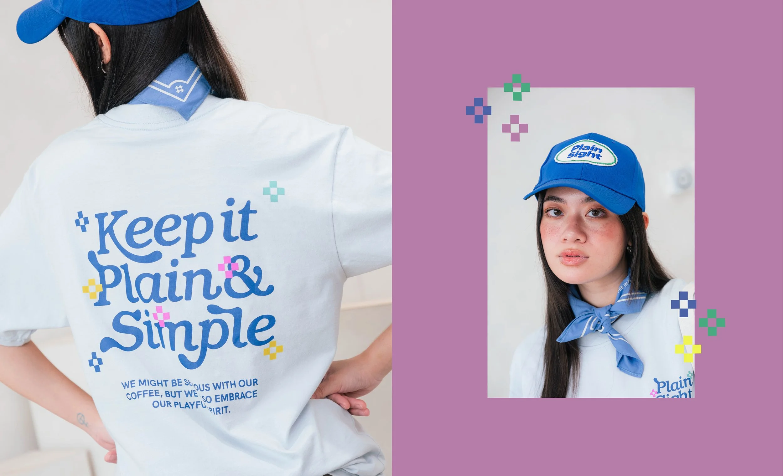
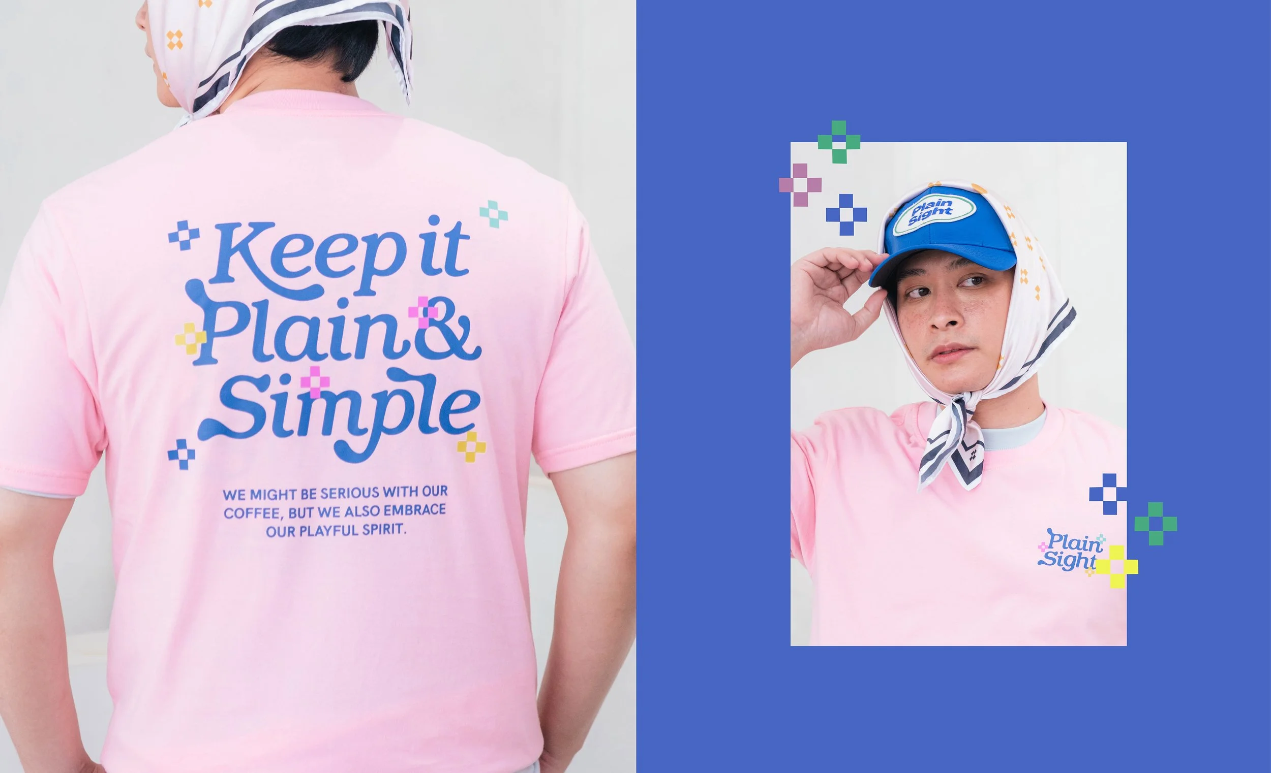
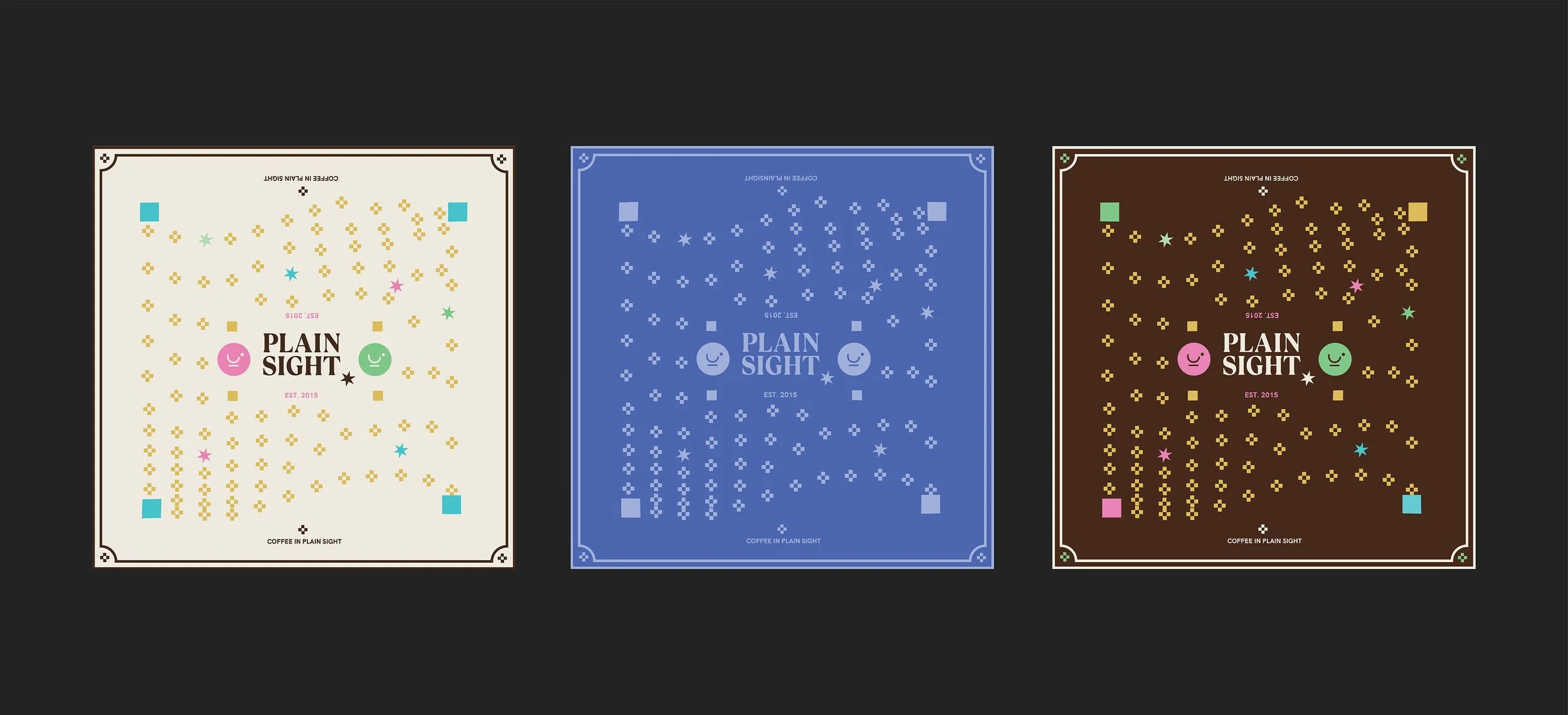
Merch Design
The Challenge:
As Plain Sight approached ten years, they wanted a bold rebrand—one that stood out from the cliché coffee aesthetic.
Our Solution:
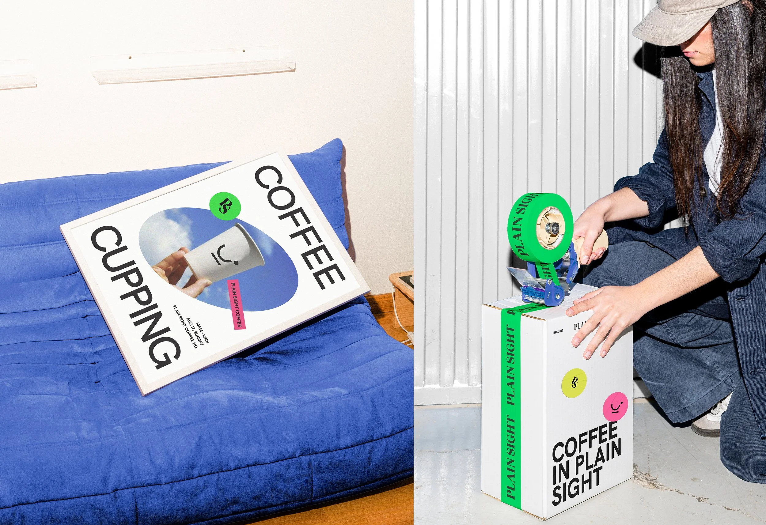
Our approach was to move beyond coffee tropes and build a lifestyle-led identity rooted in authenticity and openness, drawing inspiration from fashion and design rather than coffee.

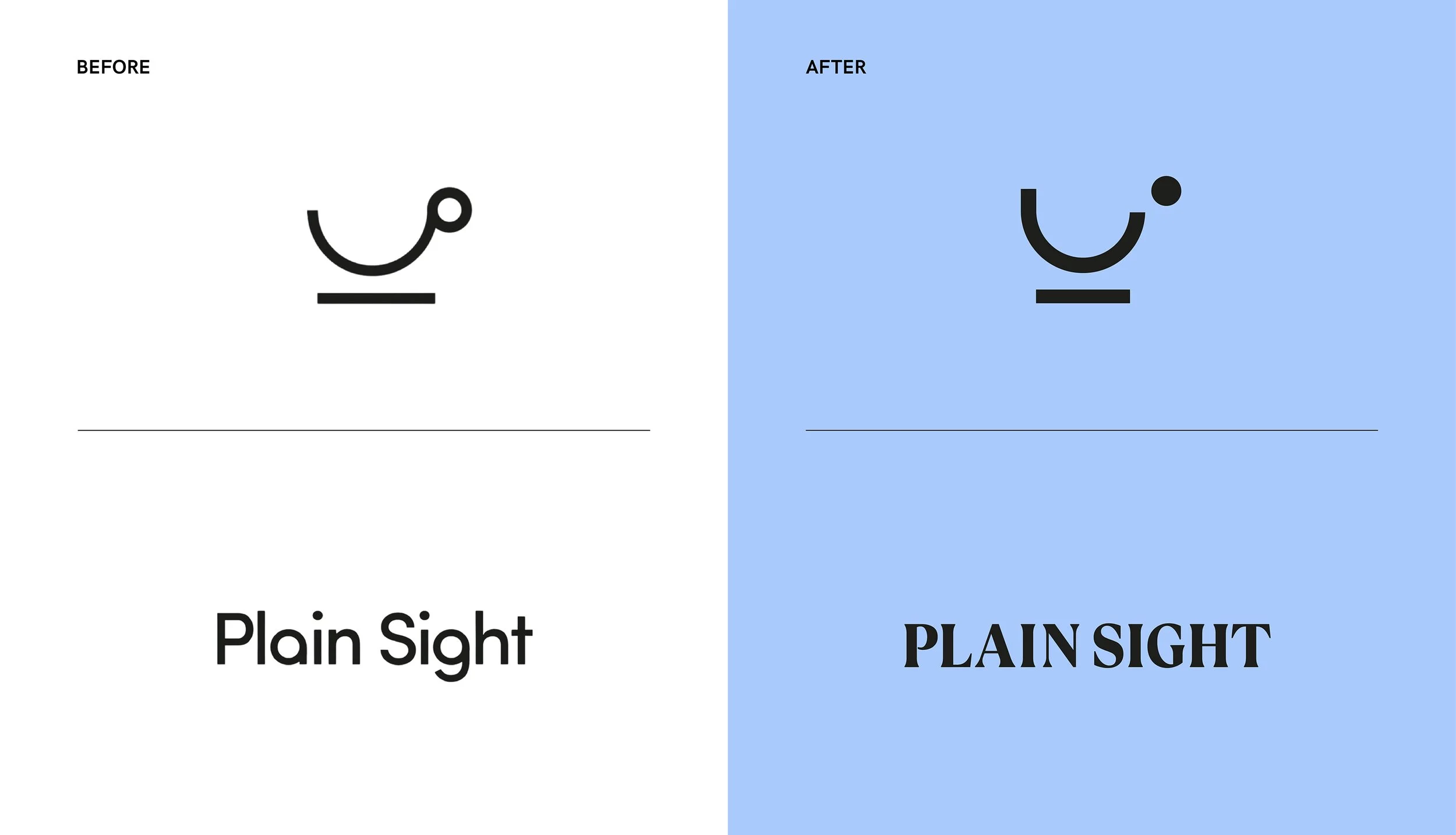
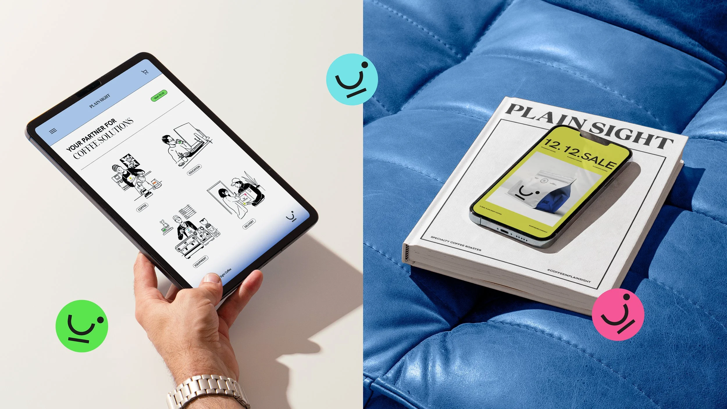
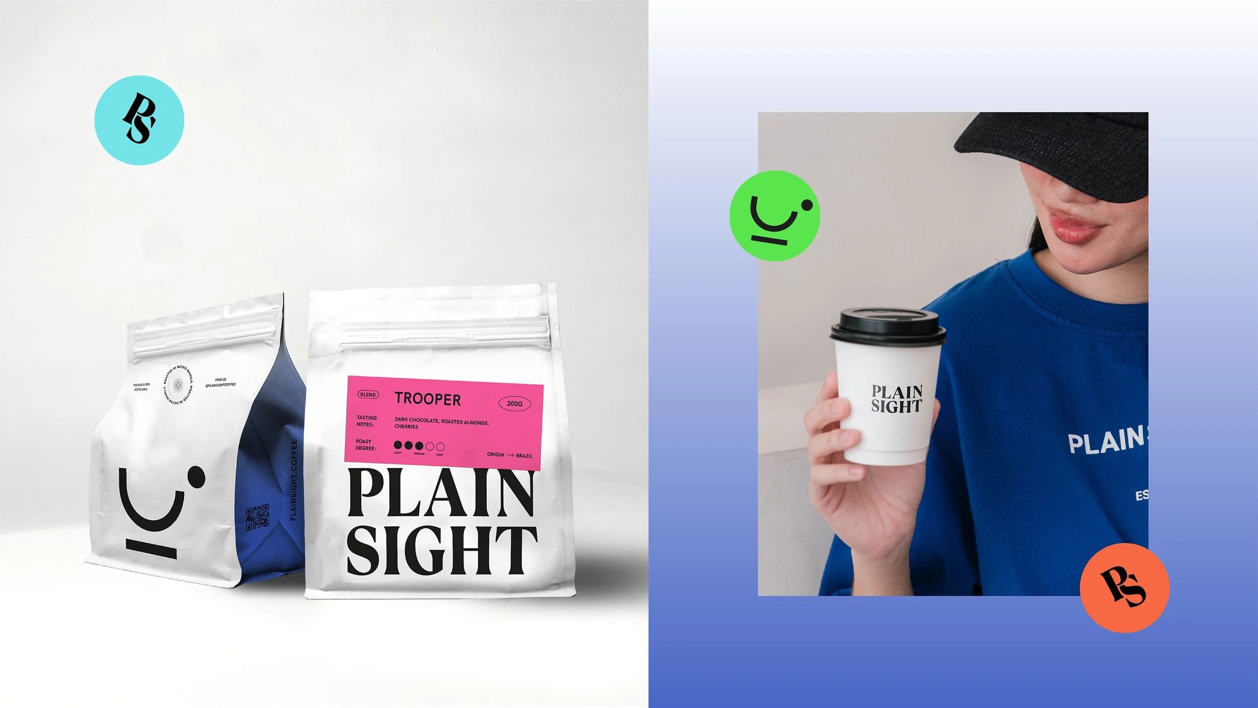
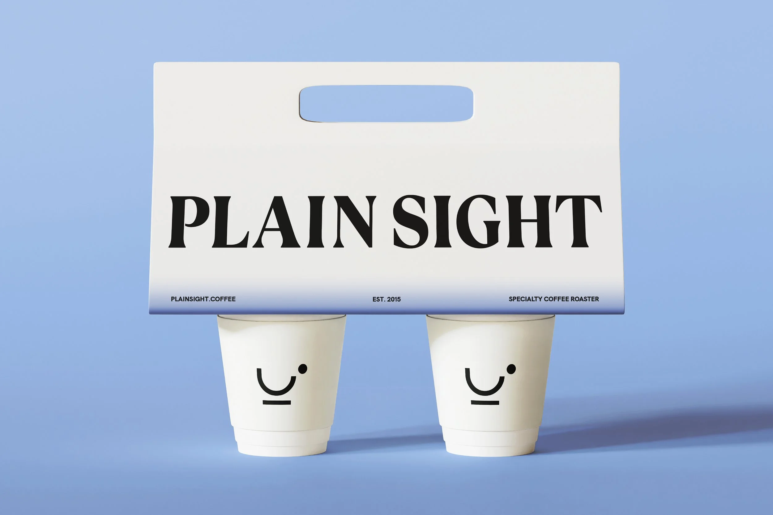
The original logo symbol, which was done by the brand’s owner, had a charm and simplicity about it that we wanted to retain. We proposed a refreshed version that kept its essence intact while improving clarity, balance, and scalability.
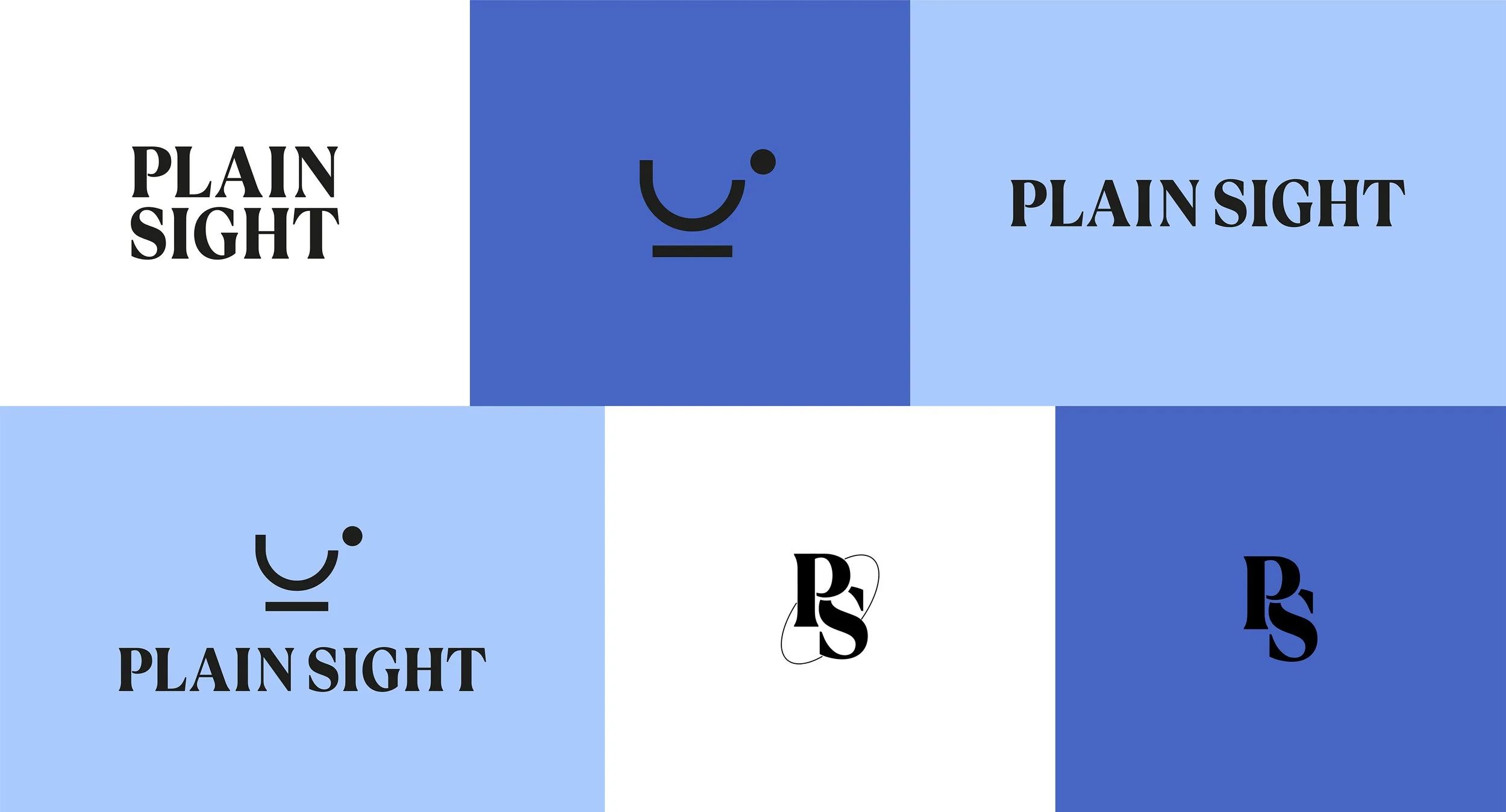
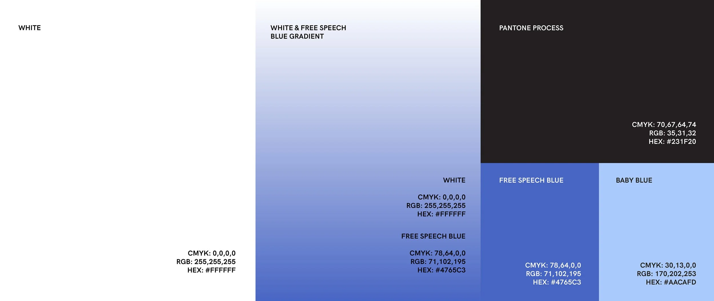
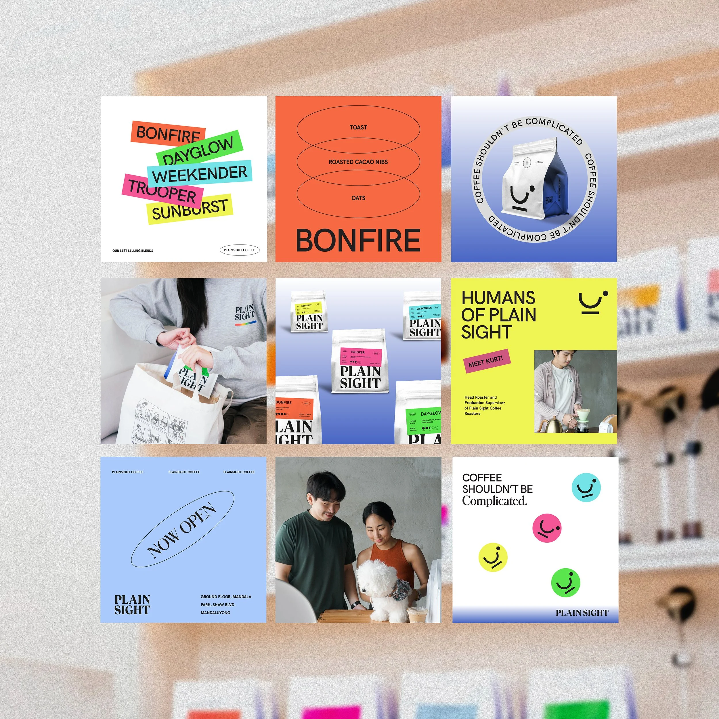
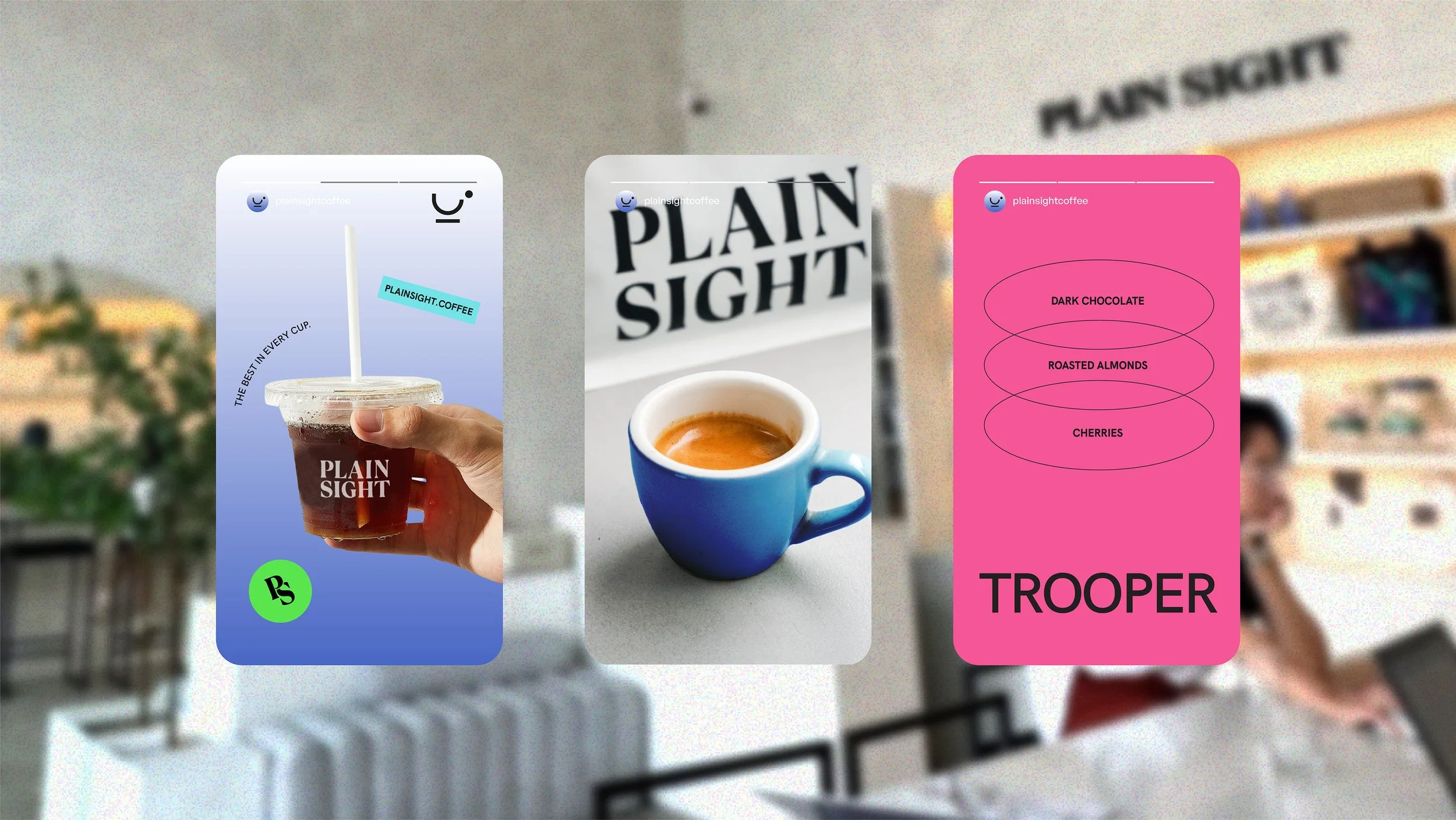
The color palette combines crisp whites, bold blacks, and layered blue tones to create a clean, contemporary identity. Soft gradients introduce a sense of calm and openness, while the contrast of black adds depth and refinement.
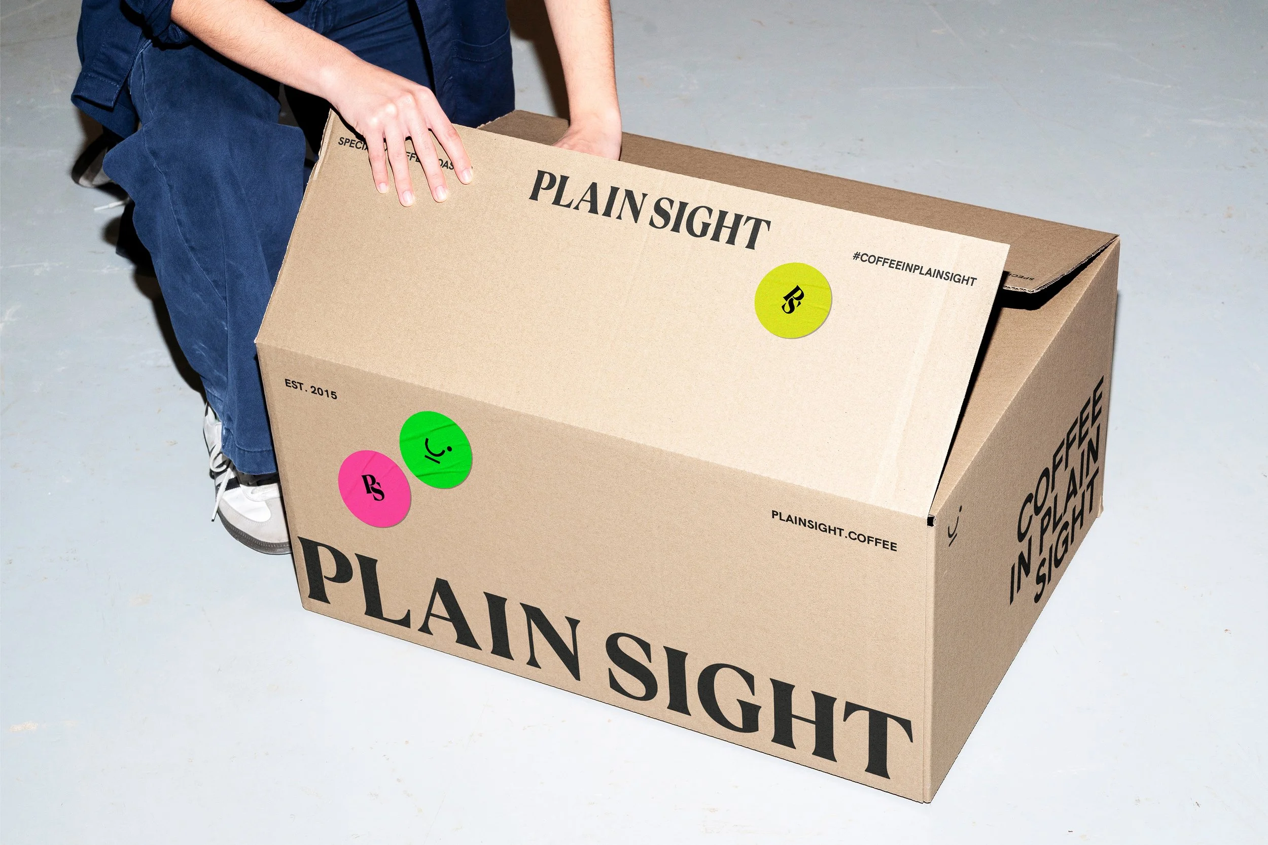
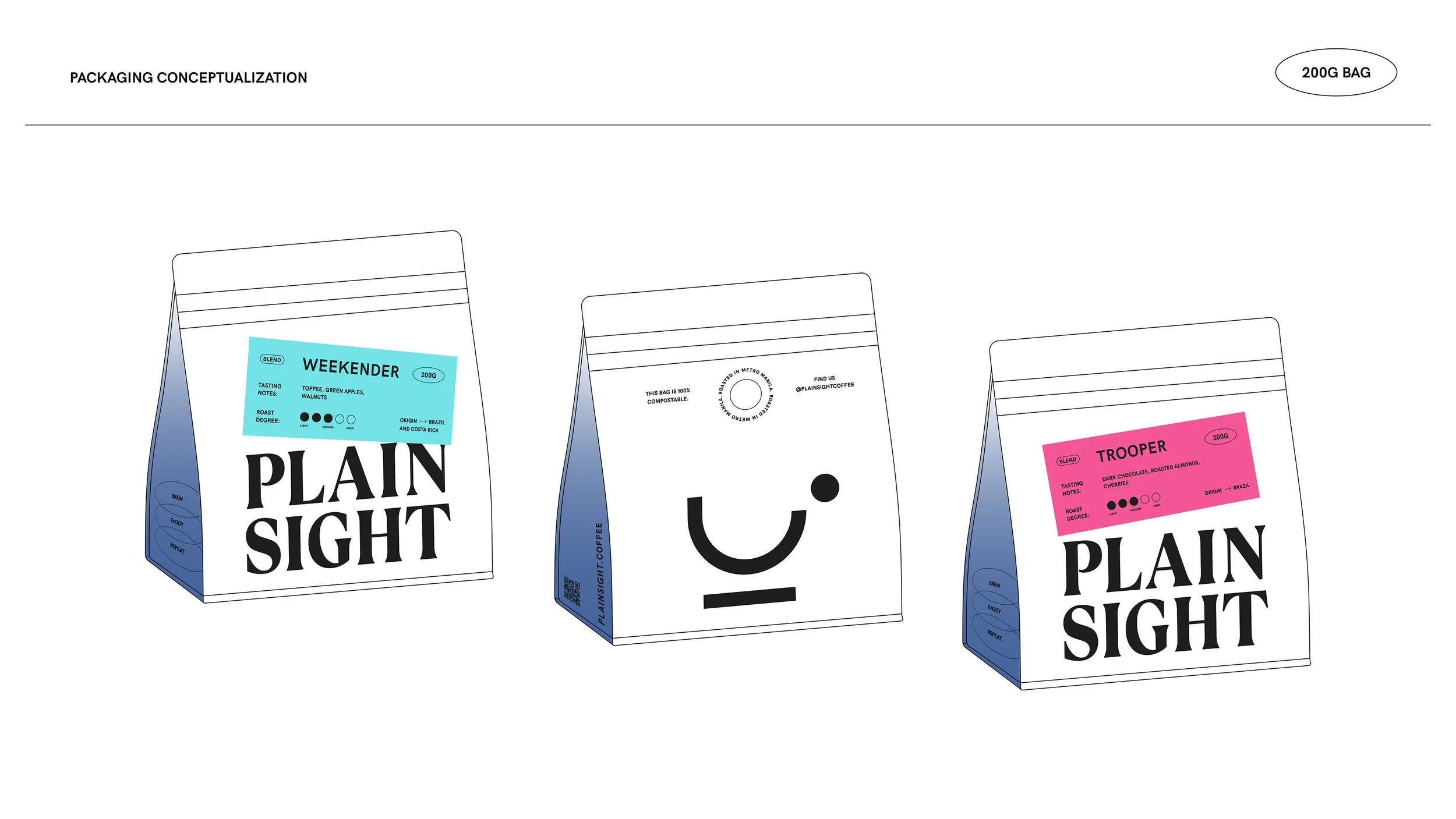
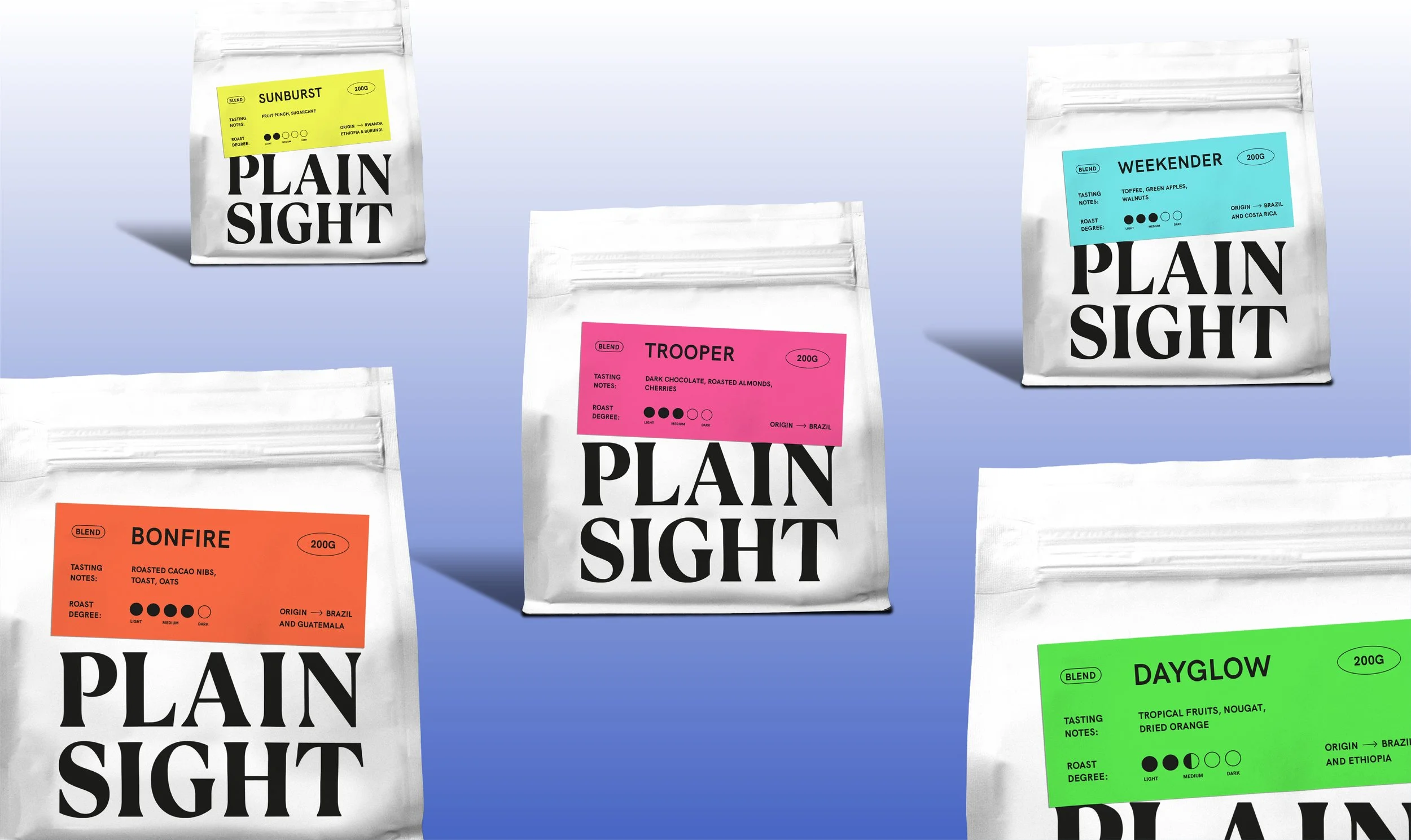
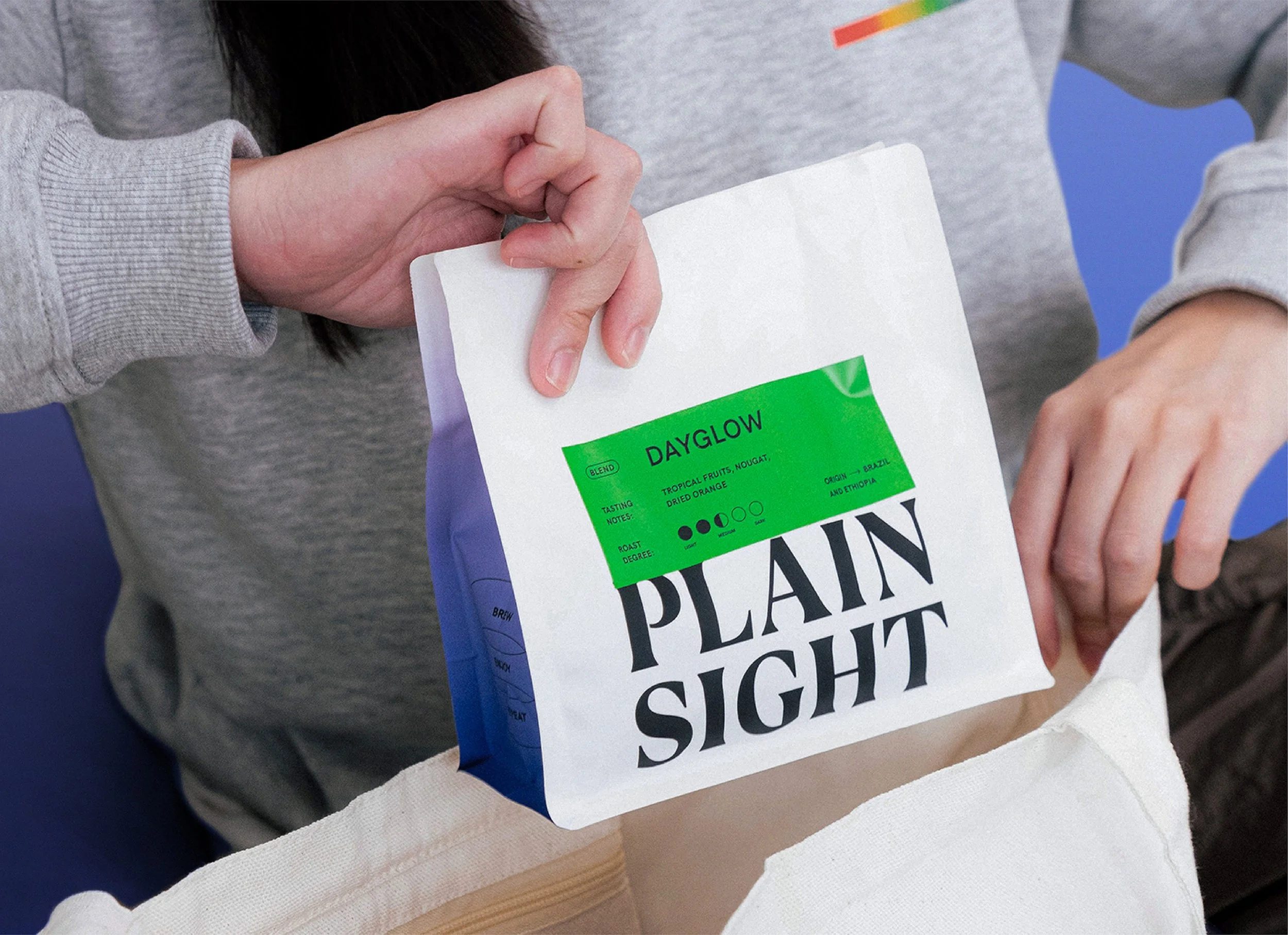
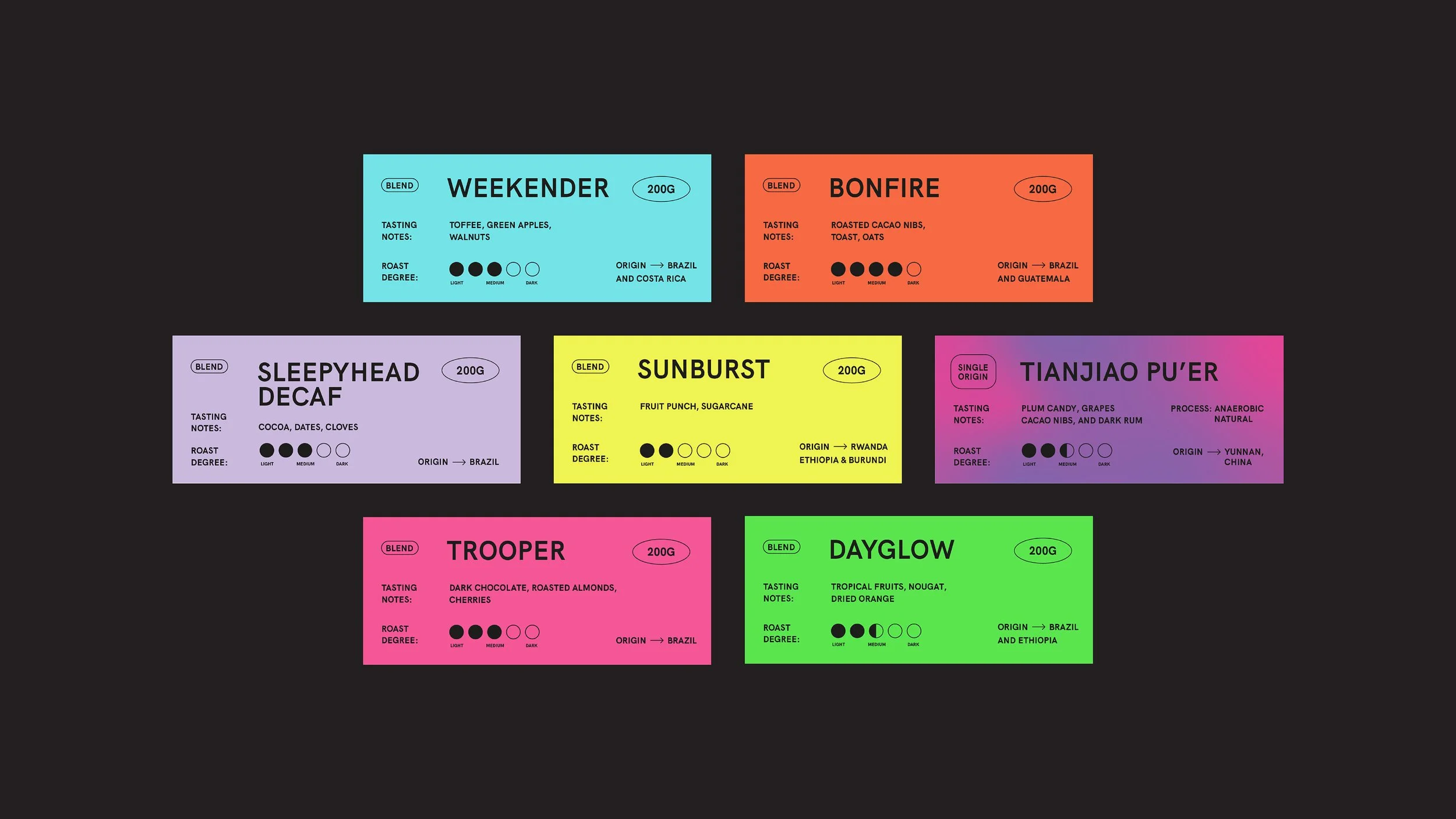
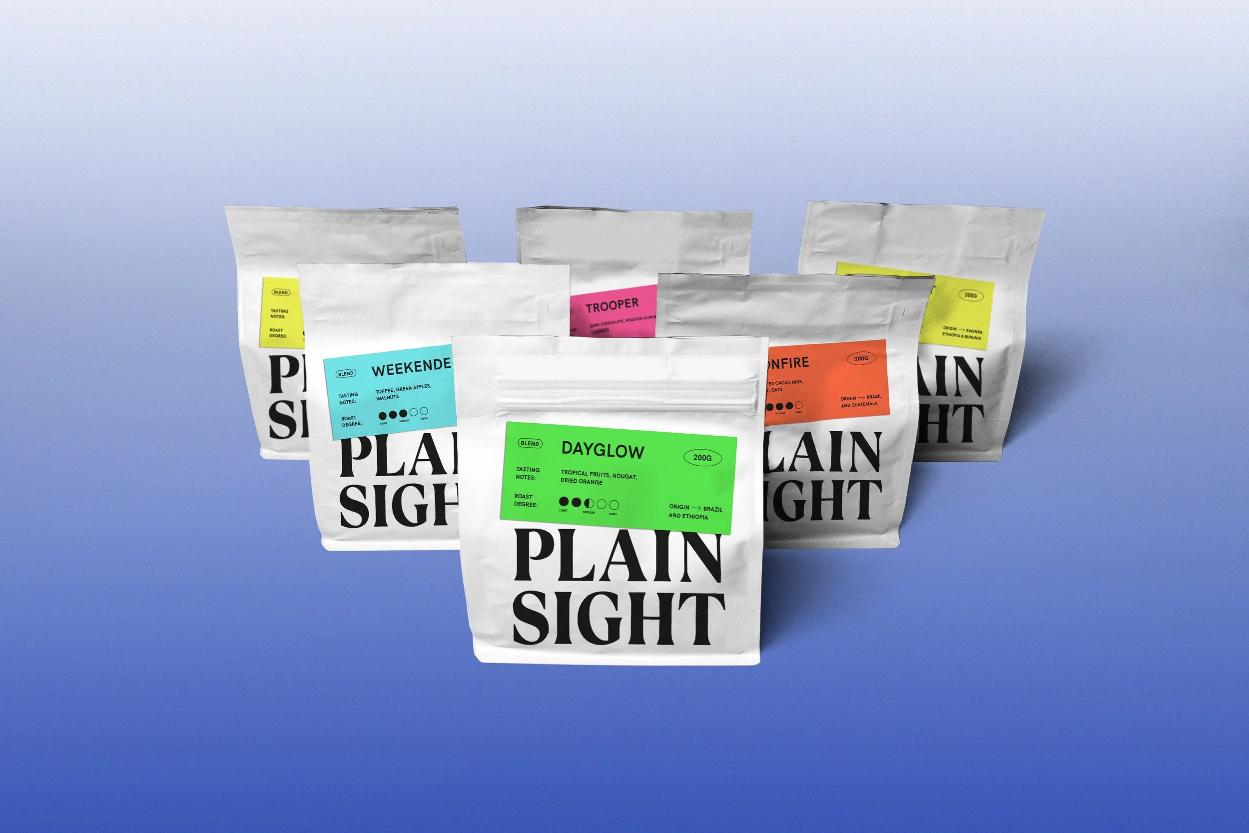
The packaging labels introduce vibrant pops of color that distinguish each product while complementing the brand's clean visual identity.
Packaging was our most important touchpoint. Built to stand out on café shelves and easy for their team to update with new releases.
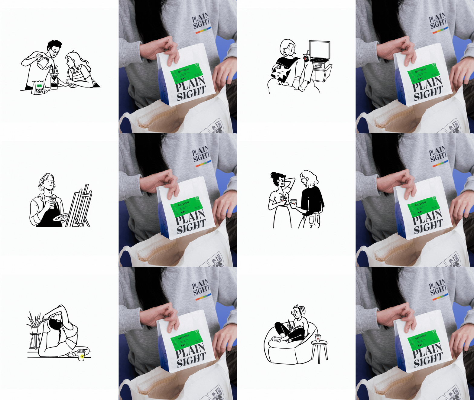
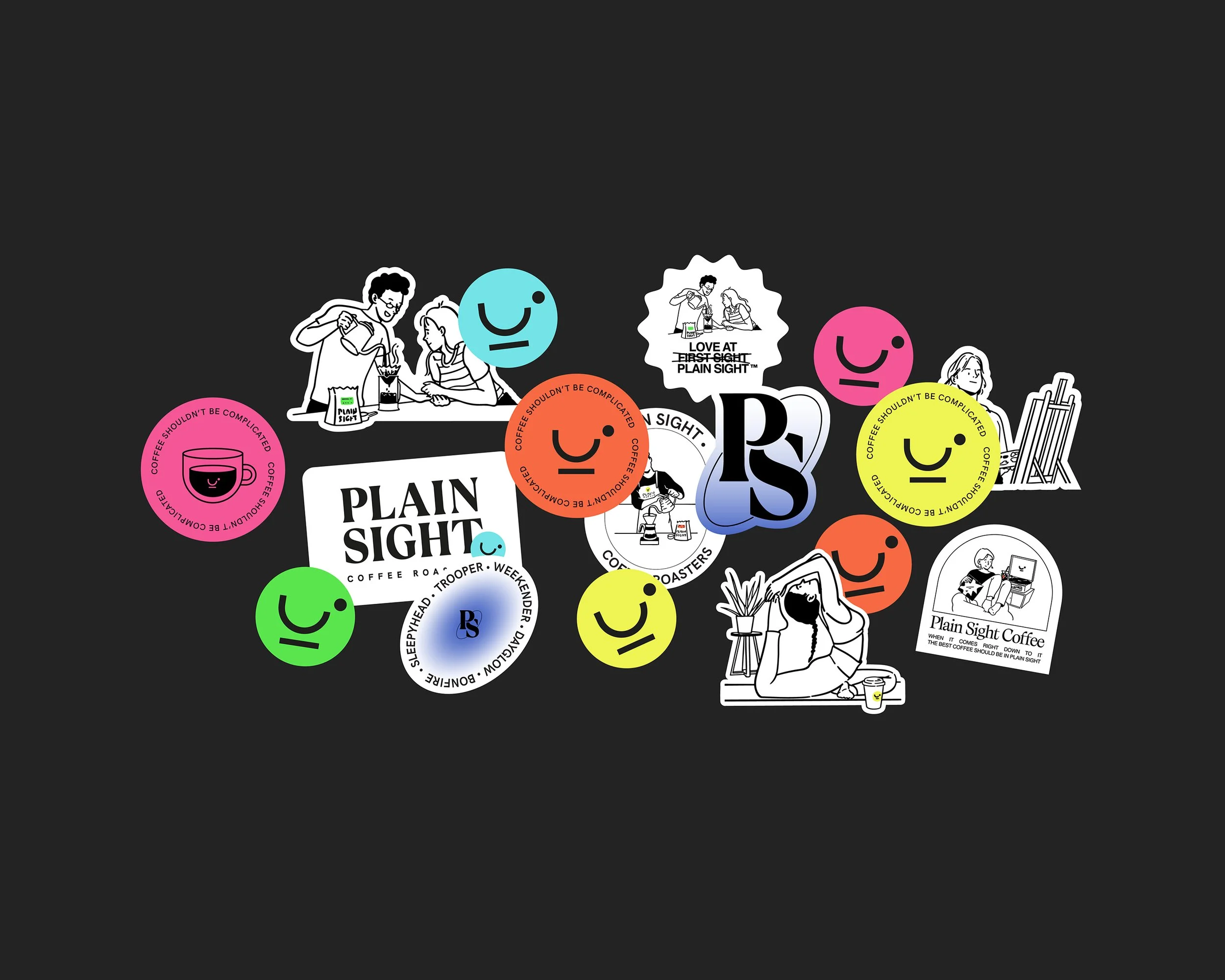
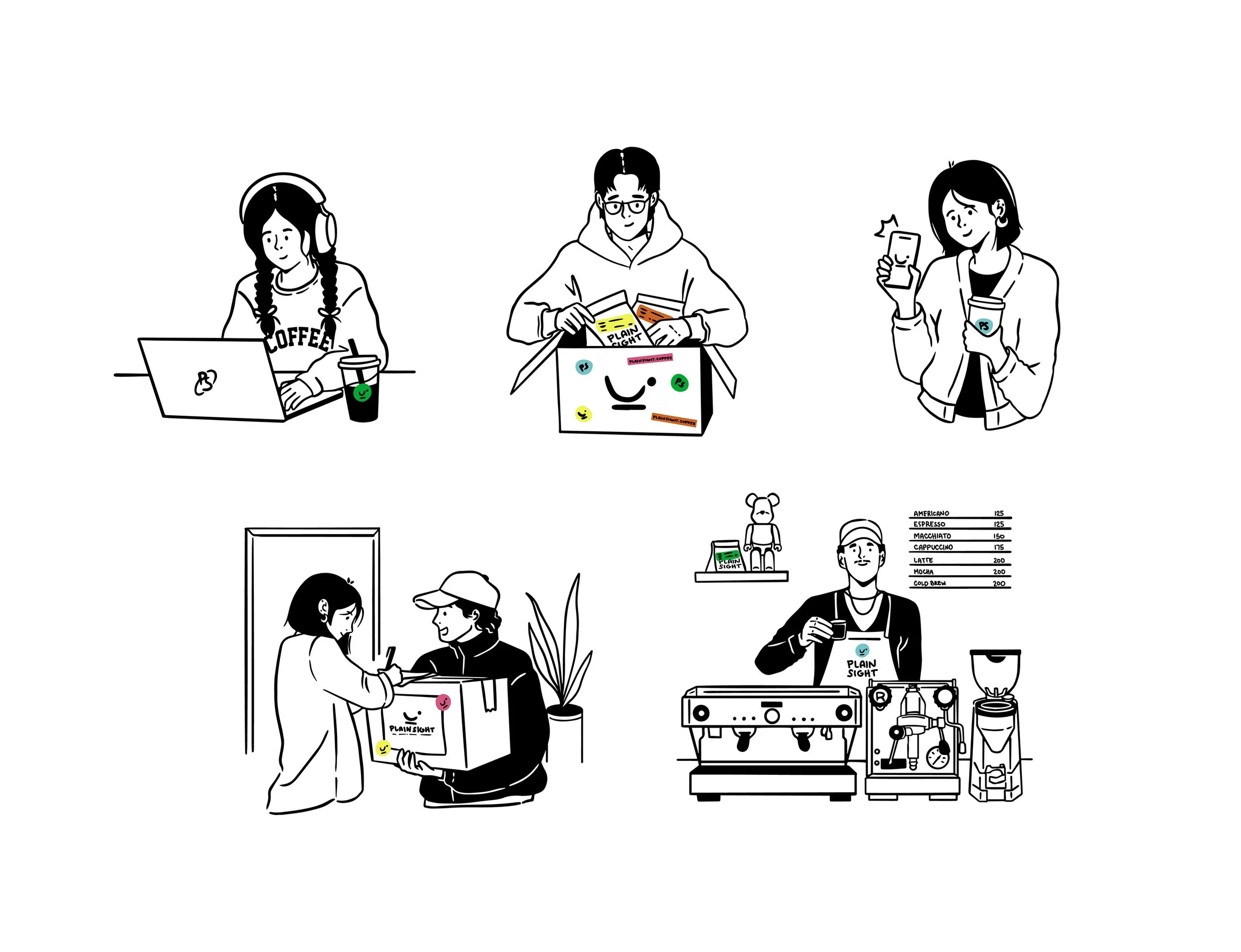
Hand-drawn illustrations, defined by black linework and subtle color accents, introduce a playful yet refined layer of personality to the brand.
The Result:
A refreshed identity that elevates Plain Sight from coffee supplier to lifestyle brand—inviting, confident, and built to last.