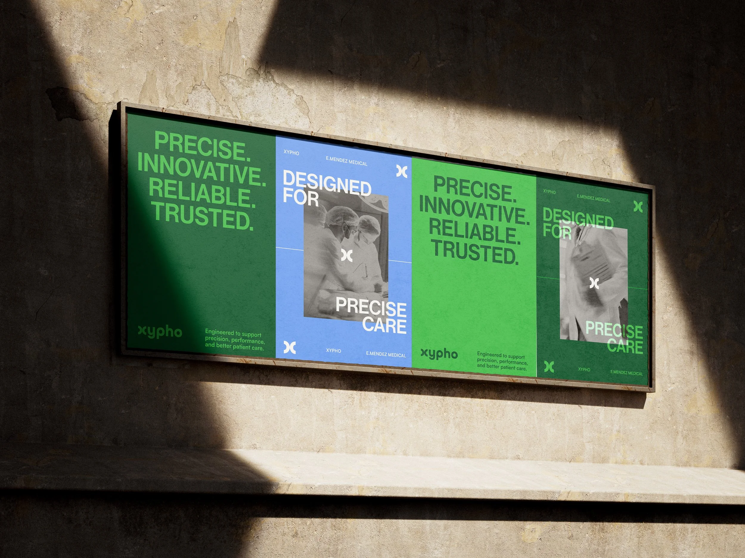
Designed for Precise Care.
Xypho is a medical device brand offering a range of products, including suction Poole drains, catheters, and other essential medical tools.
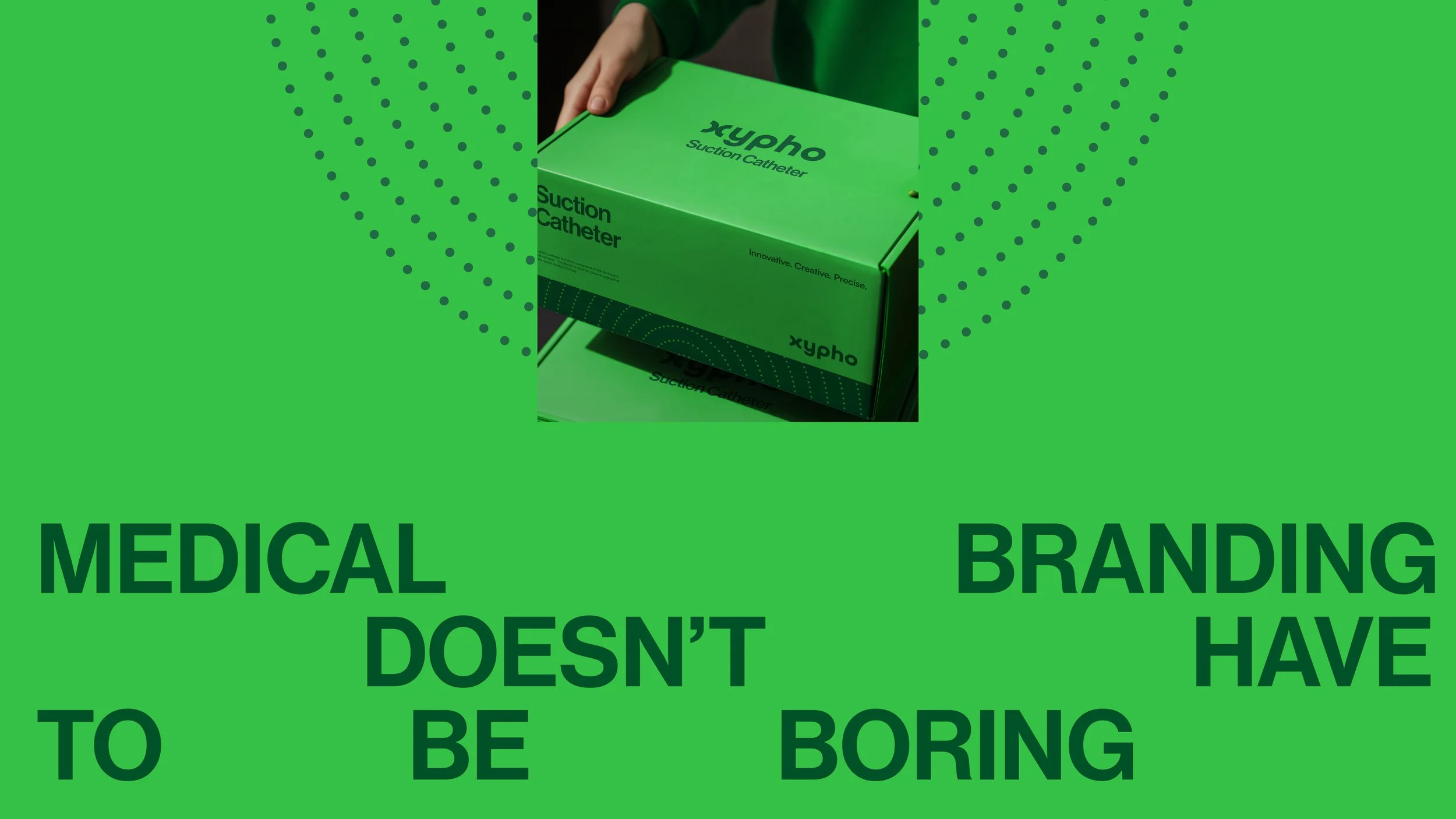
The goal was to develop a brand identity that challenges the conventions of the medical industry. We set out to prove that medical packaging can be both functional and striking, setting a new standard for the sector.
The mission: to move Xypho away from sterile, generic aesthetics toward a design system that feels intentionally distinct and visually engaging.
The Challenge:
For Xypho, the challenge was to create a brand that feels entirely new within this space without losing the trust and credibility expected in healthcare. With little visual references to draw from, the process required building a direction from the ground up.
Our Solution:
While medical packaging is often associated with bland aesthetics, we saw an opportunity to present Xypho in a way that remains functional and professional while feeling truly distinctive. We achieved this by pairing a clean, sterile layout with bold, contemporary design elements.

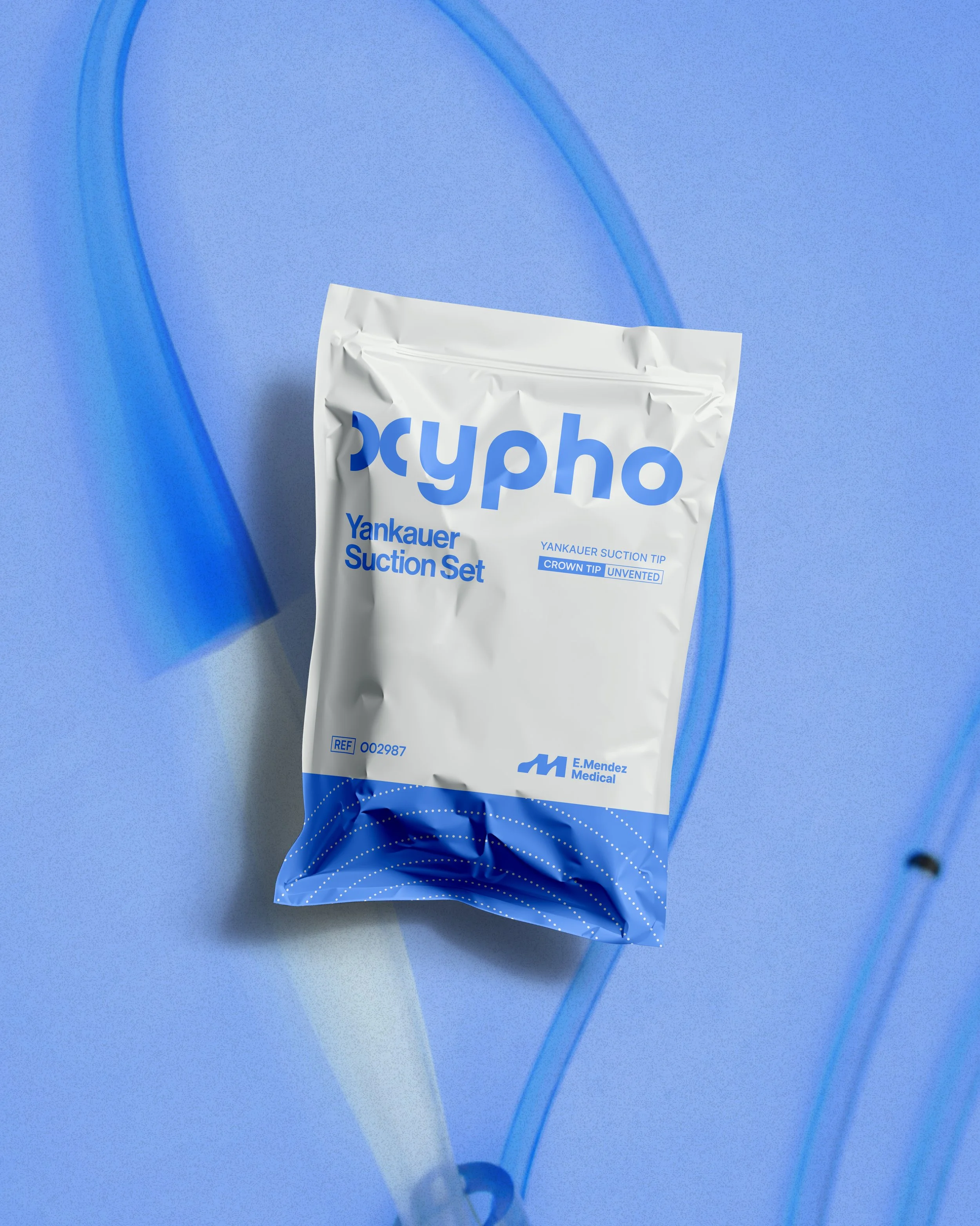
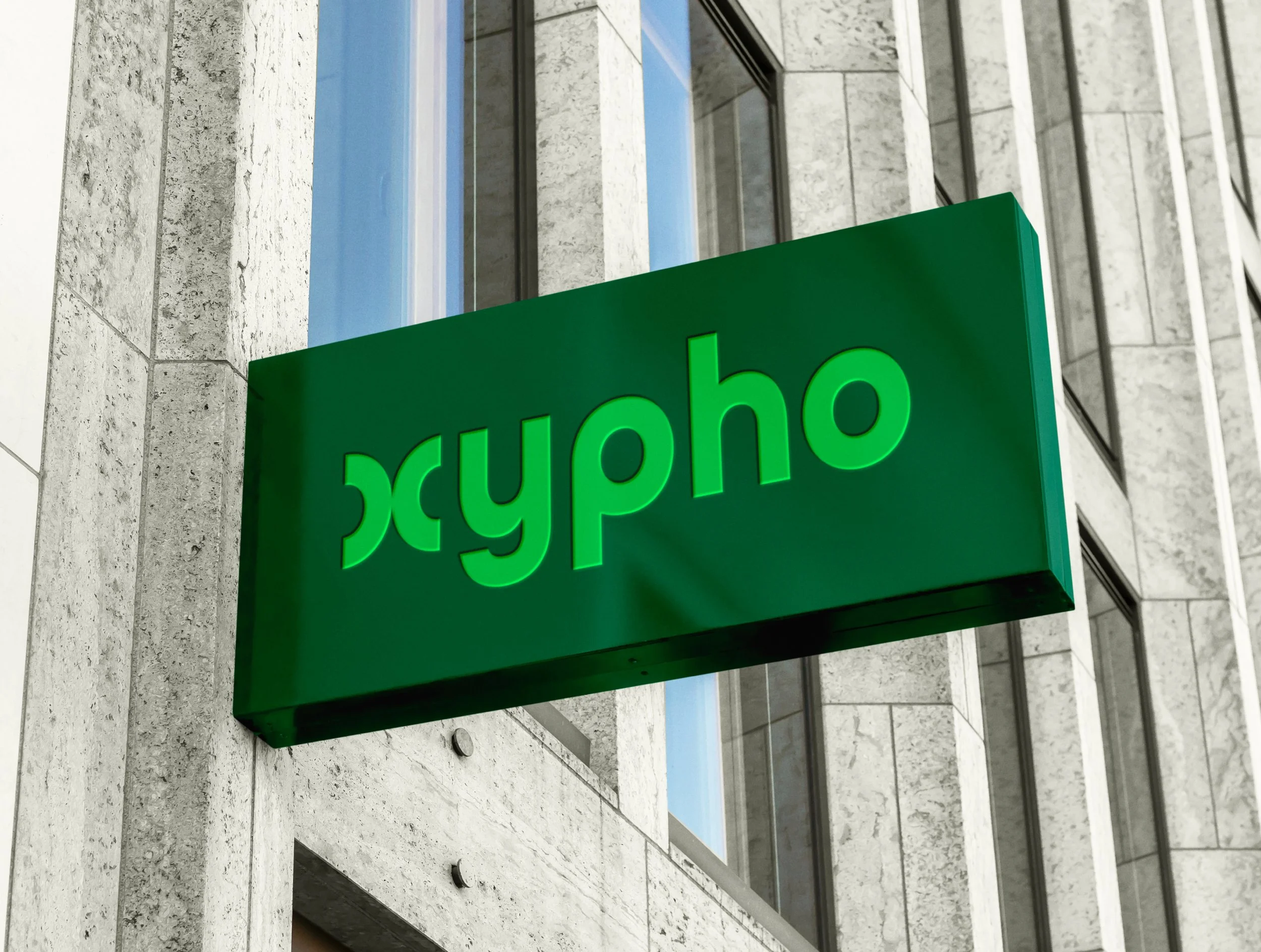
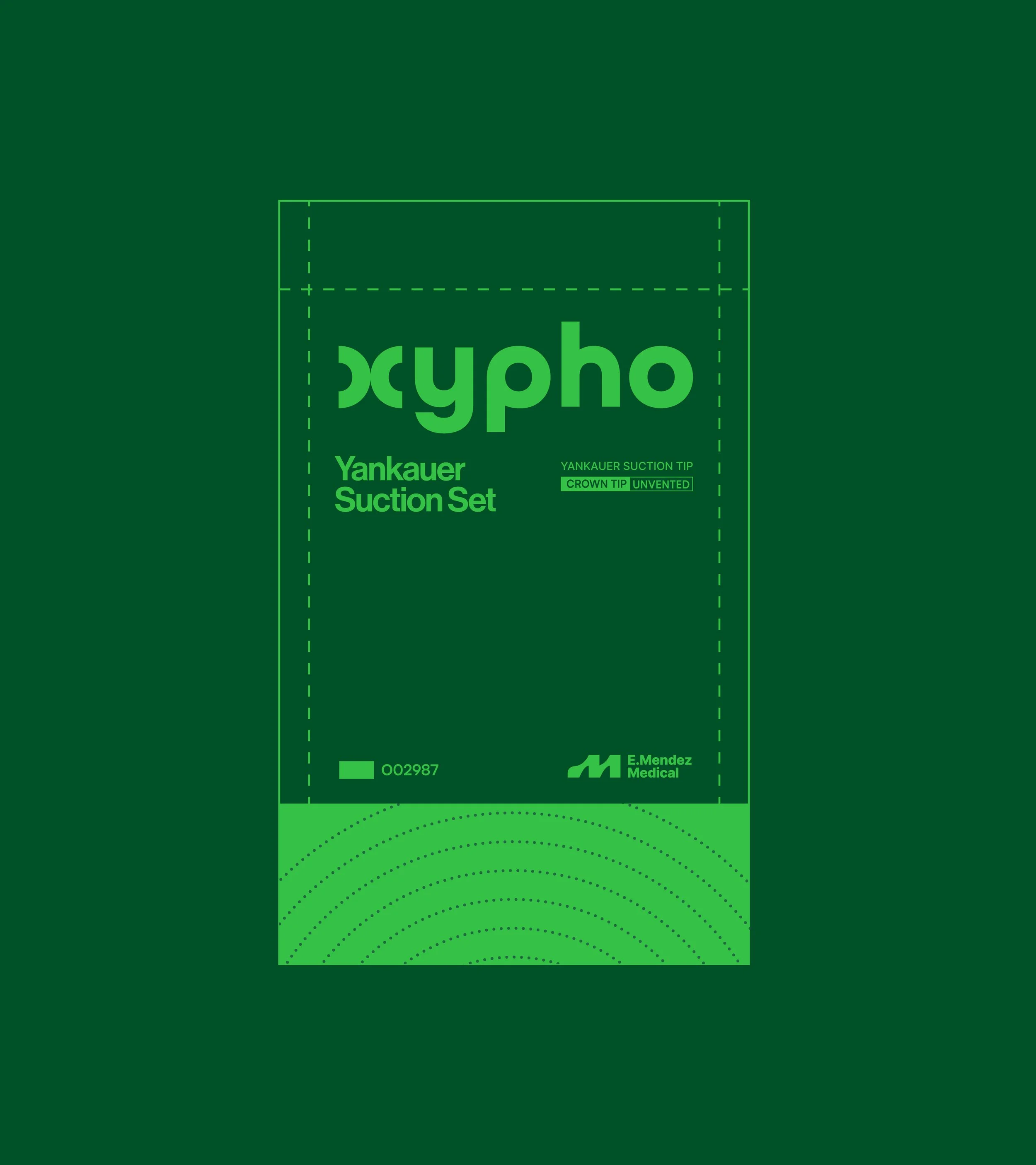
The name Xypho is a phonetic reference to the word siphon, alluding to the controlled extraction of fluids—an essential function of the product. This idea is conveyed visually through the logotype’s rounded corners, which evoke a sense of smooth, continuous flow.
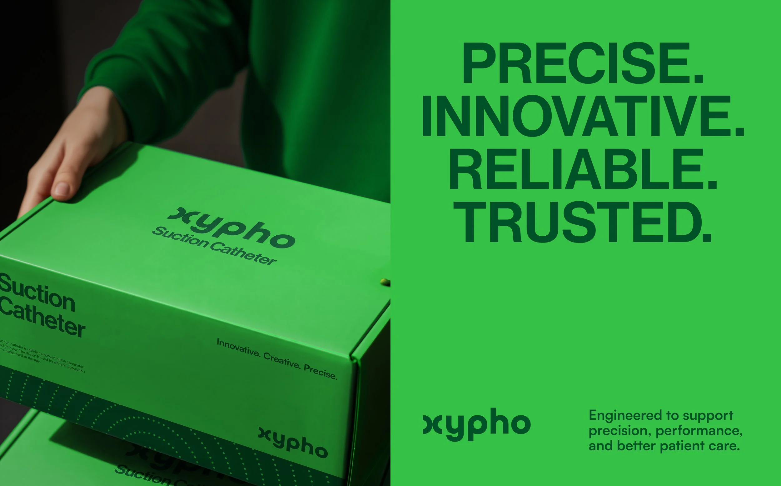
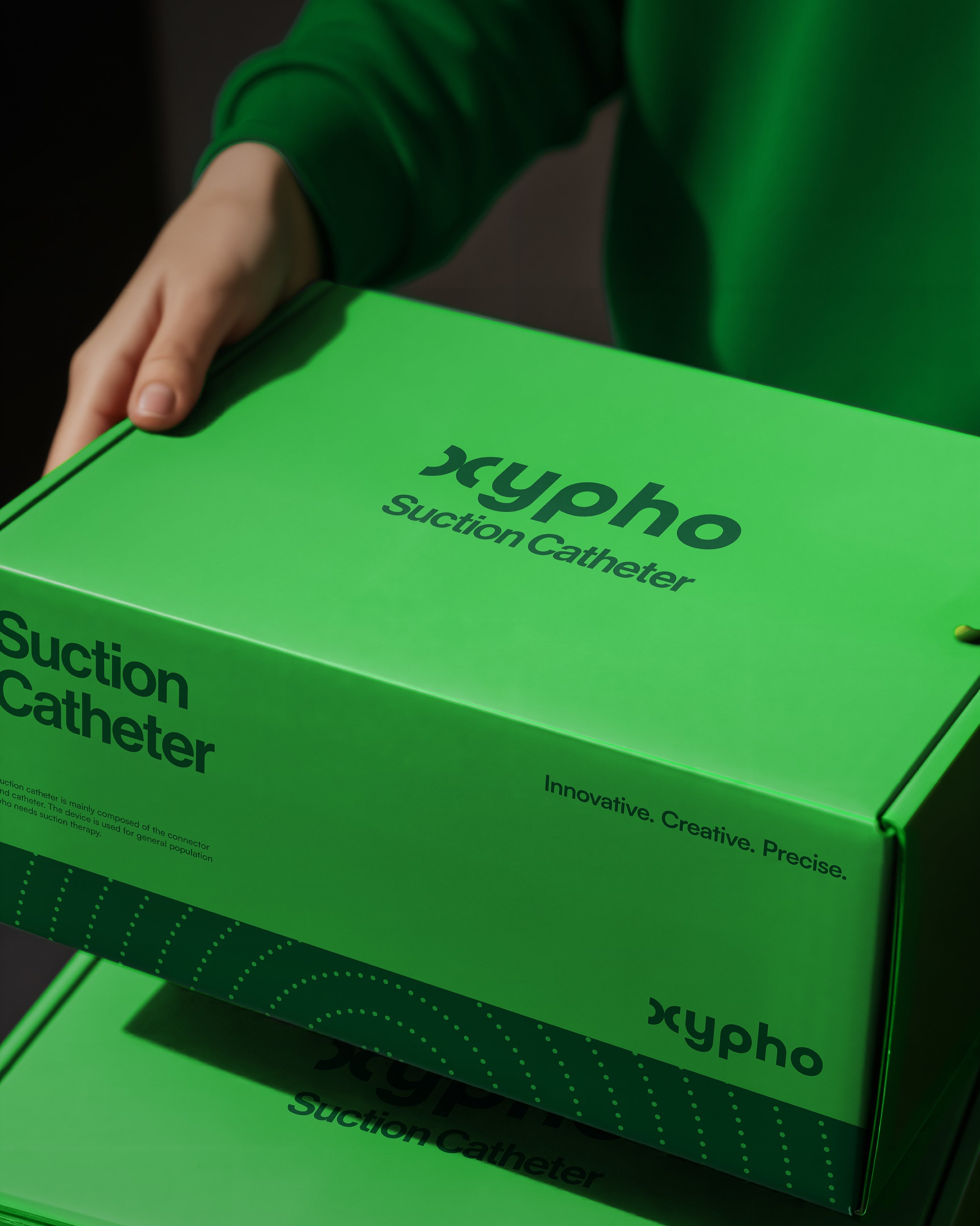
Precise. Innovative. Reliable. Trusted.
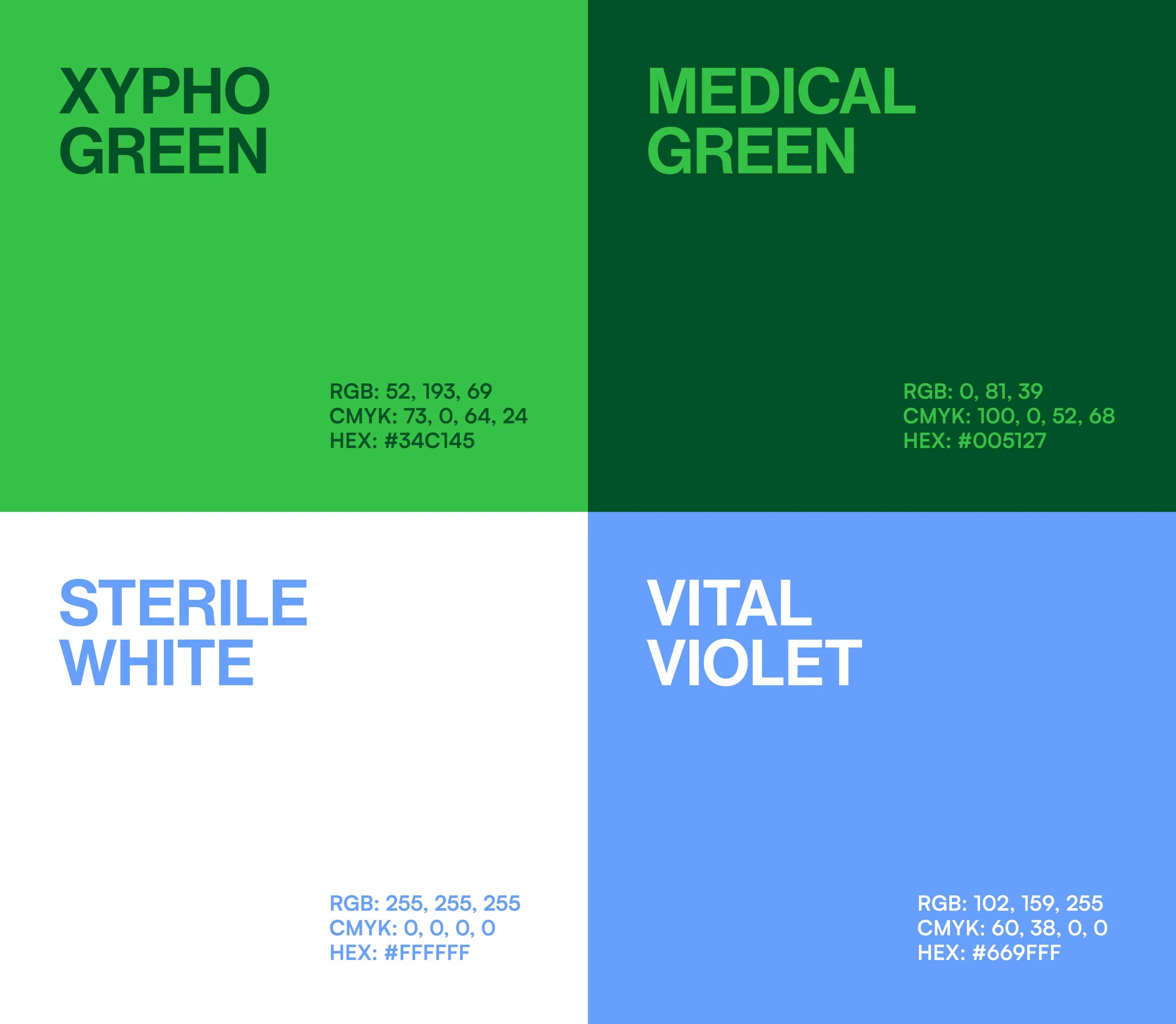
Branding is meant to differentiate, yet much of the medical sector relies on the same shades of blue. In a sea of similar packaging, we saw no point in adding to the clutter. Instead, we opted for a striking green and bold purple—a palette that disrupts the clinical 'norm'.
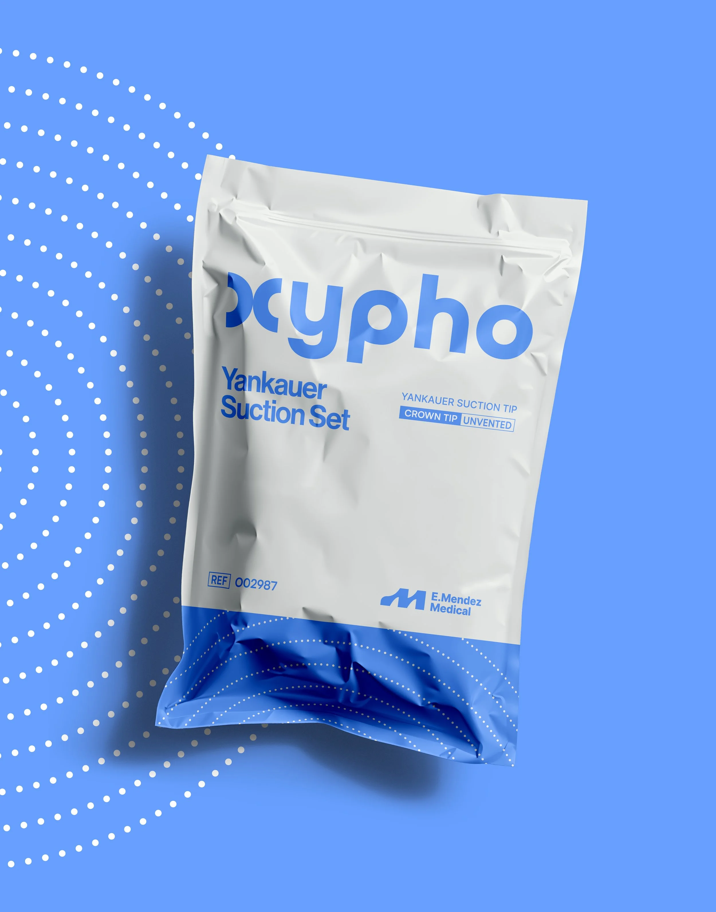
This concept of flow is further expressed through a graphic pattern that acts as a recognizable brand motif, allowing the identity to extend seamlessly across different touch points.
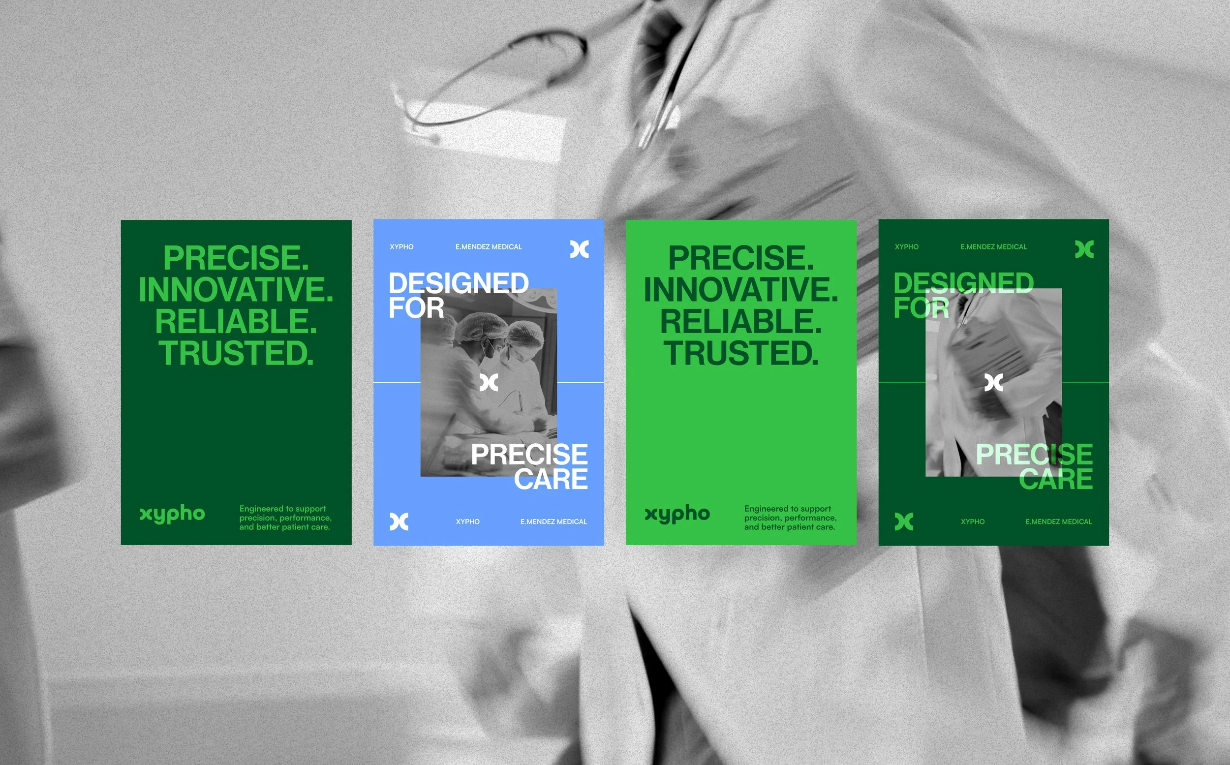
The visual identity of Xypho balances clinical professionalism with visual distinction—a clean layout, bold color, and contemporary typography.
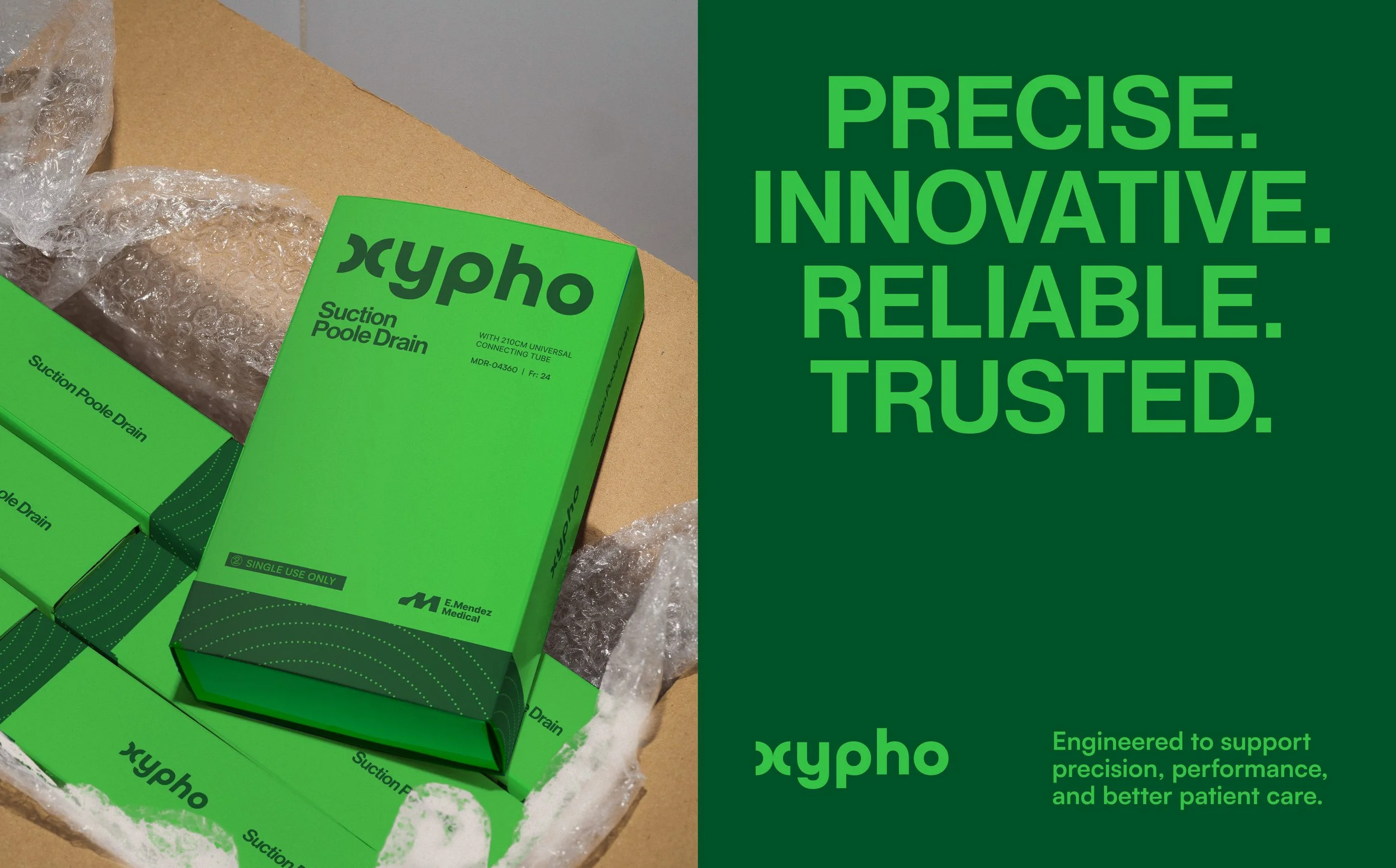

The dieline layouts were designed to be clean, bold, and reliable. Intentional use of white space ensures clarity and professionalism, while the integration of the brand motif brings Xypho’s concept of “flow” to life, resulting in a cohesive packaging system.

The Result:
A redefined identity that elevates Xypho beyond conventional medical branding.
By rejecting the status quo, the brand establishes a new visual standard, proving that even within the medical industry, design can be both functional and compelling.