Cantina Without Limits
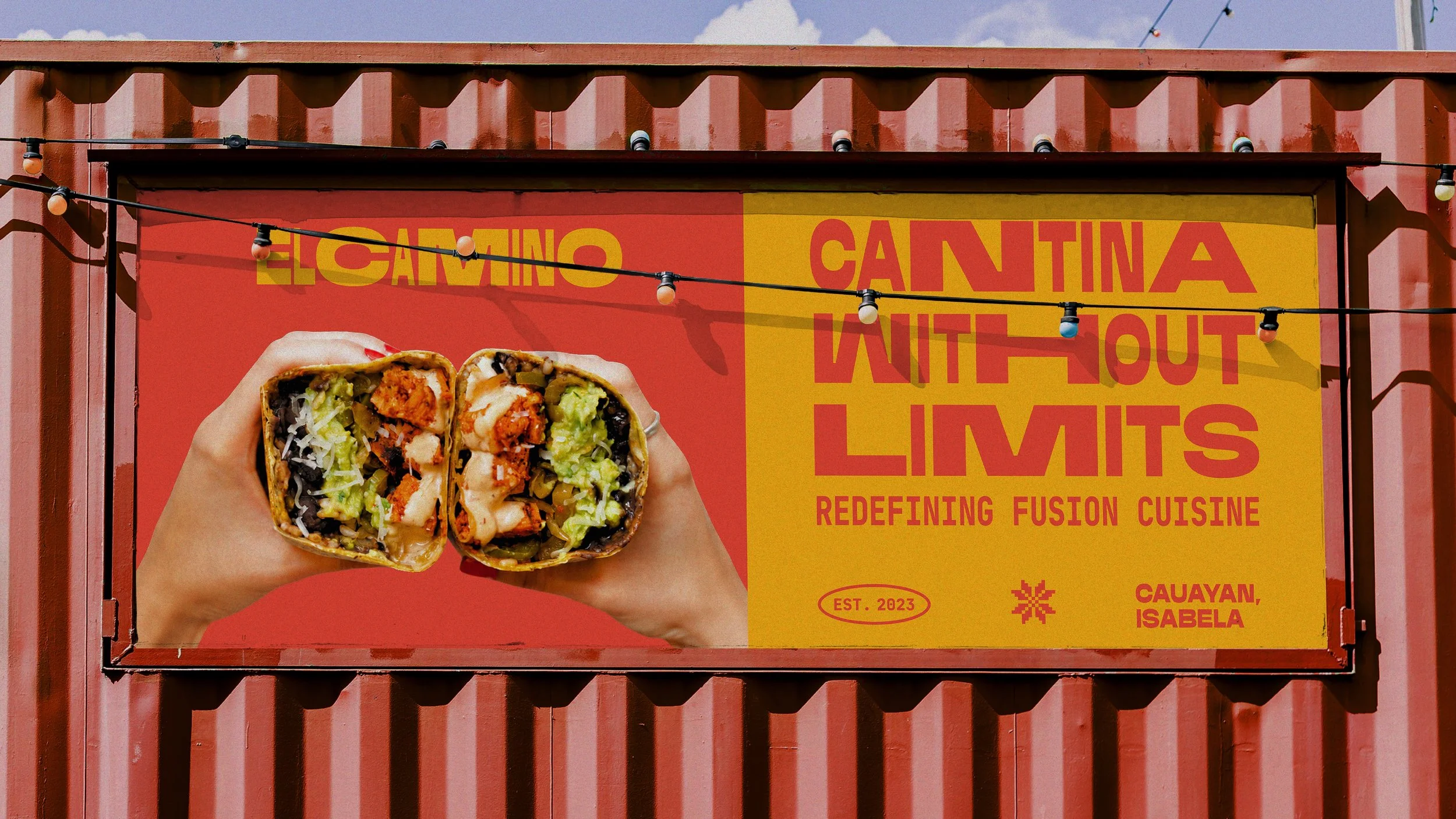
El Camino is a Fil-Mex restaurant in Isabela that brings Filipino and Mexican cuisine together through its food and atmosphere, creating a unique expression of both cultures.
What we worked on:
Brand Strategy
Brand Identity
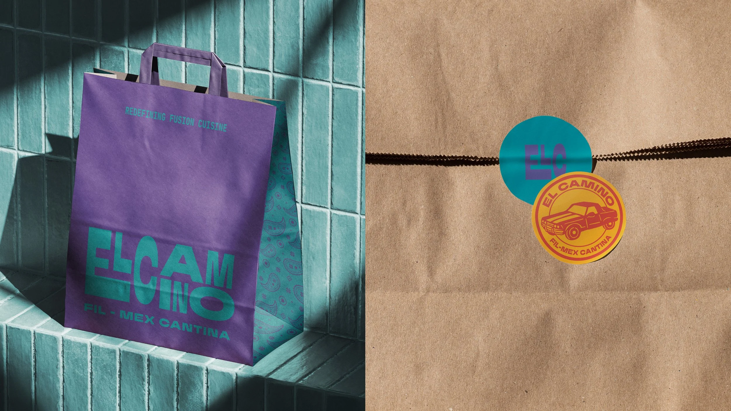
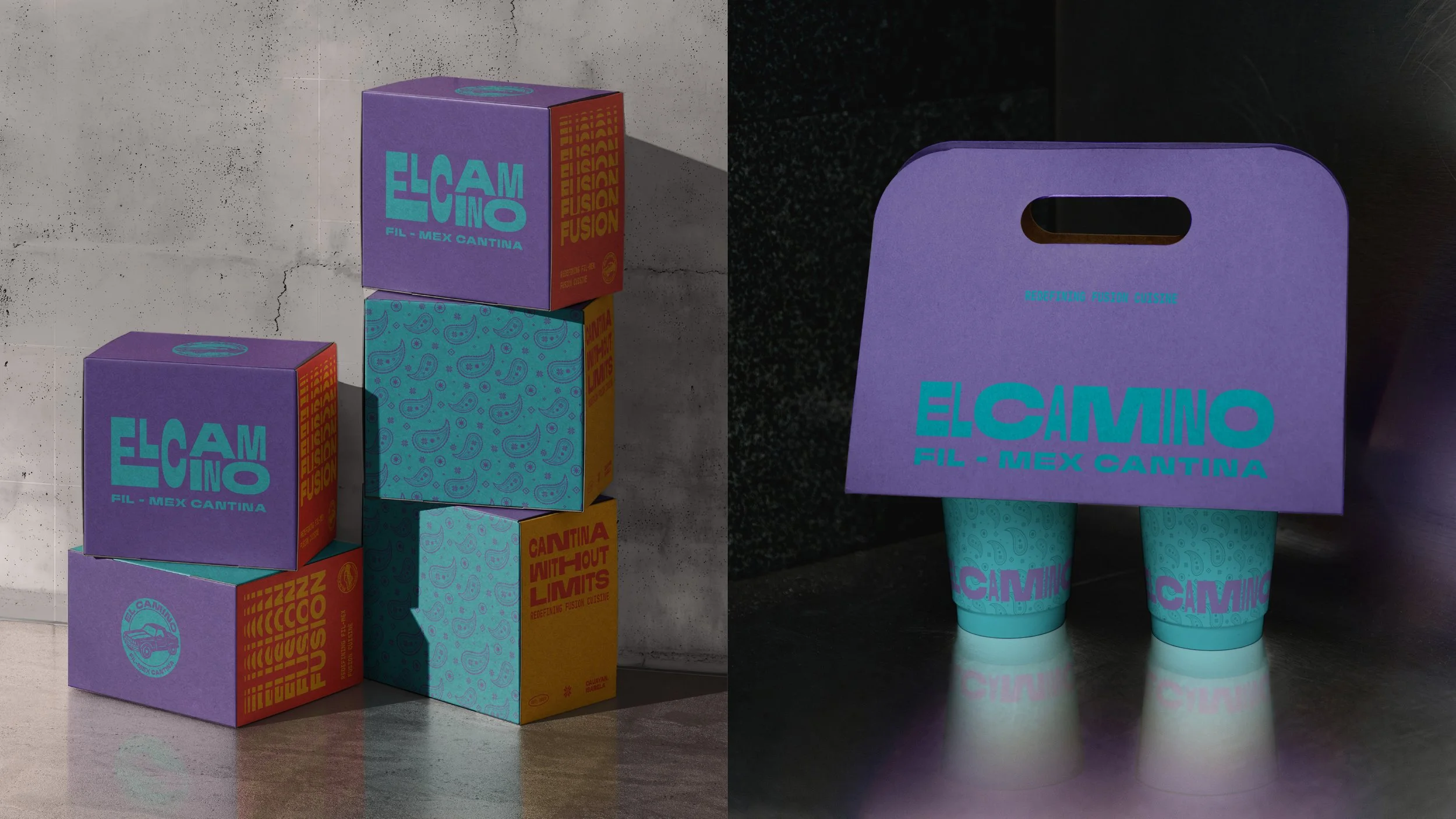
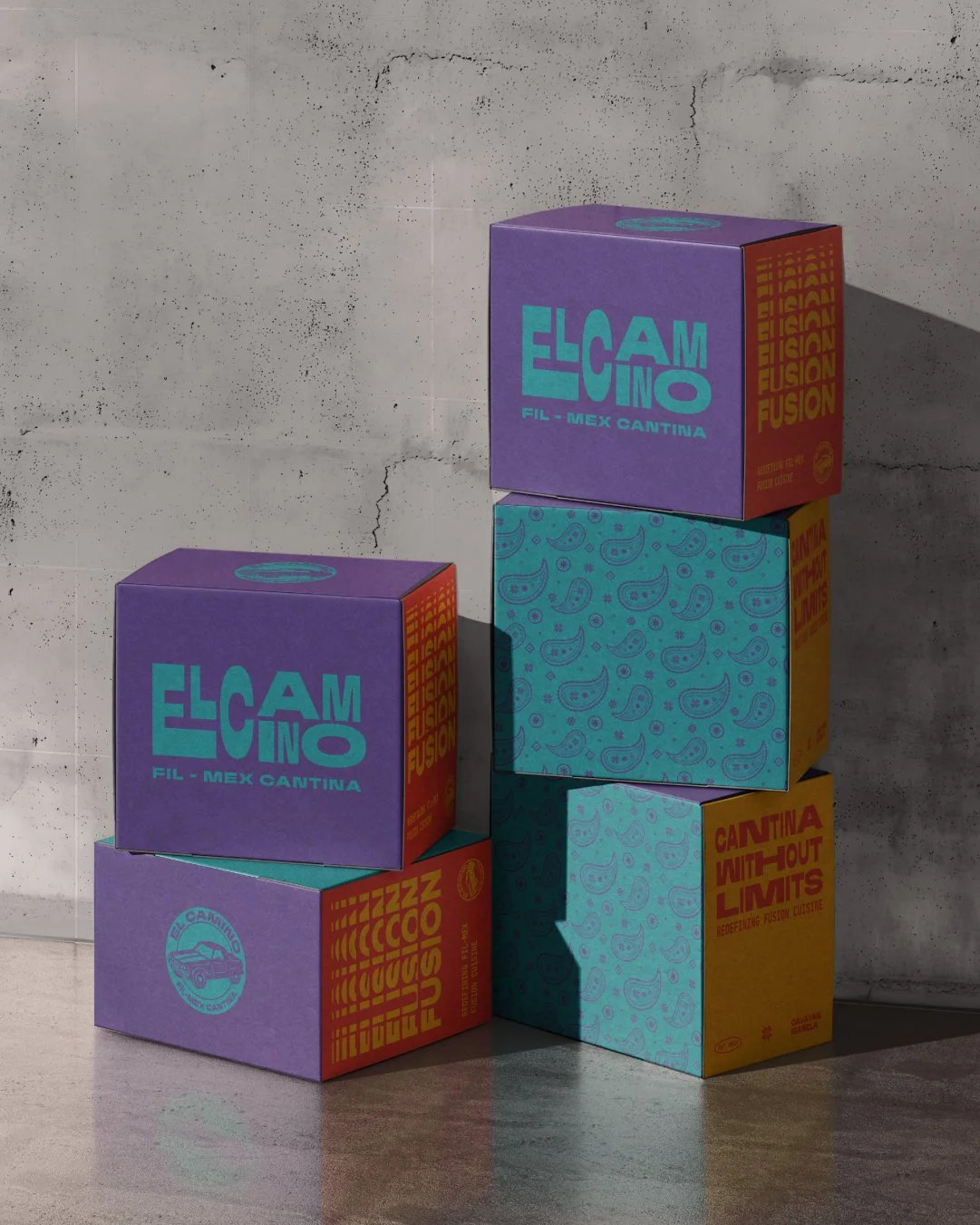
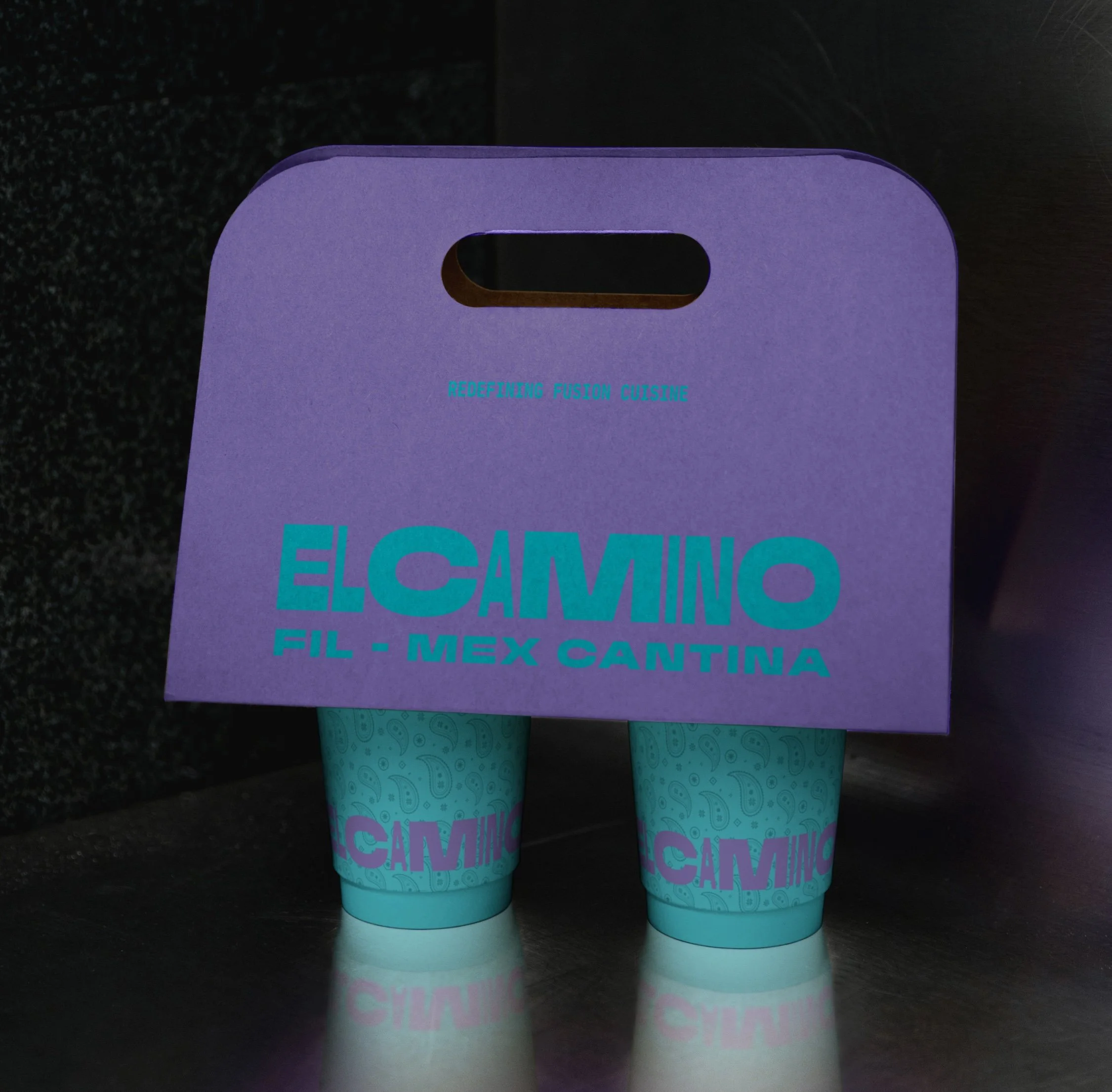
Packaging Design
Art Direction
Before Agape:
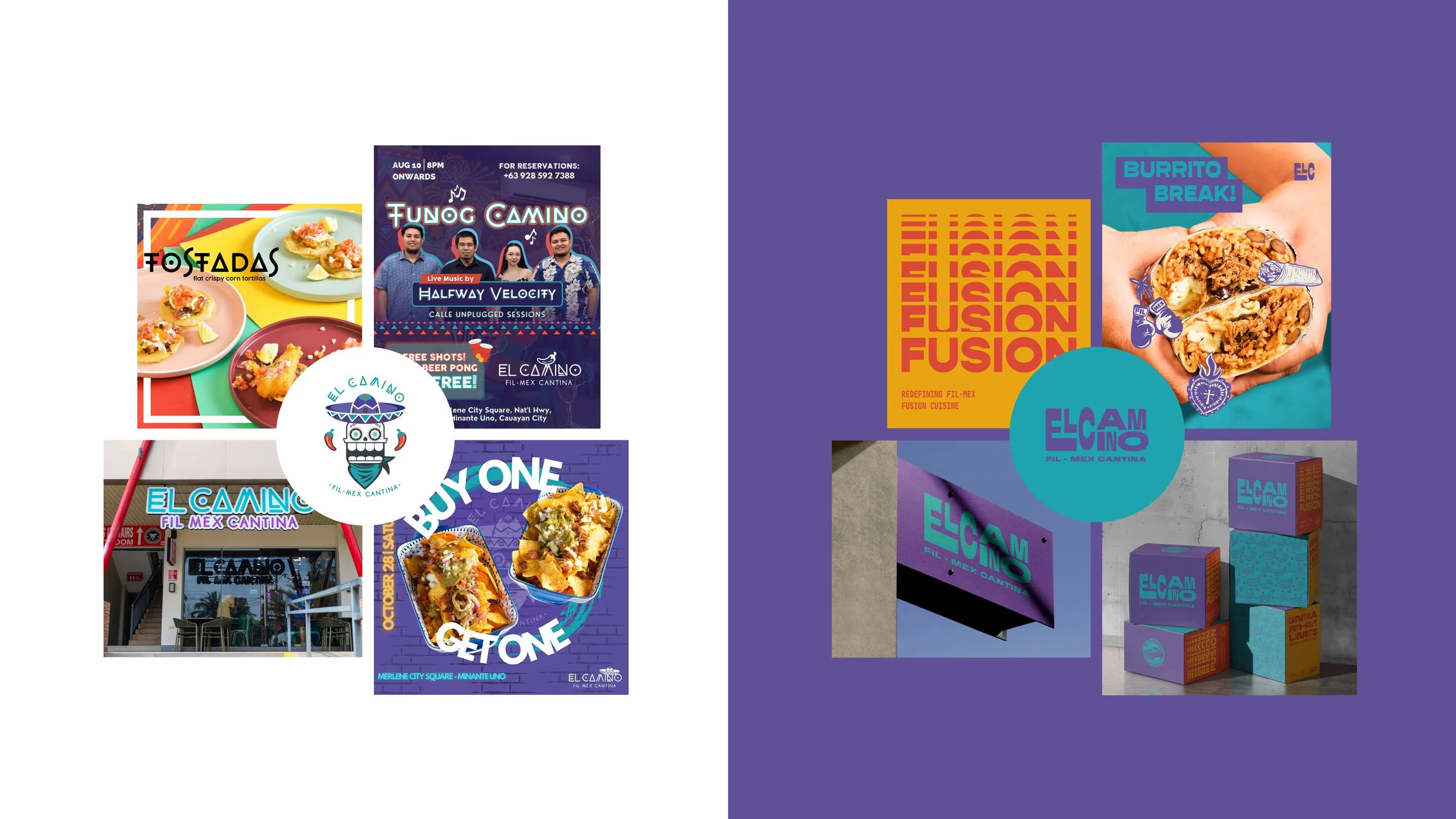
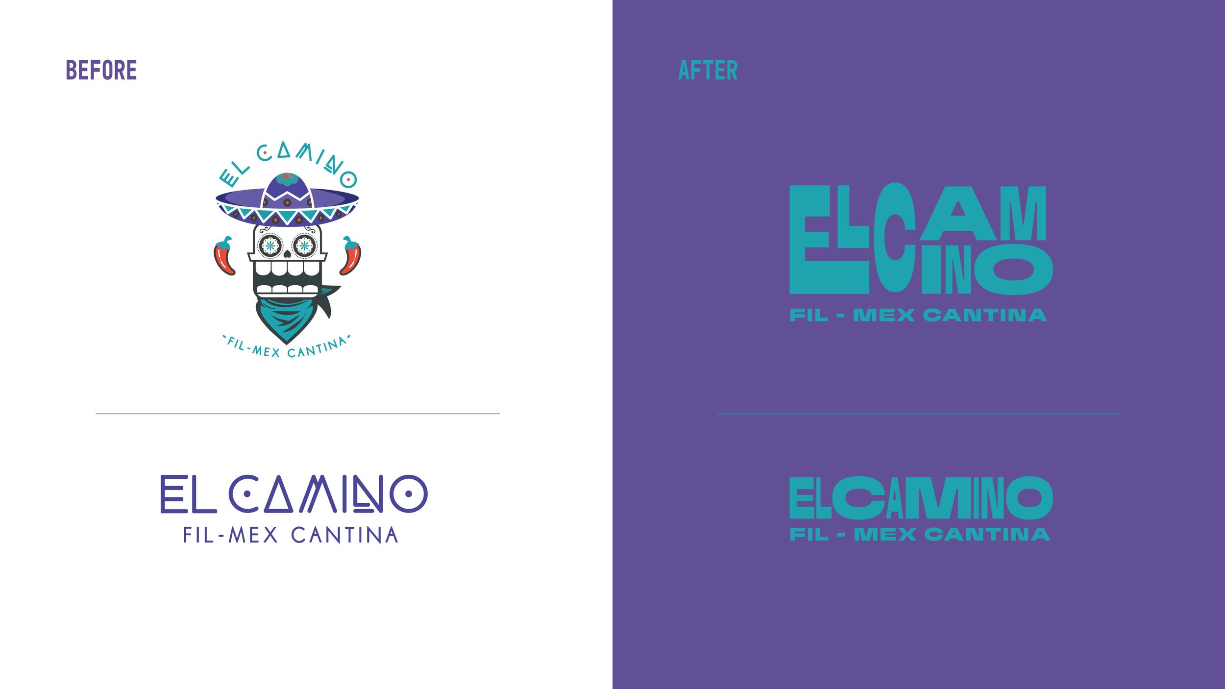
When El Camino approached us, they did not have a clear story or identity, which resulted in a brand that leaned heavily on generic Mexican imagery, with little reference to its Filipino-Mexican roots or the meaning behind the name El Camino. The branding felt templated and could easily be mistaken for any Mexican restaurant.
Our Goal:
For the rebrand, we wanted to address two things: How do we create a brand that naturally conveys the connection between Filipino and Mexican culture? And how do we tie this back to the name El Camino?
El Camino, which means “The Way” in Spanish, became a metaphor for the journey of discovering one’s self and finding where you belong.
We wrote a brand story through the POV of Cam, a Filipino-Mexican chef who grew up in L.A. and was deeply immersed in the Mexican-American community. After a lifetime connected to his Mexican heritage, Cam travelled to the Philippines to reconnect with the Filipino roots he had never fully known.

El Camino represents a journey of self-discovery and finding the common ground between two cultures.

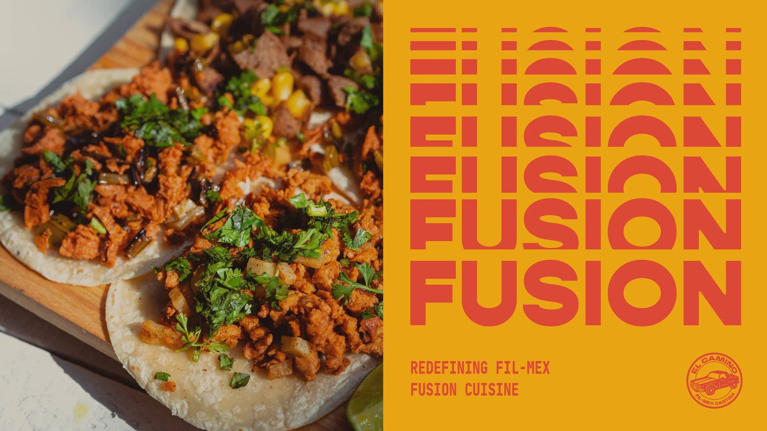
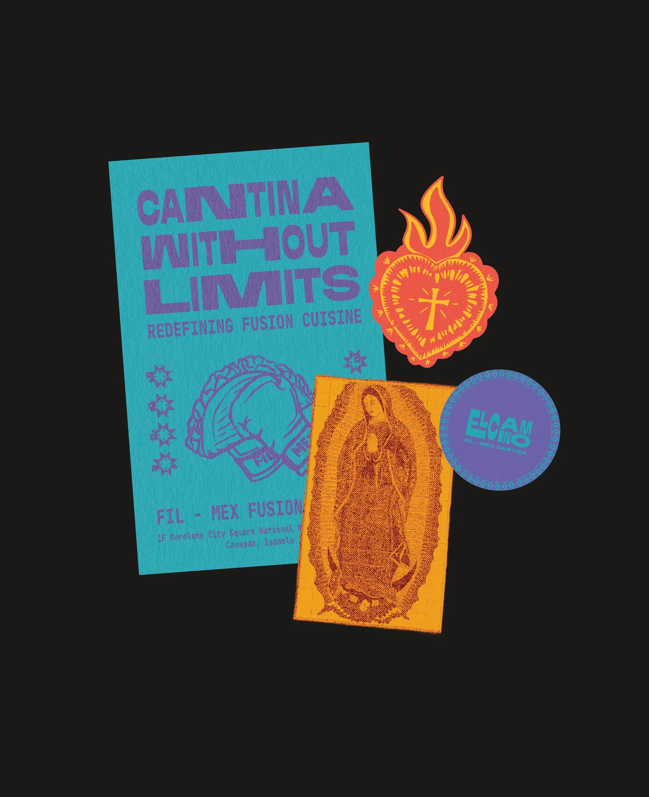
Rather than simply combining visual elements from both cultures, we focused on the shared traditions and experiences that bring them together.
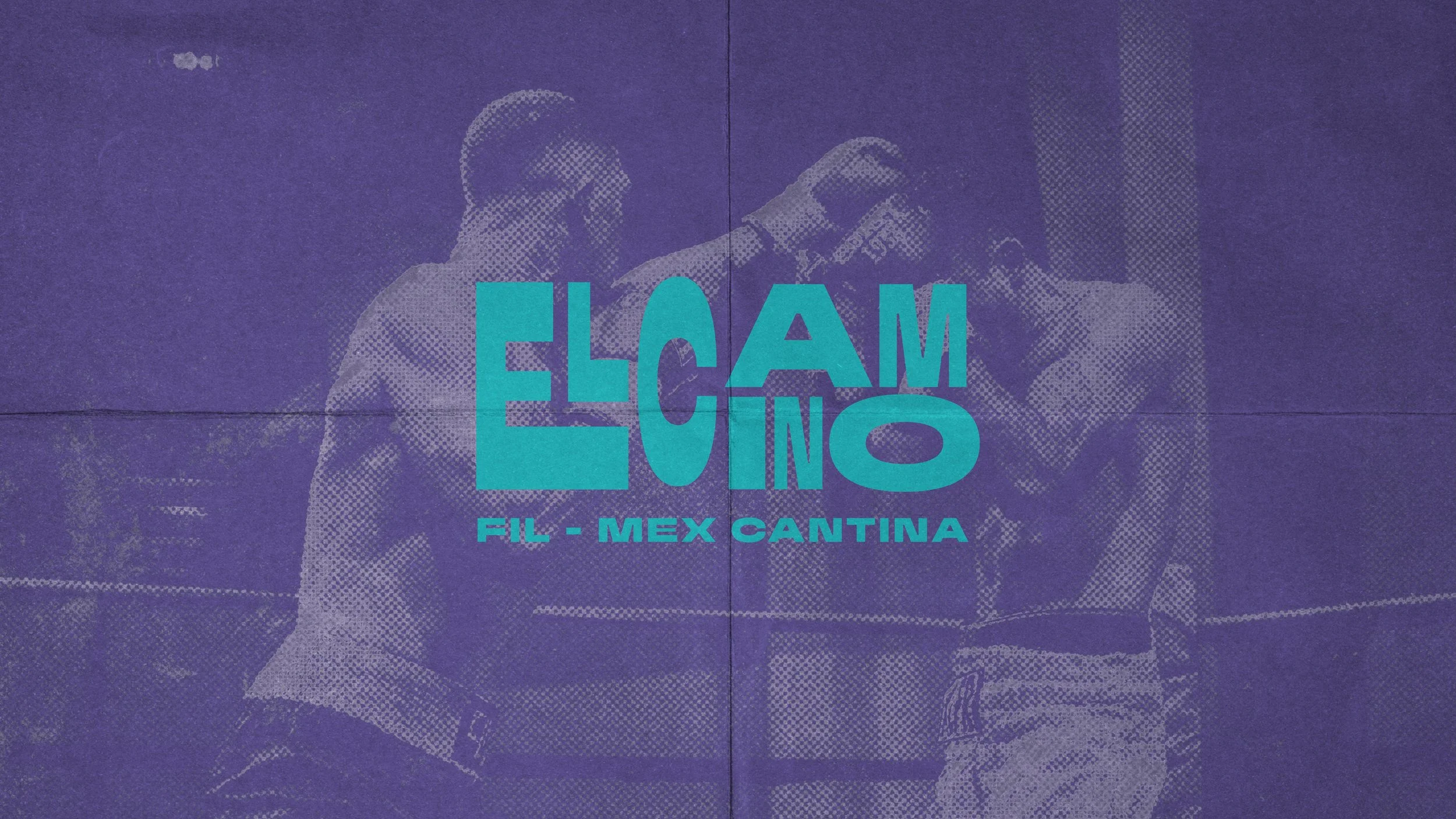
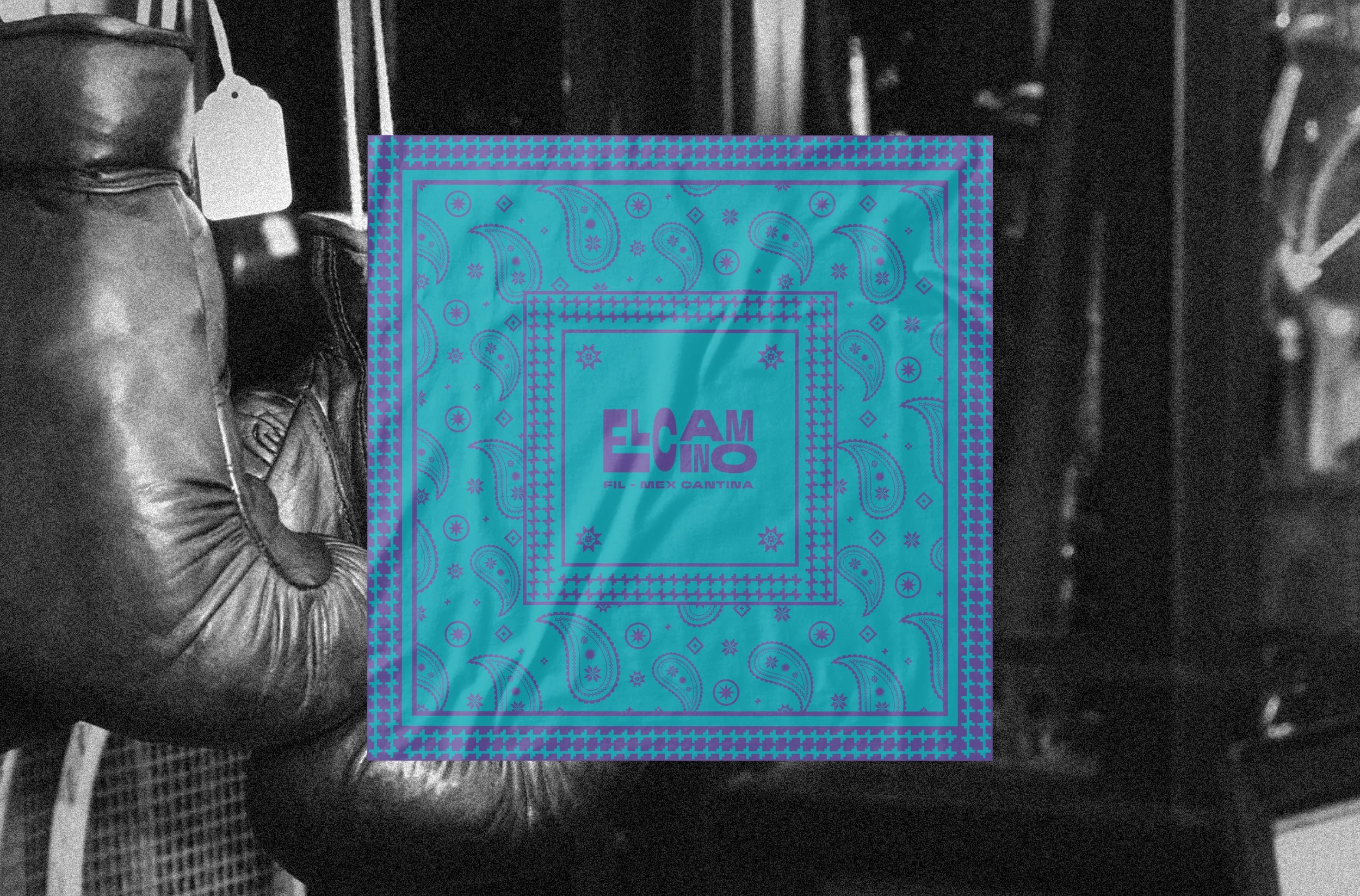
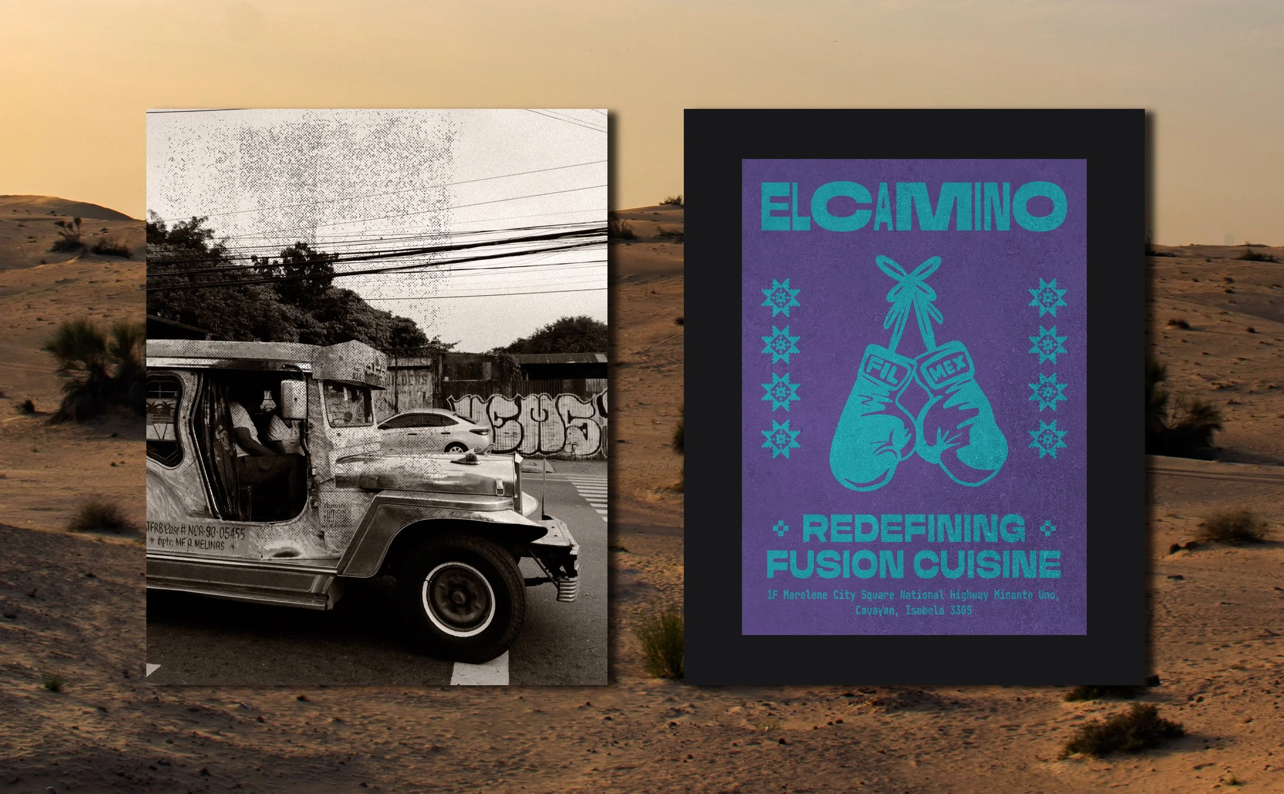
Boxing, religion, close family ties, and a love for food are just some of the things Filipino and Mexican cultures share. This became the foundation of El Camino’s visual identity.
Where two cultures cross paths.
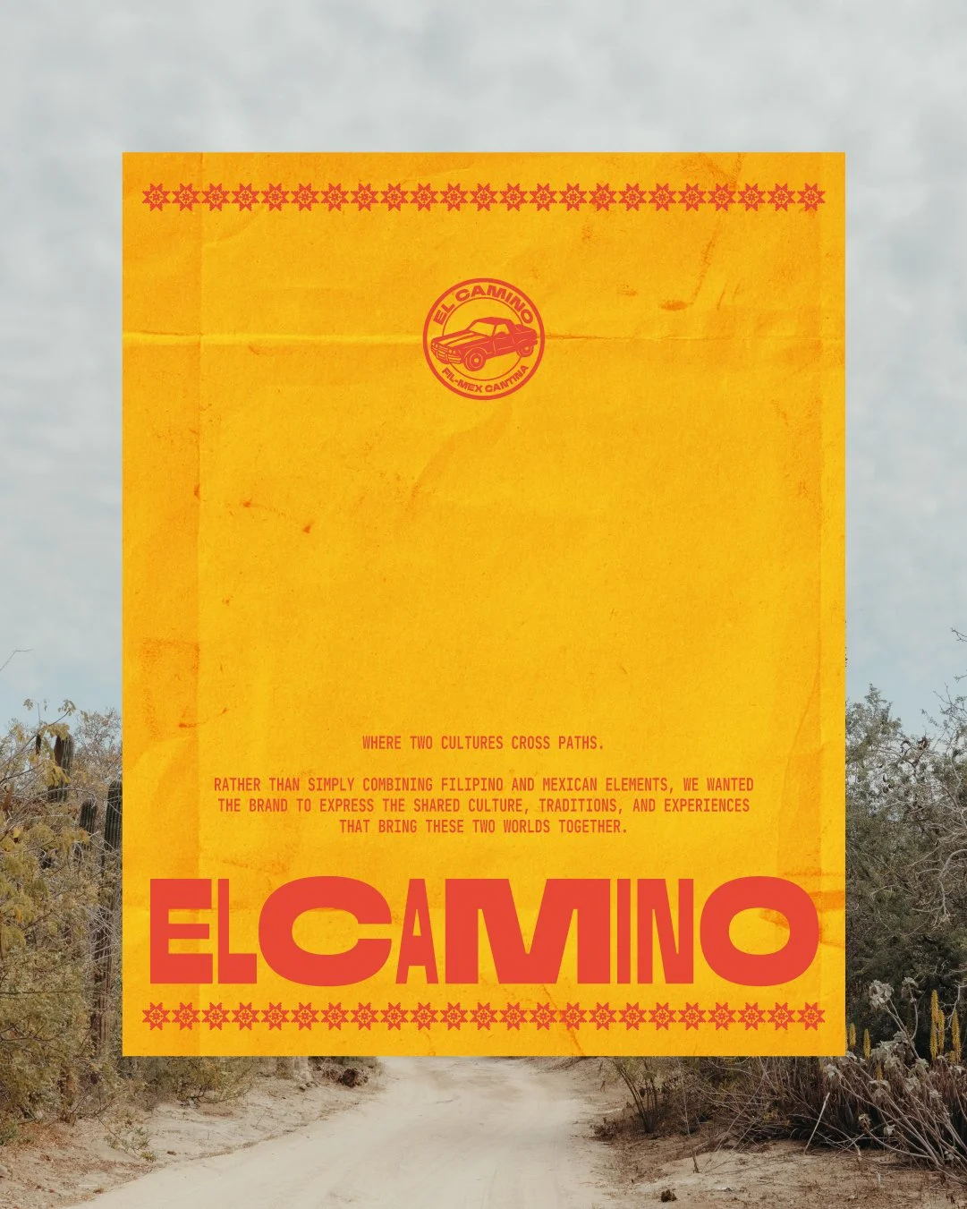
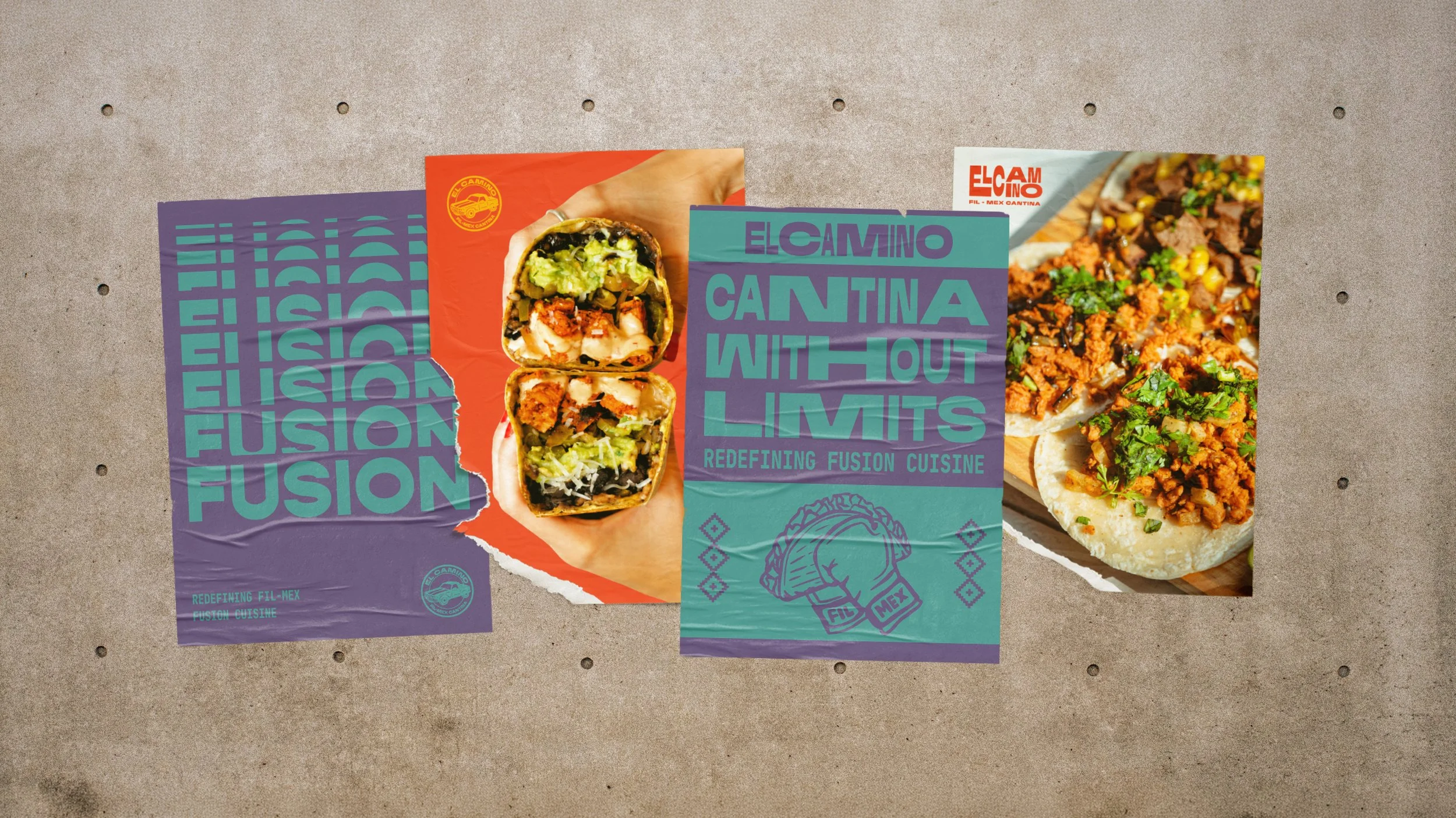
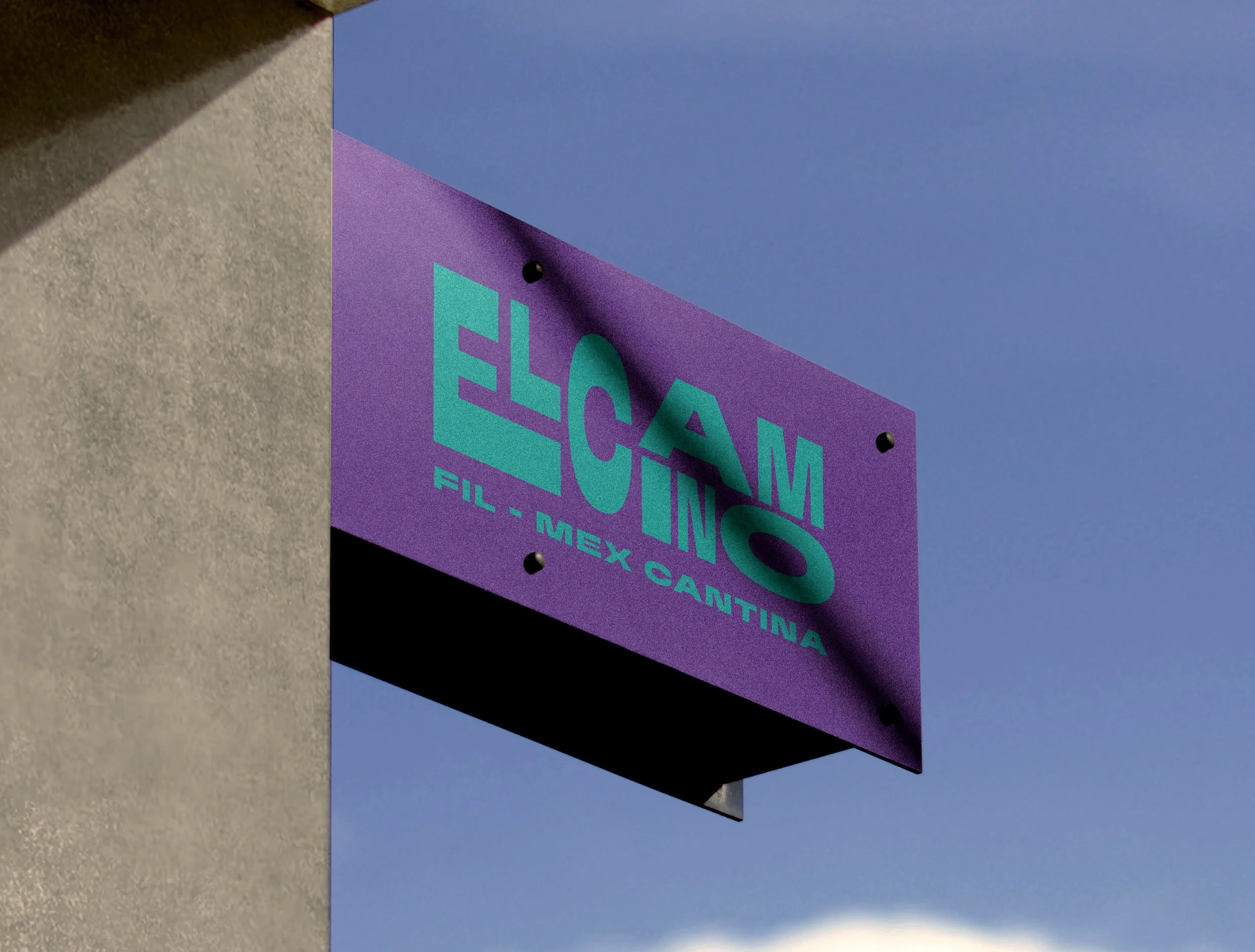
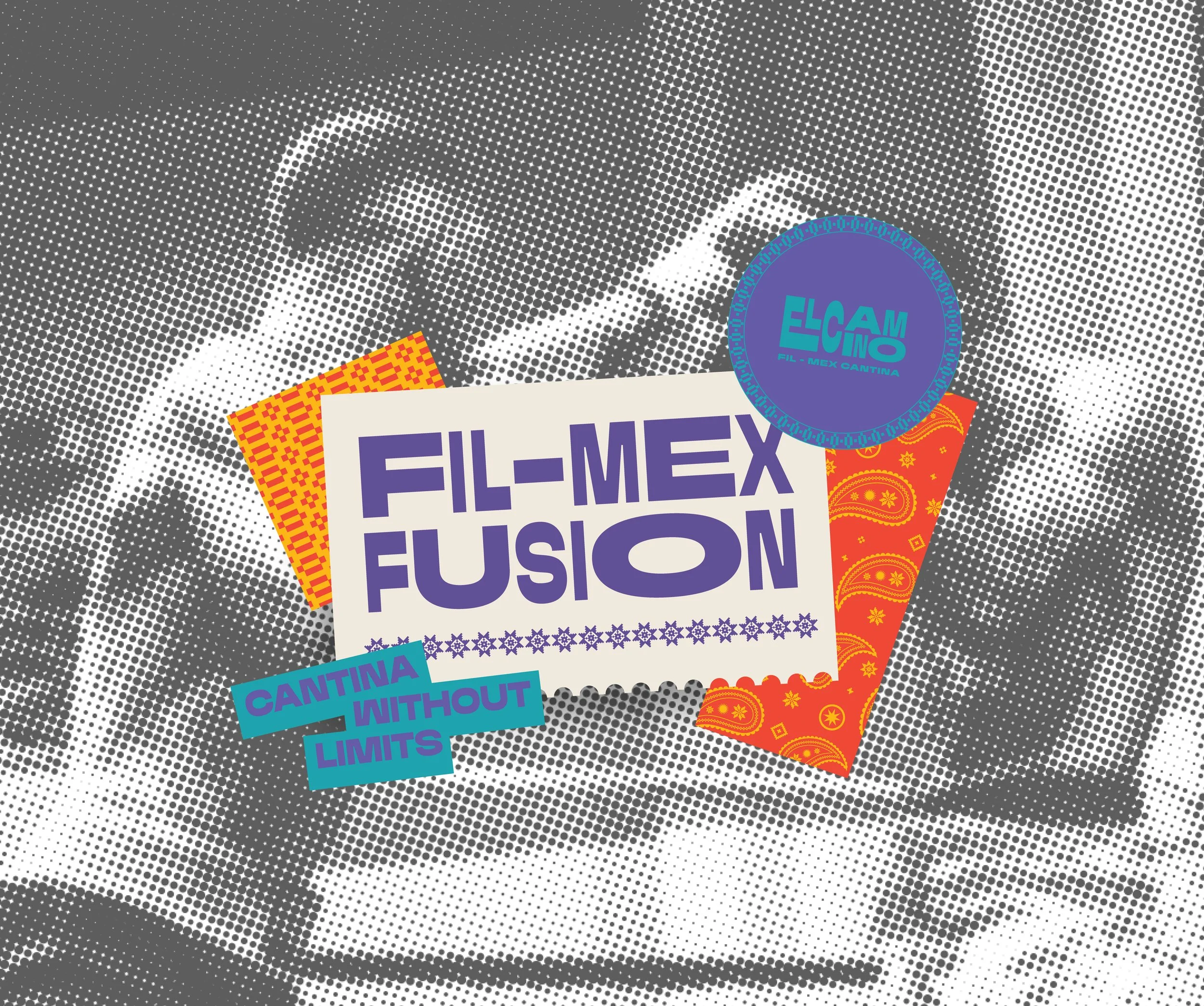
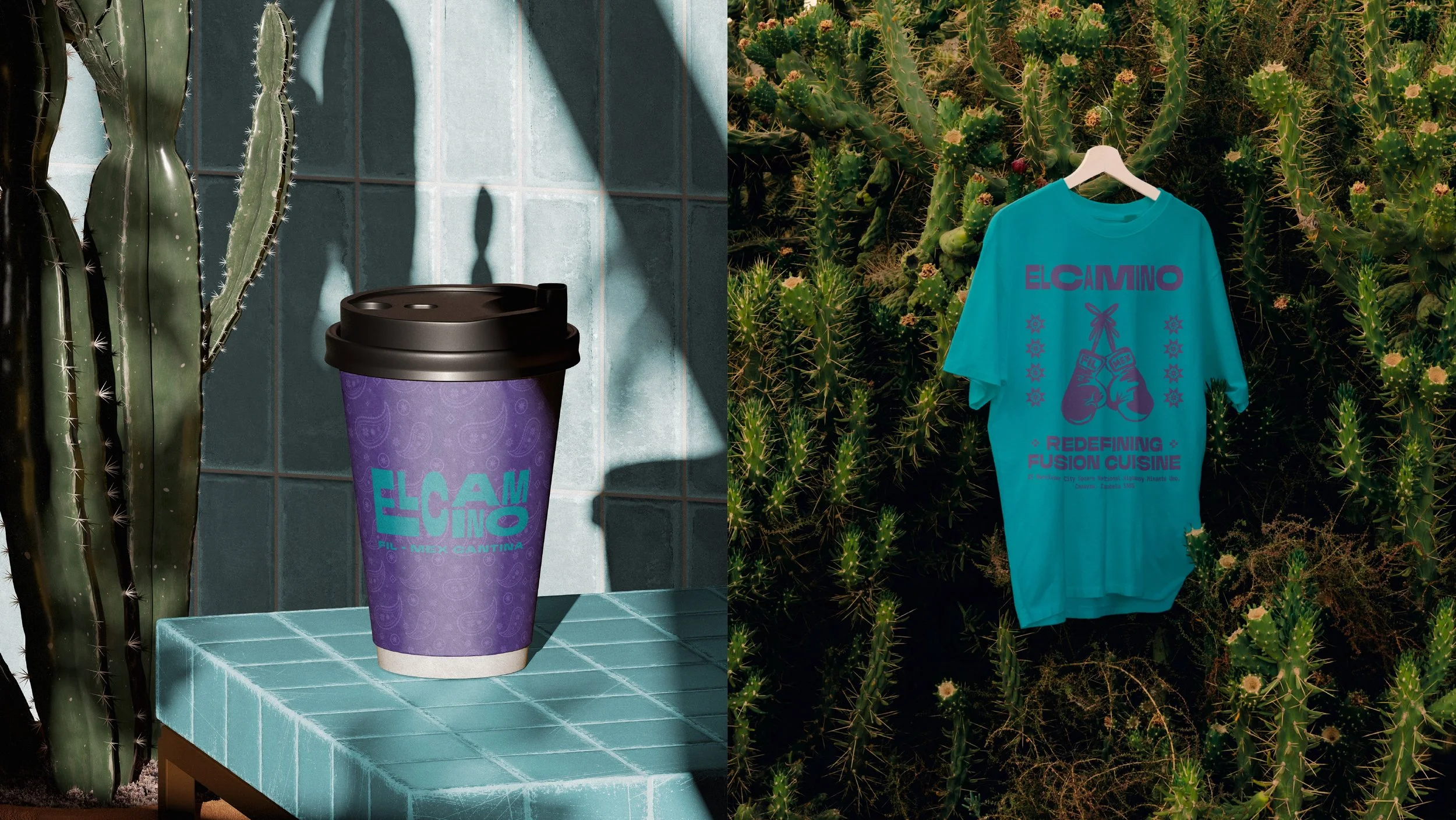
The El Camino identity uses kinetic typography to capture the energy and progression of a journey without relying on literal road or car imagery.
Wordmark variations ensure versatility and legibility across applications.
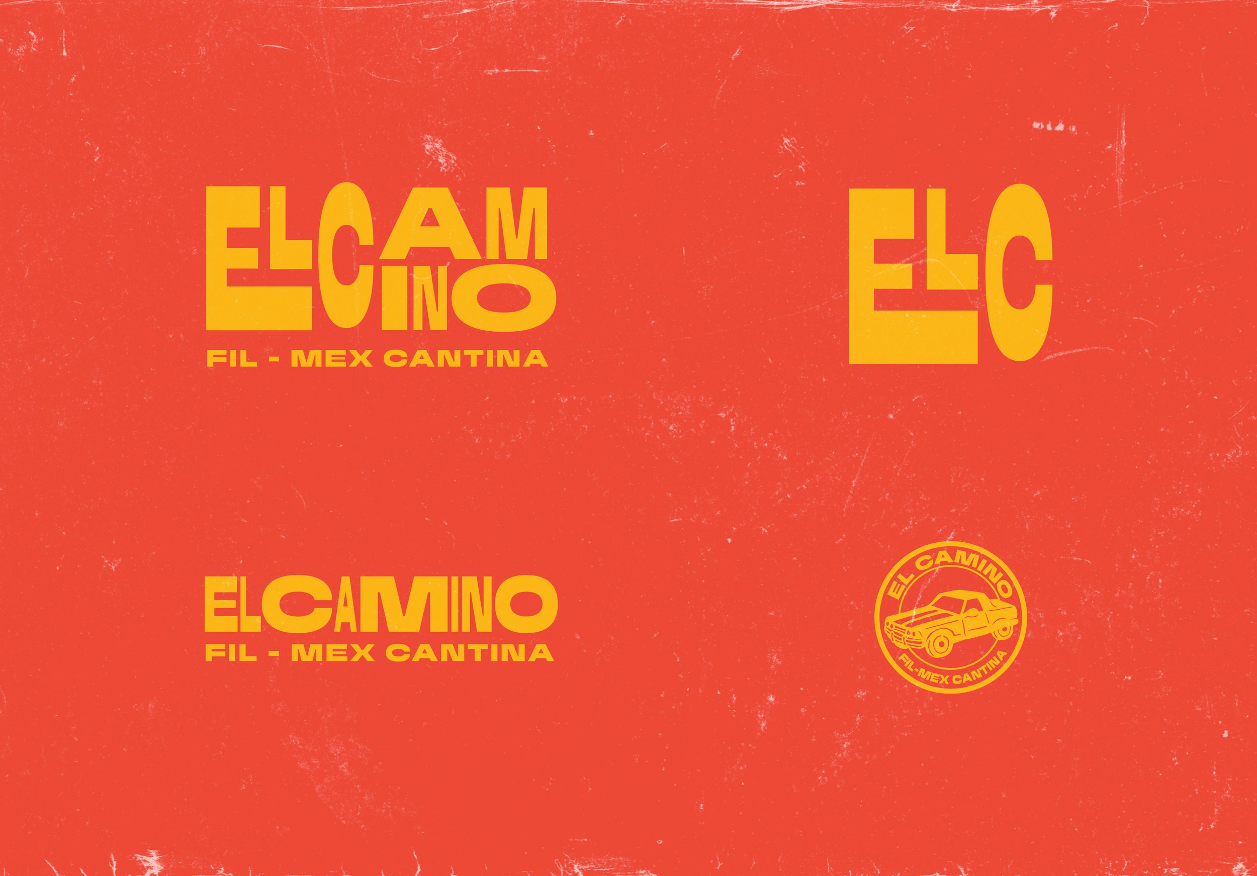
Translating the journey into a logo
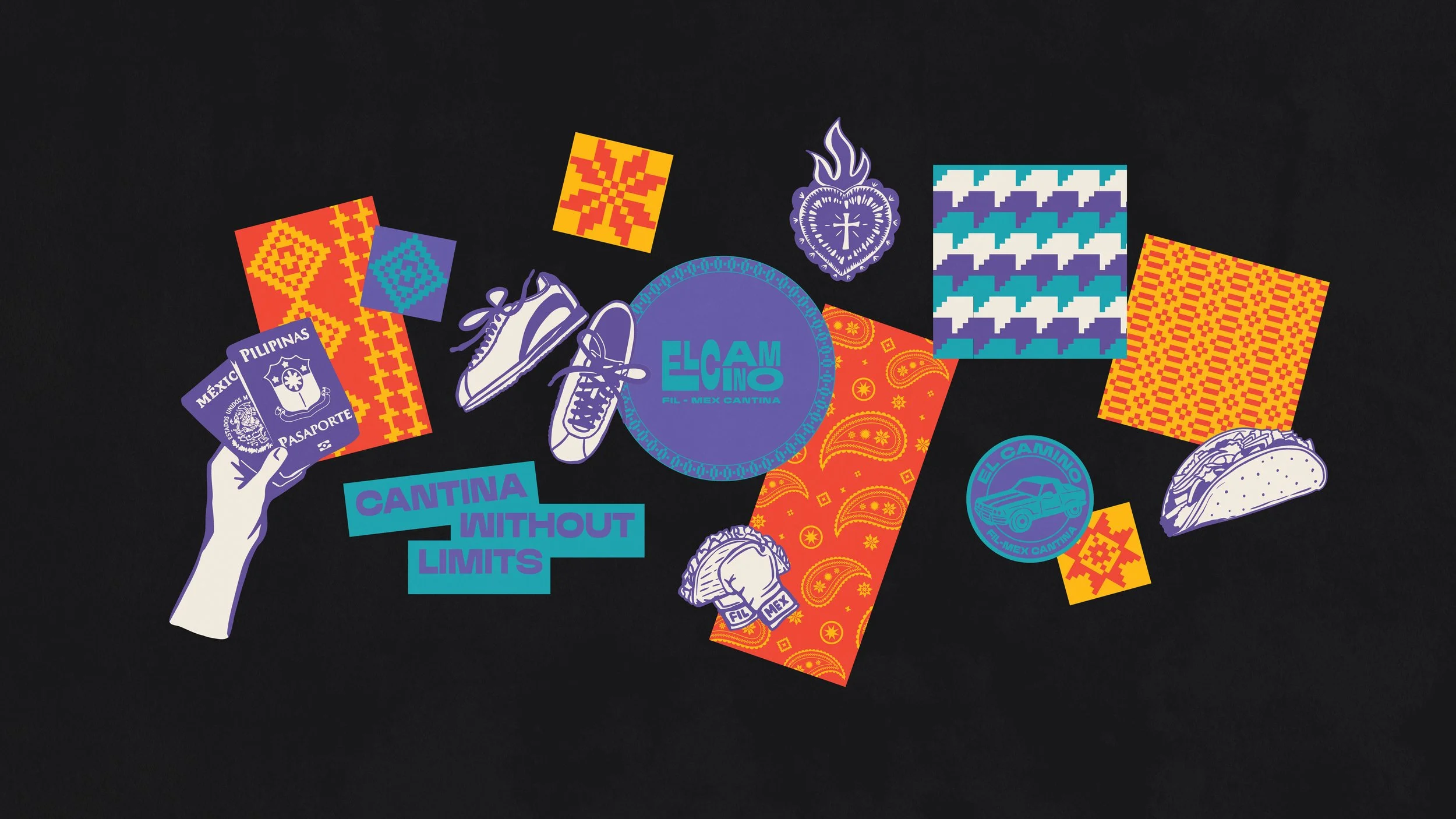
A visual system built around self discovery and shared culture
El Camino’s journey is about discovering the common ground between Filipino and Mexican culture.
We translated this into a visual system that brings both cultures together, reflecting the similarities that connect them.
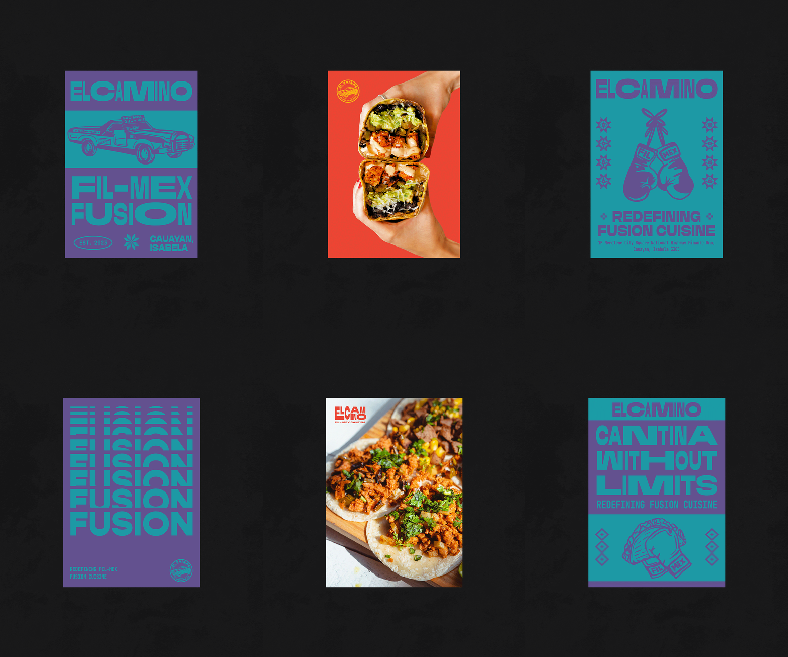
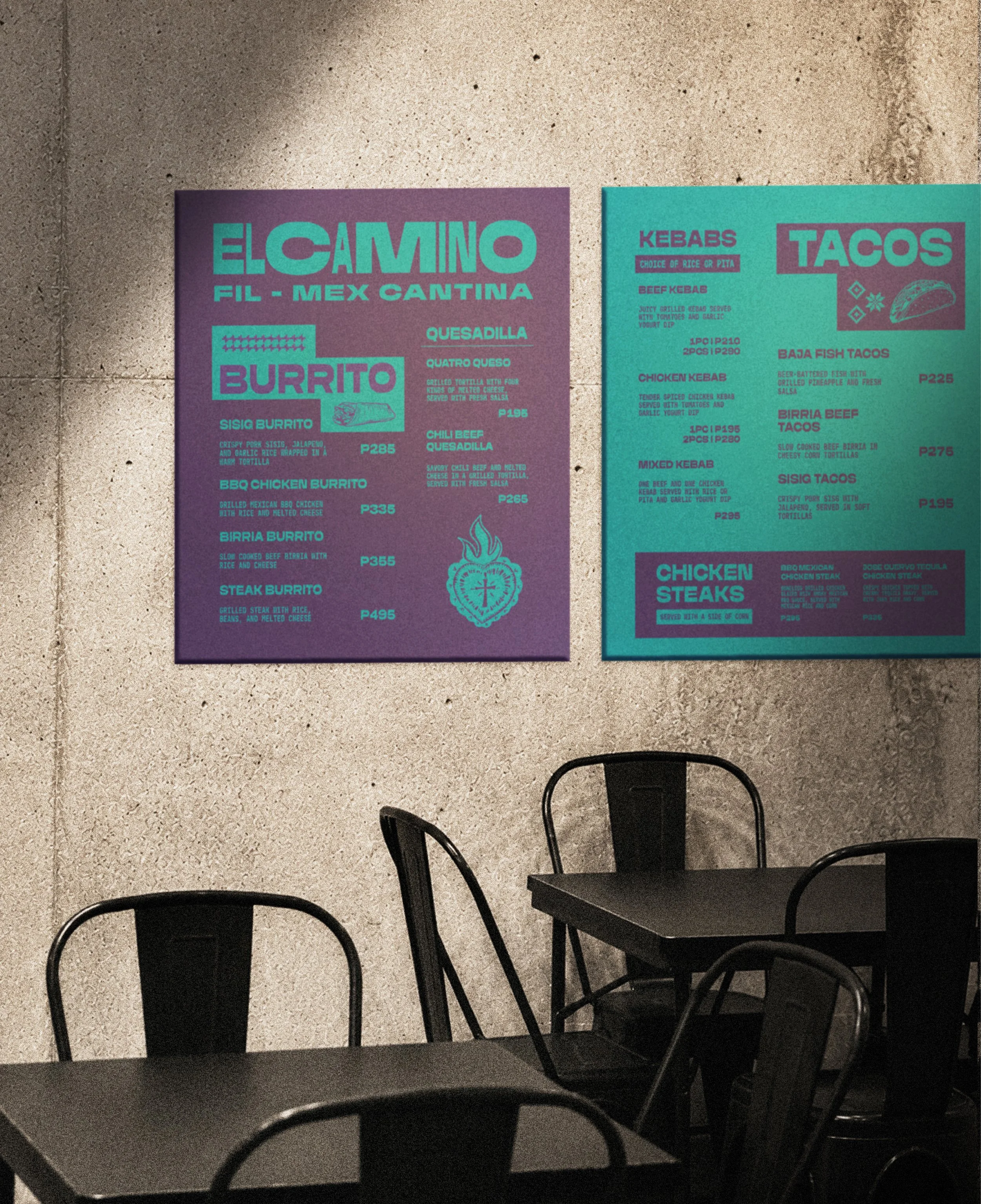
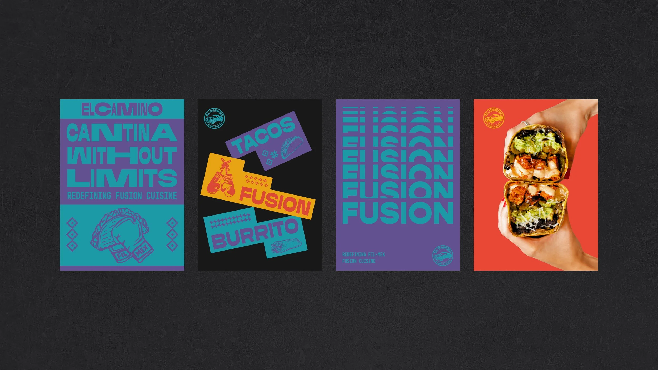
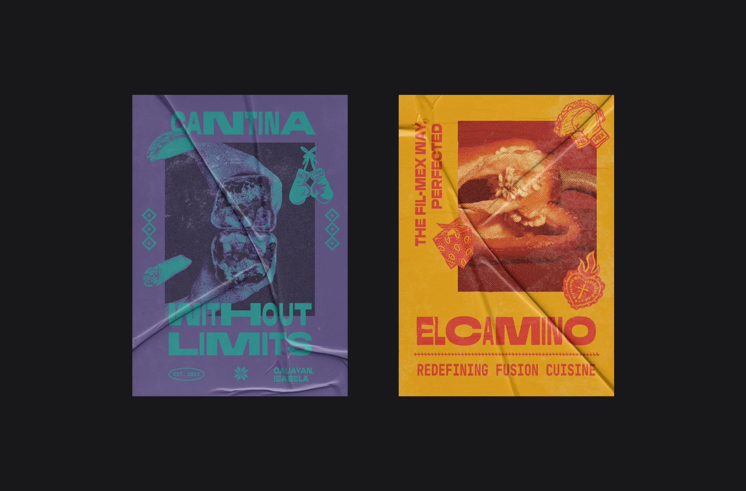
The visual system consists of:
Banig and Mexican-inspired patterns
Boxing imagery as a shared cultural touchpoint
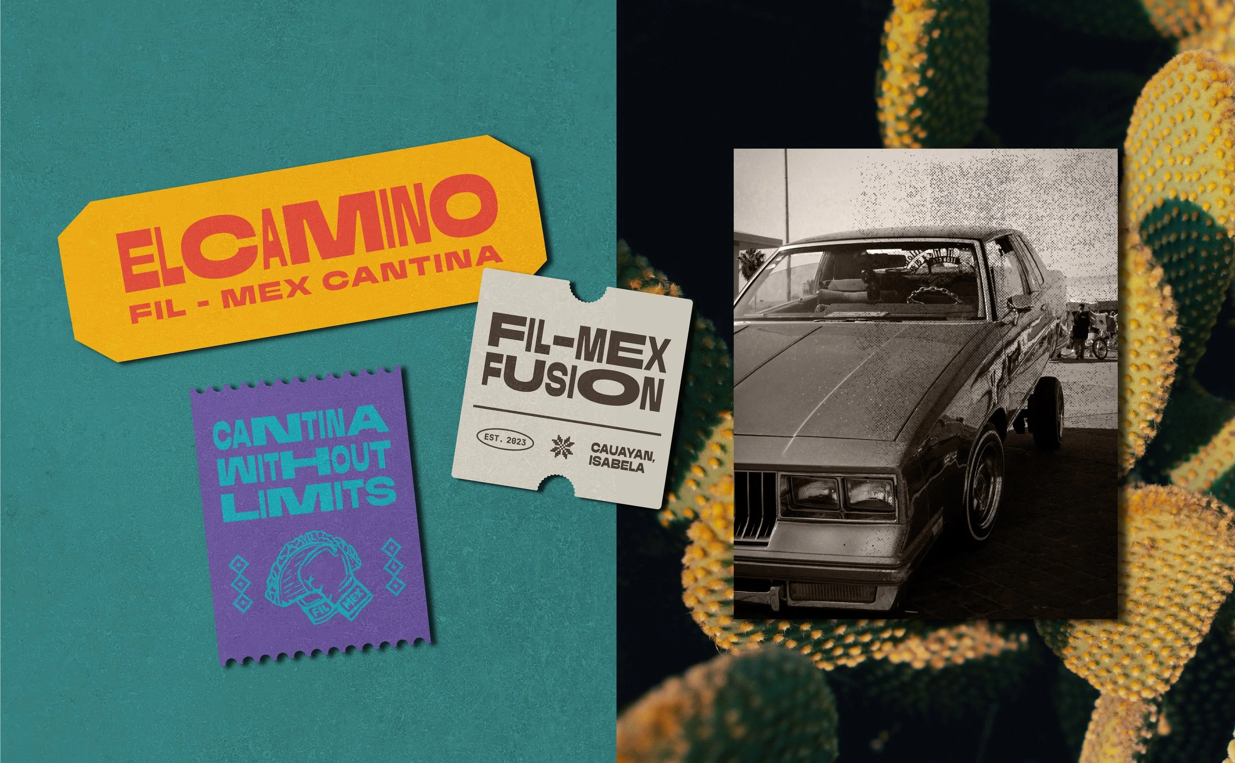
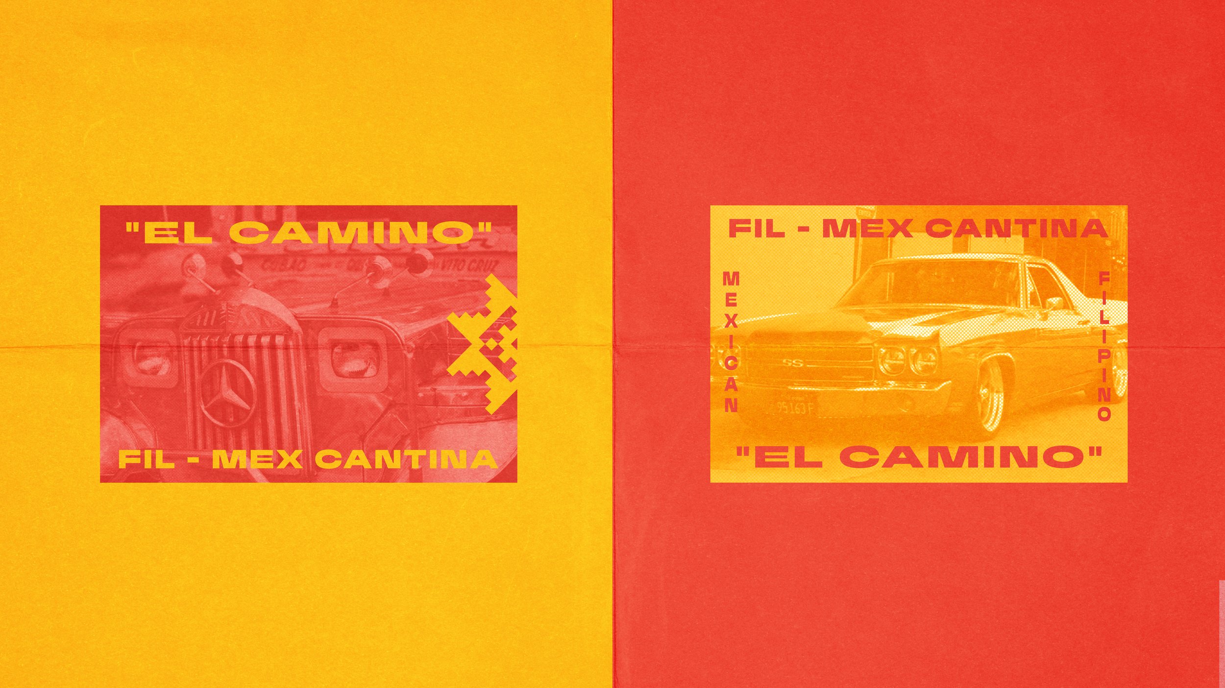
Jeepneys and lowriders representing Filipino and Chicano culture
Bandana patterns rooted in street culture
Rough textures for a grounded feel
Kinetic typography expressing movement and self-discovery
The Result:
El Camino’s journey is about finding the common ground between Filipino and Mexican culture. We translated this into a visual system that brings both cultures together through their shared similarities.